Orange? Yellow? It depends? There are two Holy Grails in color study. Perfect primaries and exact complements. After years of searching for both, I have come to the conclusion that perfect primaries do not exist and exact complements do not matter. Expand the range of the traditional pairs and you have a good enough guide: […]
Smashing Color
with Maggie Maggio
Page 2 of 5
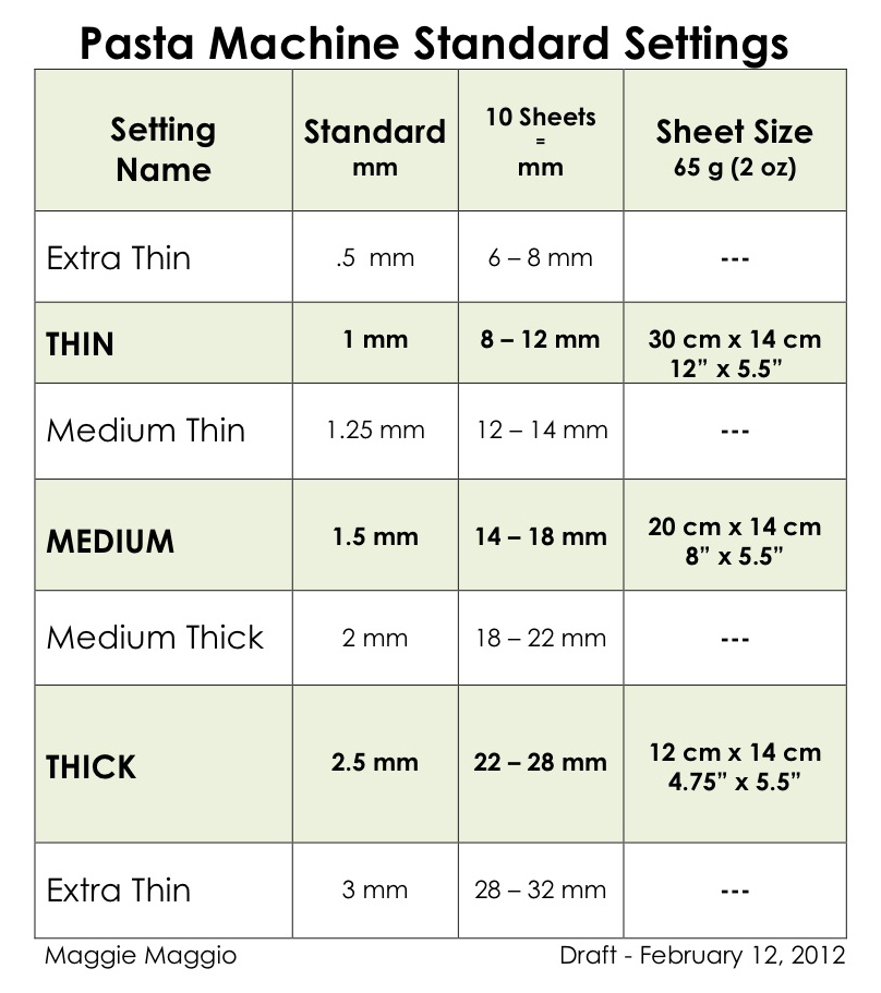
Here’s my latest draft of a chart based on input from many sources. The standard sheet thicknesses are now only in millimeters, plus I added a column for the size of the sheet (in mm and inches) that you will get from a regular sized block of clay at the THIN, MEDIUM and THICK sizes. […]

Addendum: Sage Bray from The Polymer Arts Magazine and I are collaborating on a Pasta Machine Thickness Guide. To help us collect the data we need, measure your pasta machine settings using either the playing card method or the metric stacking method and send us the information by filling out the online survey. – – […]
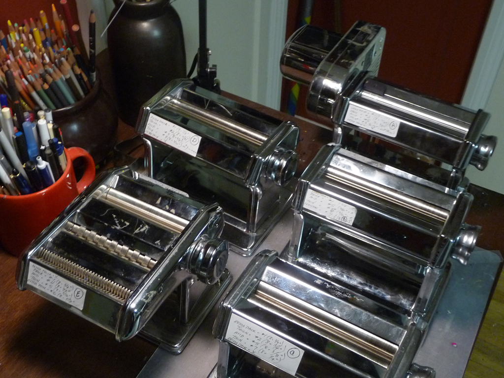
After struggling to write the instructions for a new project, I realized how crazy it is that we do not have standard settings on pasta machines. We can’t just use the numbers because every pasta machine is different. Sometimes the thickest setting is #1, sometimes the thinnest setting is #1. Sometimes the thickest setting is […]
The Smashing Color Retreats in 2012 will take place in the ArtSpace at TaborSpace in Portland, Oregon. Located in the historic Mount Tabor neighborhood, TaborSpace is an innovative grassroots community center sharing sacred space with a 100 year old stone church. The ArtSpace is on the second floor of the Parish House. Its a comfortable, quiet, […]
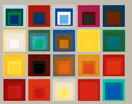
In Chapter 5 of Interaction of Color, Albers notes that when students were shown two colors of similar value and asked which one was lighter the results were consistently 60% wrong. 60%! And these were art students at Yale! Why is it so hard to see value? I think part of the challenge has to […]
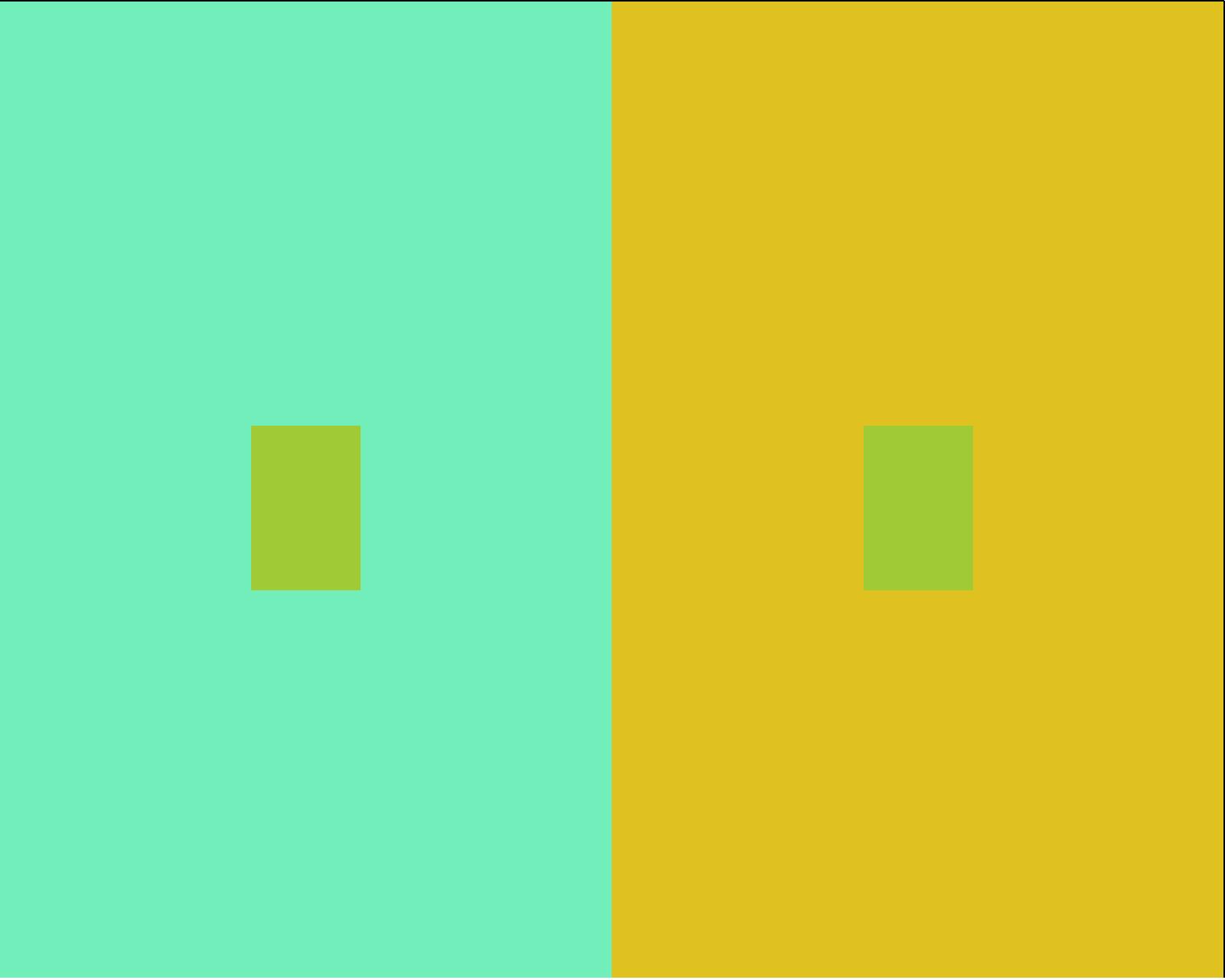
Albers encouraged his students “to try to find those colors which are more inclined to exert influence and to distinguish them from those which will accept influence.” I’ve played around with this exercise for years and still can’t quite predict where the bigger shifts will take place but one thing I know for sure . […]
Last Saturday we asked these questions about colors shifting: Which colors exert influence – make colors shift the most? Which colors accept influence – shift easily. Which color combinations maximize the shift. Here are a few samples from last week. Can you make any conclusions?
“Color is the most relative medium in art.” Chapter IV, Interaction of Color The first exercise is to make one color look like two. Start by downloading and printing a copy of the PDF Templates for Albers Color Studies. Cut out the template you want to use, or make a custom one for yourself. You can […]
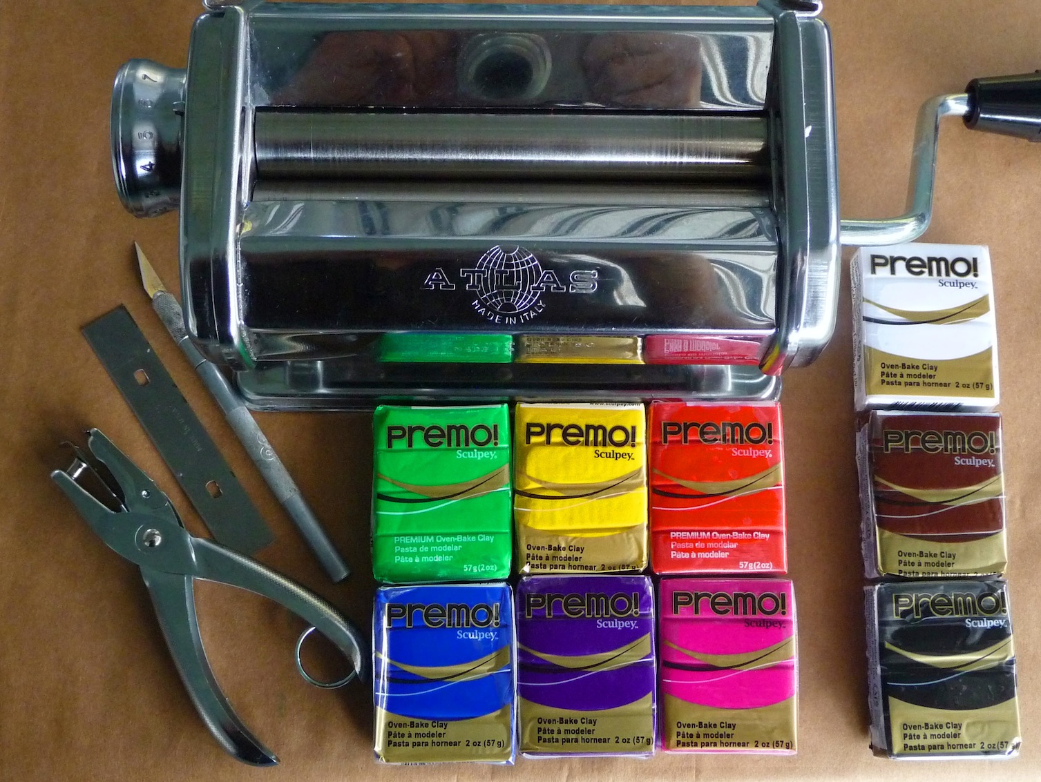
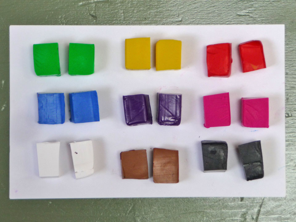
Chapter 3 of Interaction of Color is titled, “Why color paper – instead of pigment and paint.” I’m suggesting we try using polymer clay instead of paper or paint. For the exercises starting next week, you will need a pasta machine, 1/4″ hole punch, blade, # 1 X-Acto knife and nine colors of polymer clay. […]
I am teaching four one-day workshops at The Artway, Polymer Clay Express, in Damascus, Maryland over the Veteran’s Day weekend. Join me for just one day or for all four. Registration is easy, or at least I hope it will be. I am trying something new, a Wufoo form. If all goes well, you can […]
“If one says “Red” (the name of the color) and there are 50 people listening, it can be expected that there will be 50 reds in their minds. And one can be sure that all these reds will be very different.” This famous quote from the first chapter of Josef Albers book, Interaction of Color, […]
My freshman year of college I took Color 101. We used Josef Albers’ classic Interaction of Color as the text. That experience opened my eyes to the difference between what a color is and what it appears to be. Almost forty years later I’m still learning new ways to look at color and loving every […]
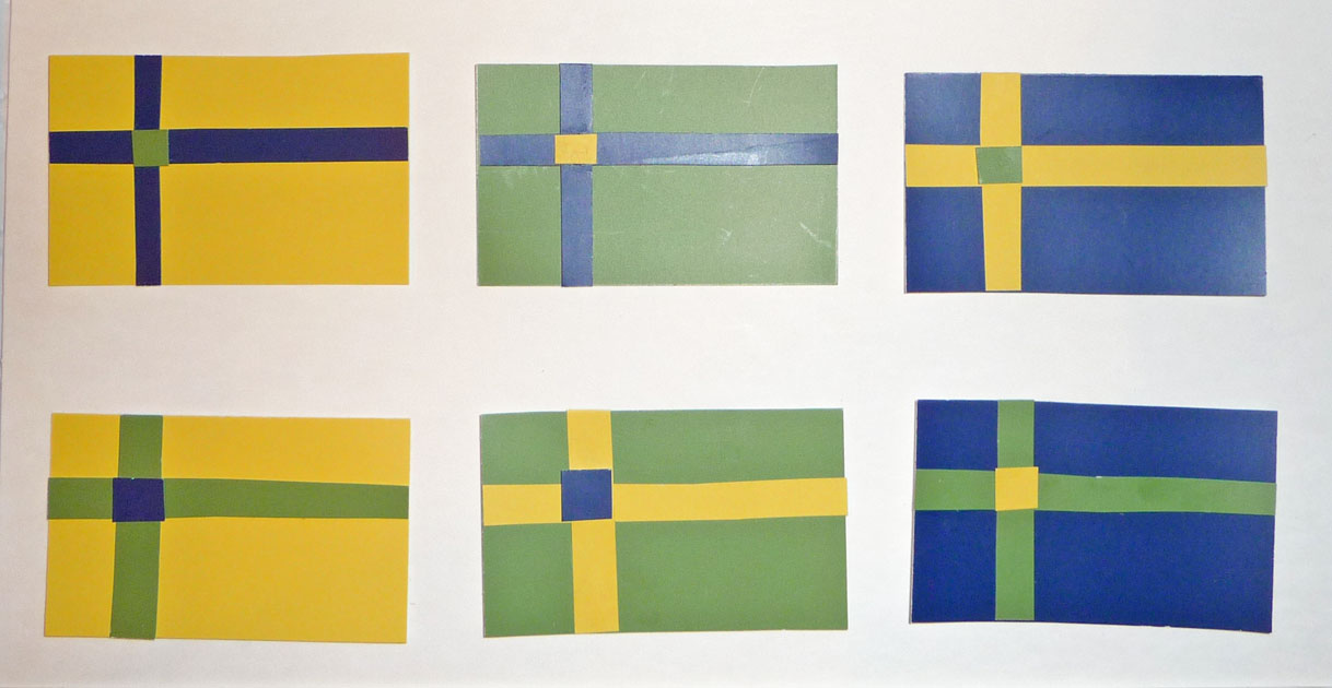
The last day of the retreat we focused on placement and proportion. The flag exercise is a fun way to see the six different options for three colors in a simple design. To be effective, all three colors need to be visible when the flag is flying on top of a capitol building. As you can […]

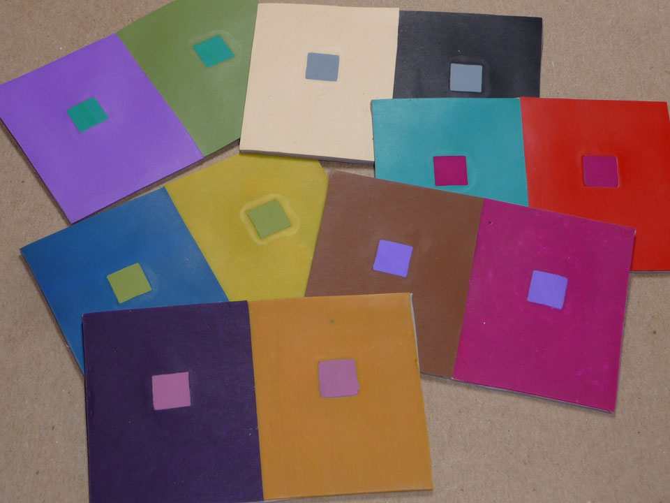
One of the reasons I wanted to host a Color Retreat was to see how the exercises I use in polymer workshops could be translated in other media. When the time came to check contrast, I challenged the group to come up with their own designs for Contrast Tables. Here are the results (some still […]
© 2026 Smashing Color