Albers encouraged his students “to try to find those colors which are more inclined to exert influence and to distinguish them from those which will accept influence.” I’ve played around with this exercise for years and still can’t quite predict where the bigger shifts will take place but one thing I know for sure . . . the three properties of color – Hue, Value and Saturation – all work together simultaneously to shift the appearance of colors when seen in relationship to each other. In the samples below, all the centers are the same lime green.

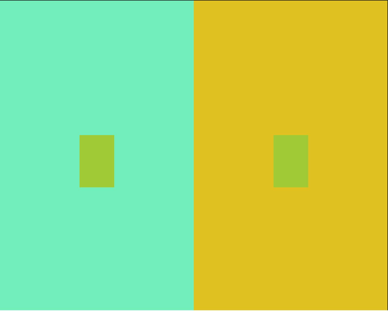
Hue Shifts: Primaries and secondaries have the most power to shift colors. More complex colors, intermediary and tertiary colors, are the easiest to shift. Two hues that are the parent colors of an intermediary center color will cause the most shift. Here a lime green appears more yellow-green on turquoise and more blue-green on yellow.
Center colors will take on a little bit of the afterimage colors of the surround. The afterimage of the light turquoise is red-orange, add a little of that to the green center and the color is slightly muted. Add a little of yellow’s afterimage to the center and the color is a slightly brighter and a slightly more blueish green.
_ _ _ _ _

Value Shifts: High and low value colors cause the most shift. Mid value colors are the easiest to shift. The same green as above on a pale blue background appears darker than the same green on a dark blue background.
Albers stated that “there are 2 kinds of changing influences working in 2 directions, light on the one side and hue on the other. And both occur simultaneously though in varying strength.” I like to add saturation shifts as well.
_ _ _ _ _

Saturation Shifts: Full saturation shifts colors toward neutrals while low saturation colors will make colors appear brighter in comparison. Here the same green appears grey green on a bright yellow green and shifts to a bright yellow green on a muted orange.
In this sample there is also some shifting due to hue – the orange is close to the complementary color of green and makes the green appear even more saturated. There is also some shifting due to value – the green surround is lighter than the center color so the center rectangle appears darker as well as less saturated.
_ _ _ _ _
Color relationships are complicated by the fact that pure colors are not all the same value. A pure yellow is much lighter in value than a pure violet. This adds another layer to the problem of predicting color shifts which we will cover next week in more detail.
In summary, colors shift away from the color that surrounds them. If the surrounding color is blue – the center color loses some blue and gains a slight bit of the afterimage color. If the surrounding color is lighter – the center color appears to be darker. If the surrounding color is clear – the center color shifts to appear more muted. And all the shifts happen simultaneously.
Next Week: More on value shifting.
Leave a Reply