
Smashing Color
with Maggie Maggio
Page 3 of 5
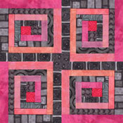
Log Cabin quilt blocks are studies in light and shadow. The fun comes when they are combined. Here are a few variations to try with your dark and light Stripe Blends. Weekend Extra Exercises 1. Play with the Spiral. Here’s the diagram showing the order to put the strips for a spiral effect. The construction […]
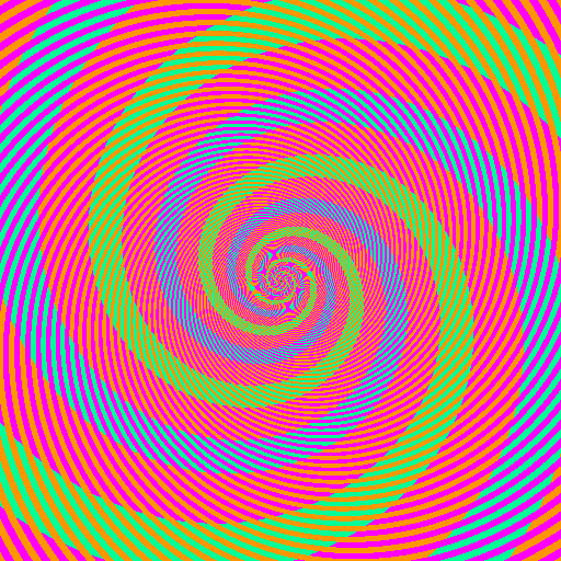
The swirls that look green and the swirls that look blue are the same color. Yes, really. Published by Akioshi Kitaoka in 2009, this illusion is based on mixing colors optically. What you don’t notice at first is that the colors of the thin stripes crossing the swirls are alternating between orange-red and purple. Look closely […]
One of the most important concepts in color study is an appreciation of the difference between what a color is and what it appears to be. In our book, Lindly and I introduced this concept in the Chapter “Games Colors Play.” We explored simultaneous contrast, blending, and the apparent shifting of hue, value and saturation […]
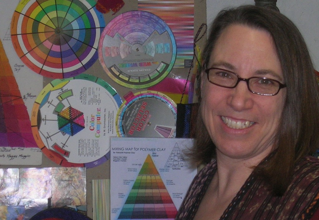
I recently decided to shift how I think about myself as an artist – from polymer artist who teaches color, to colorist and teacher of color who uses polymer clay as my medium for color explorations. Why? Because I want to focus on sharing my love of polymer clay and what I am learning about […]
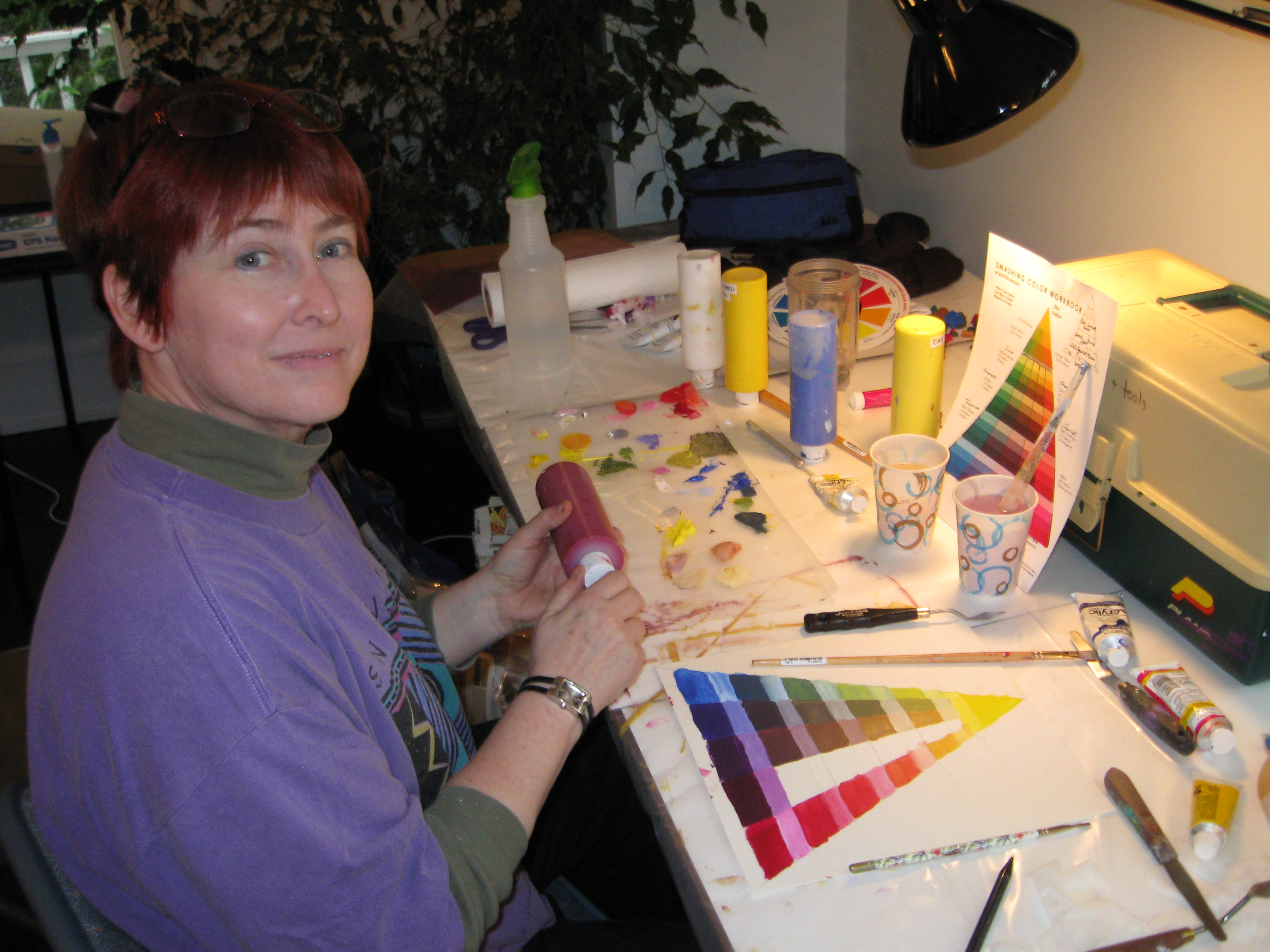
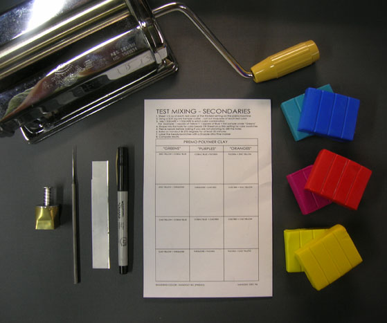
Have you ever tested colors just to see which primaries can mix the widest range of colors? If so, then you have played the Gamut Game. Over the years I have played this game in countless media. I played it in acrylic paint – the winners were Phthalo Blue (GS), Quinacridone Magenta, and Hansa Yellow. […]
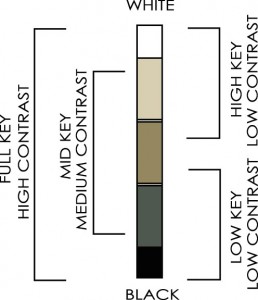
Value Keys As we saw last week, contrast of value is relative. Combinations of colors that are all high/light in value are called high key. Color combinations that are low/dark in value are called low key, and if all the colors are in the middle value range then the combination is in the mid key. All these combinations are […]
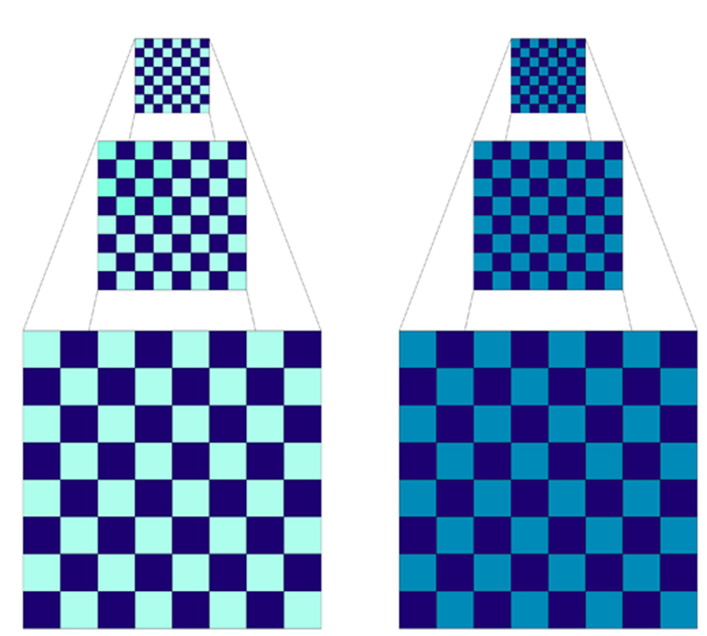
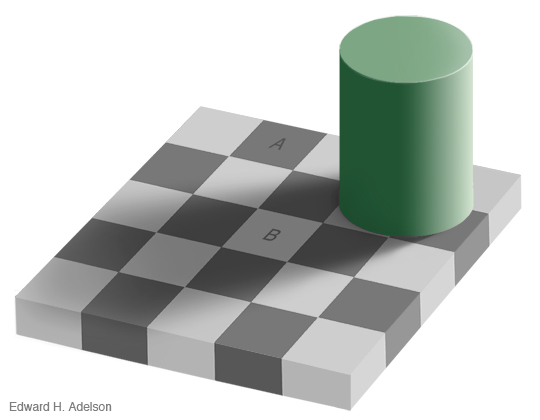
To contrast two colors you need to compare them. If their properties are very different, then the contrast is high. If not, then the contrast is low. Since color has three properties – hue, value and saturation – you need to compare colors in each of these areas. Let’s compare two checkerboards. Hue – Both the checkerboards are made out of two colors […]
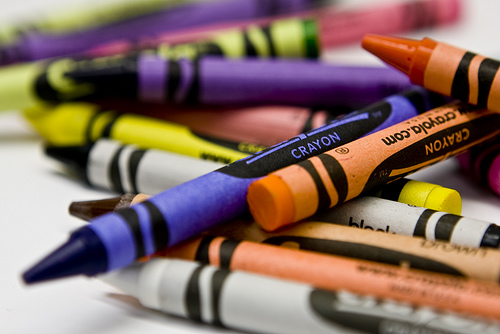
Treat yourself to a box of 64 crayons and clear some space in your studio. Its time for the return of Saturday School! Starting next Saturday, September 11th, I will be expanding on the exercises in Lindly’s and my book, Color Inspirations. Last year we covered Chapters 1 to 5. This year we will start with some […]
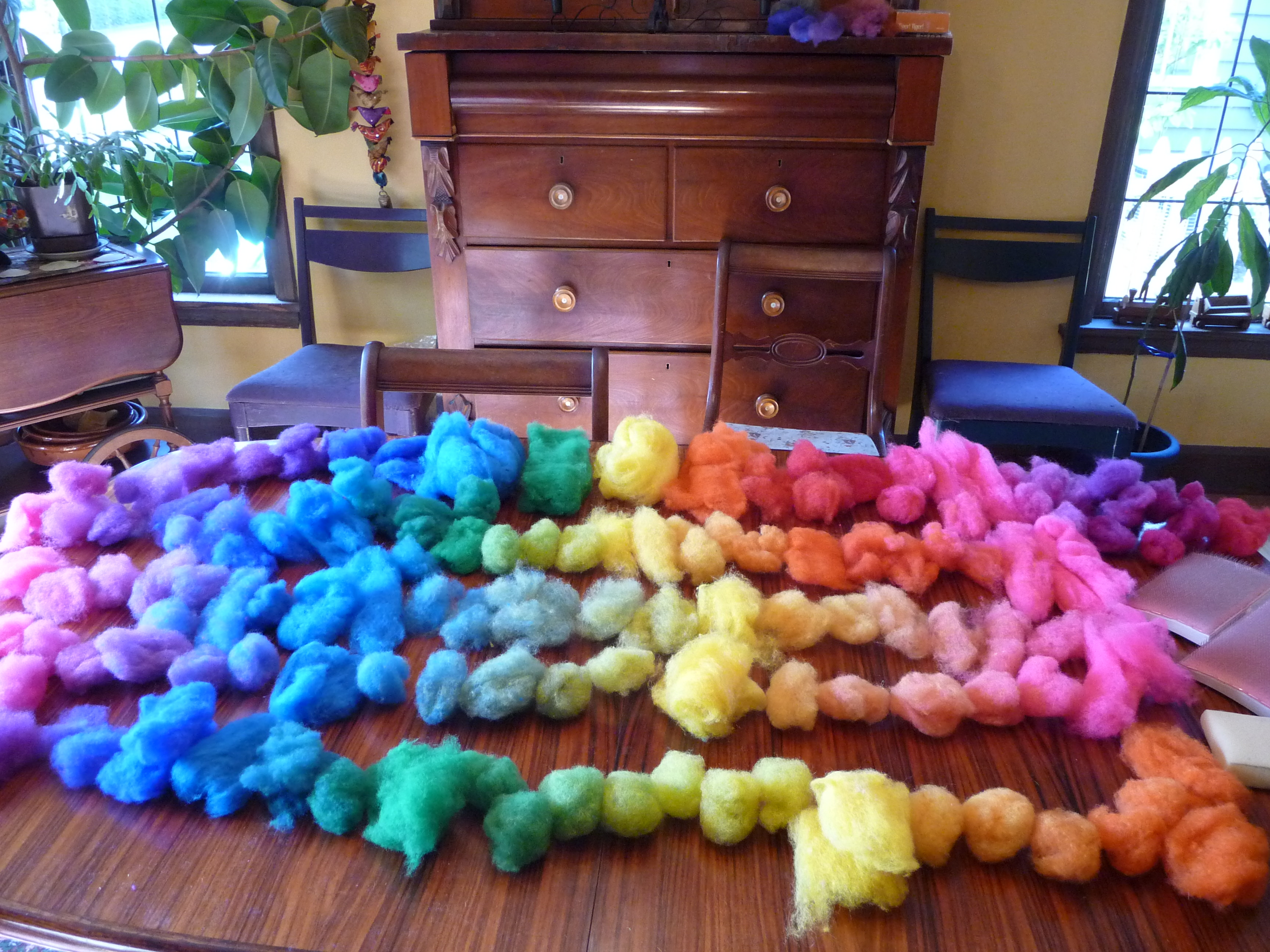
The idea for the Color Scales came when I was struggling to keep track of all the test mixing I was doing when I first started using polymer clay in the mid ’90’s. I decided there had to be a better way to organize all the little bits of clay and tried all kinds of systems before […]

I’ve seen some wonderful images posted online by artists who have already made the Pinched Petal Necklace project in Chapter 4. Here’s a gorgeous one from Nora Pero’s flickr site. I especially love the tomato red centers! I would like to post a sampling of Pinched Petal necklace photos on Saturday for the Weekend Extra. If you have […]
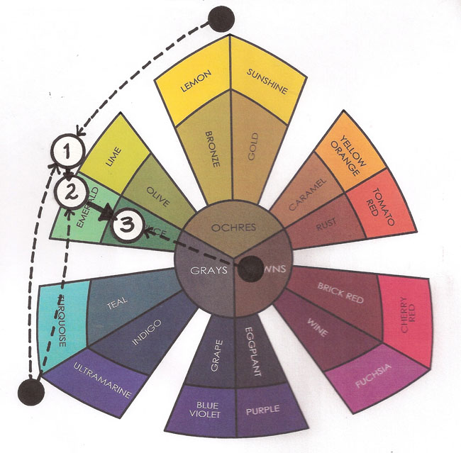
When you are instinctive mixing it helps to imagine the direction that you want to move the color. Once you know the direction, you can find the path. The “path” is the imaginary line that runs between the color you have and the color that you want. If you extend this line across the color sorter, any color along that line can be used to move the color to where […]
The rally was lots of fun. Pioneer Courthouse Square was filled to the brim with people carrying 350 banners. I love my city! Here are my Kato tasting tiles, including four muds made with equal parts of the various three primaries. The set-up for the muds is different from the book. I cut the squares of each primary […]
This is the first of two Studio Tool exercises in the book. We originally had more of them, including a fan deck of Skinner blends, but due to space limitations we had to cut them out. I will try to add instructions for the missing tools at the point in the book where we wanted them to […]
© 2026 Smashing Color