 To contrast two colors you need to compare them. If their properties are very different, then the contrast is high. If not, then the contrast is low.
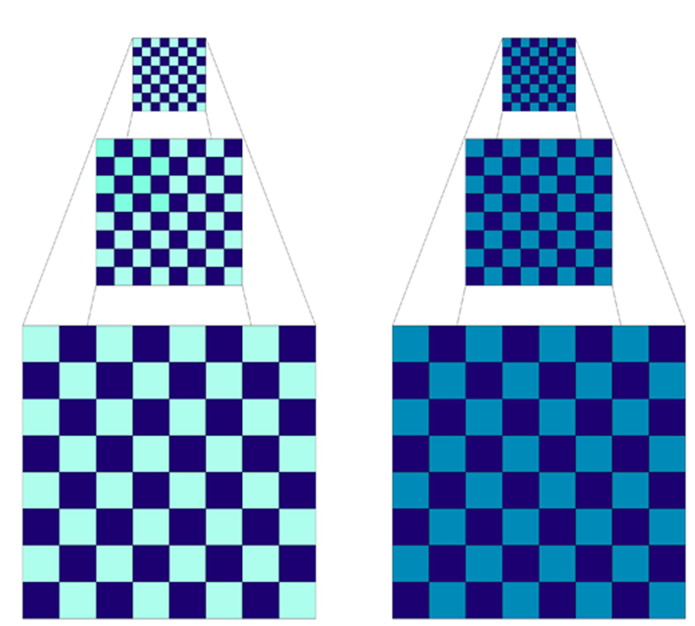
Since color has three properties – hue, value and saturation – you need to compare colors in each of these areas. Let’s compare two checkerboards.
Hue – Both the checkerboards are made out of two colors of blue, so the hue contrast is low.
Value – The left checkerboard has a light and dark blue so the value contrast is high, while the right checkerboard has similar dark value blues, which makes the value contrast low.
Saturation – The checkerboard on the left also has a higher saturation contrast since one blue is bright and one is dull.
Value Contrast
In many color books the emphasis is placed on hue contrast (we will cover that next week) but Lindly and I both believe it is more important to understand value contrasts.
Why is value contrast so important?
Without value contrast, separate parts of a design will not be distinct. This is especially critical when reducing a polymer clay cane. Look at the difference in the reduced versions of the checkerboards. Even in the reduced version the left checkerboard’s pattern can still be seen but the top right checkerboard’s pattern has almost disappeared.
I learned this lesson the hard way when I first started to make canes. I was getting ready for a Christmas show and made a checkerboard red and green cane for turning into earrings. I reduced it, cut it into hundreds of slices and baked them. They darkened a little bit in the oven and by the time I pulled them out, the pattern was gone. From about two feet away they looked just like mud. At that small scale, the red and green were not different enough in value and the two colors pulled together visually to make a brown color. Now I love browns – but not for Christmas earrings!
In this case, the colors I chose were contrasting in hue – red and green – but not contrasting enough in value. If you want individual colors to stand out, value contrast always trumps hue contrast for legibility.
 Swirls – Simple Contrast Studies
One of the easiest ways to check for contrast between two colors is to make swirls. We borrowed this quick and easy technique from fiber artists who twist yarns together to check the result.
In Chapter 6, we show a collection of contrast tests using variations of orange and blue. Evaluate these swirls. Which have a high level of contrast and which do not?
Why?
Weekend Extra Exercise
1. Select four of your palette colors – one light color, one dark color and two middle value colors.
2. Make 1/8″ diameter snakes, 12 inches long, from each color.
3. Cut the snakes into three pieces each and combine them so you have six combinations of two colors.
4. Twist each of the two color combinations together.
5. Reduce the snake – twisting one end to a point.
6. Swirl the snake into a button shape and bake following manufacture’s instructions.
7. Analyse the contrasts.
This is a simple exercise that you can do anytime you want to check for contrast between two colors of clay. It doesn’t take much material, or time, and it trains your eye to see contrast.
Here’s a twist on the swirls: Make each of the colored snakes a little bit thicker in diameter. After twisting two colors together, roll them into a smooth snake and follow the instructions for turning them into a split ring. If you do this with all your package colors as well as your palette colors, you will have a very fun reference chain to hang in your studio. The reality is that you may never look at it again, but just doing it teaches you so much that its worth it!
September 15, 2010 at 9:27 am
Thanks for this latest lesson. Your book has been a revelation for me and has really helped me to follow my intuition on color!
September 14, 2010 at 9:36 pm
Thanks for the extra exercise. I made it and the main lesson learned was that contrast is relative (as mentioned in your book). I used some colors from my pivot tiles exercise and some from my scales triangle. I’ll be posting about it on my blog: http://www.normasclay.com when my camera decides to behave. Thanks again!
September 13, 2010 at 6:29 pm
thanks a lot for this wonderful work! I’m reading your book and, even though reading it in English is not always easy for me, it is helping me a lot with understanding colors combination. Great work!
Sofia