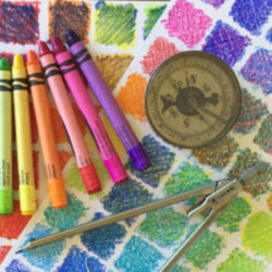
Over the last year there has been a flurry of interest in my Watercolor technique with tutorials and videos by enthusiastic artists popping up in many places. Remember playing the game of “Telephone” or “Whisper Down the Lane” and by the time the last person repeated the information it was all mixed up? That’s what […]
Smashing Color
with Maggie Maggio
Page 2 of 2

Here are two more places to get prisms. Sargent-Welch has a 25mm x 25mm for $7.50 plus shipping. Science Kit also has an equilateral triangle with a base for display for $9.50 plus shipping. The shipping cost is $8.00 in both cases. If you order more than one the shipping costs can be shared.
Thanks to everyone who let me know that the January 22 issue of the New Yorker had an article about the color industry. “Made in the Shade”, by Eric Konigsberg, tells the story of color consultant Leslie Harrington and gives an inside look at the color business. For a workhop a few years ago I […]
In Monday’s tutorial I mislabeled Fuchsia. On the right side of the chart I called it Magenta. Thank you to Judy Reese in Washington for raising her virtual hand to ask the obvious question. Where do I find Premo Magenta? Ah. There is no such thing as Premo Magenta – just lots of confusion because I used […]
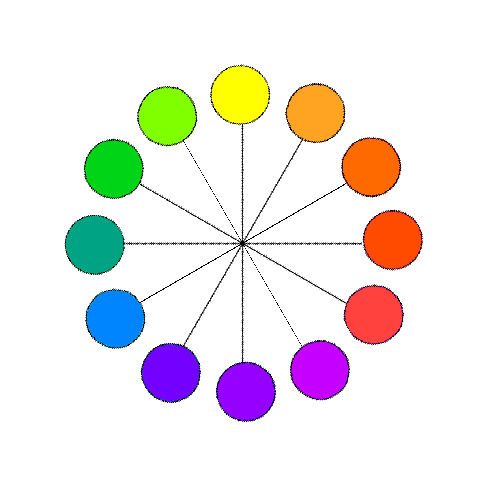
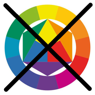
The concept of complementary colors is one of the cornerstones of color theory. Complements are Opposites The traditional way to define complements is that they are opposite each other on a color wheel. The problem with this definition is which color wheel to use. RYB? RGB? CMY? Newton? Munsell? Itten? Ives? Oswald? All have different […]
When you mix two colors in equal amounts you expect to get a color that appears to be in the middle. In reality this doesn’t often happen. Usually one of the colors will be stronger than the other and pull the half and half mix closer to its side than the other. Understanding the “tinting […]
Traditional theory says R+Y+B =Black, and Modern Theory says C+M+Y=Black. Reality is Three Primaries = MUD. I define MUD as the color you get when you mix primaries in equal amounts. Depending on which primaries you pick MUD can be many colors. Traditional MUD If you have been mixing colors using the traditional Red, Yellow, […]
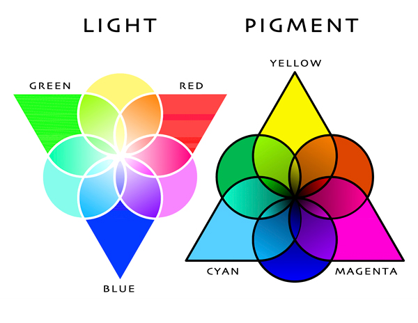
I’ve been looking for the perfect primaries ever since my first experience mixing colors for batik dyeing. At first I thought the manufactures were not making the colors I needed. Now I know that the differences between mixing light and mixing pigments make it impossible to have perfect primaries in pigments. Color Triangles Whenever you […]
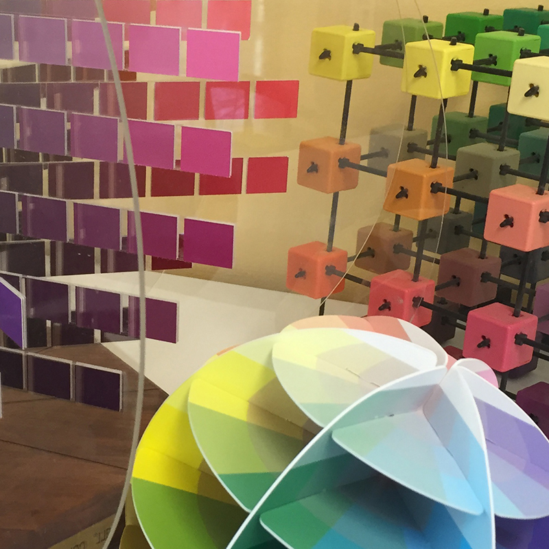
Most diagrams of color are two dimensional. The problem is that color has three distinct properties. HUE, VALUE and SATURATION The Three Properties of Color Hue – The color family. Ex. Green, Yellow. Some systems use six families, some eight, some ten. I don’t really care how many hue families you divide color into as […]
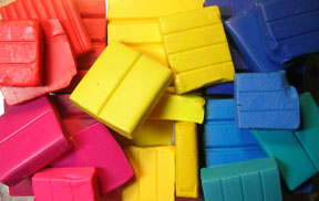
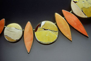
Whether you are a painter, dyer or polymer artist, I believe polymer clay is the best material for beginning color exercises because it is measurable, easy to use, not messy, not expensive and lets you mix colors right in your hand. There are now many brands to choose from. I am most familiar with Premo […]
Color theory is not reality. It is a collection of concepts that explain the complexity of color in a very abstract way. Traditional color theory uses the same key concepts over and over because they are elegantly simple – not because they are always right. Primary Colors The first of these key concepts is the […]
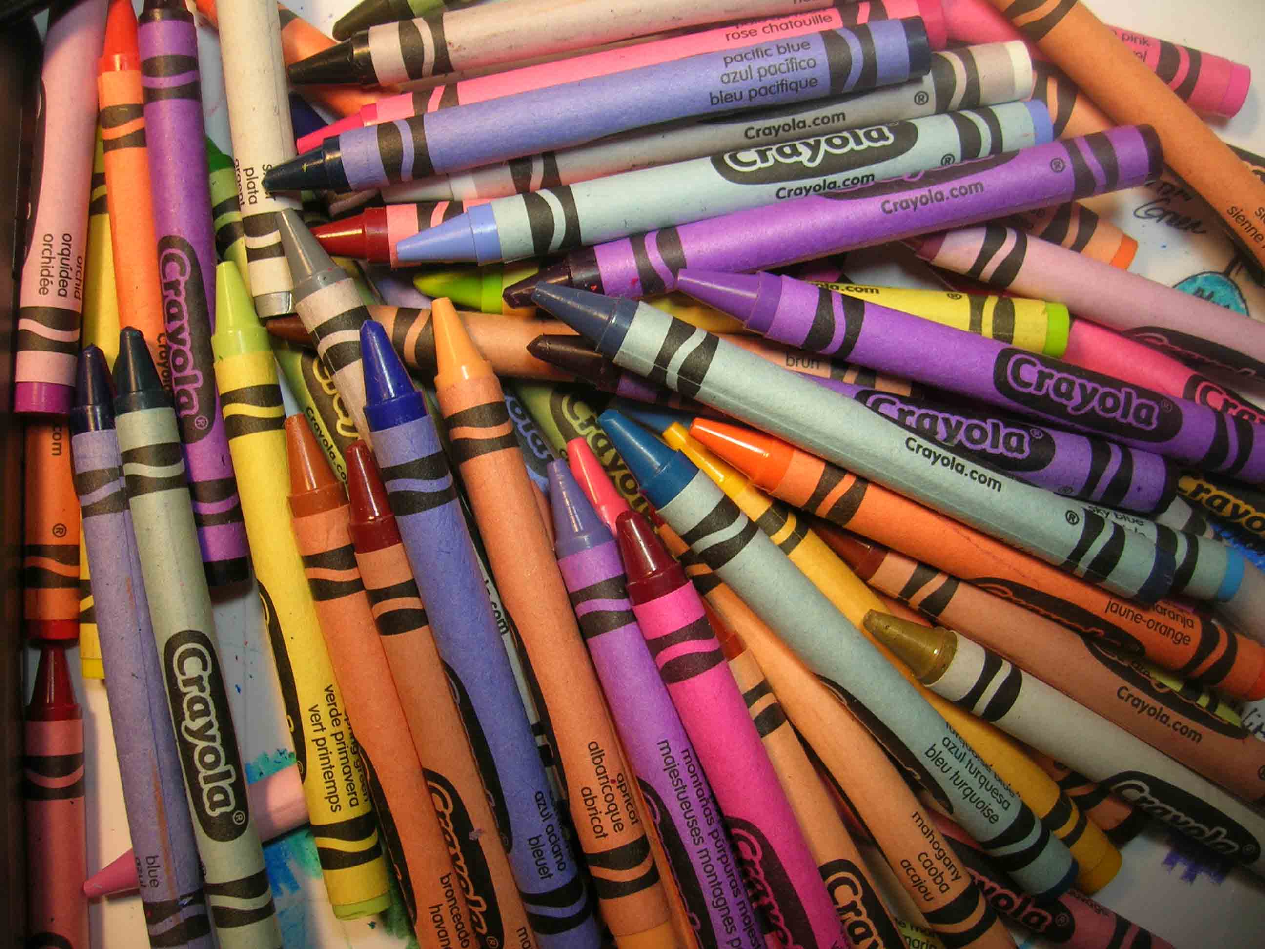
Starting in January the tutorials will use clay. I use Premo for color studies but you can use any of the clays. You will need 2 ounce blocks of six colors plus white. The six colors we will start with are: Magenta/Fuchsia, Red/Cadmium Red, Lemon/Zinc Yellow, Golden/Cadmium Yellow, Med.Blue/Cobalt, and Blue/Ultramarine. Until you get your […]
© 2026 Smashing Color