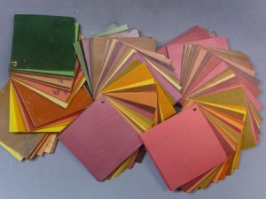
Taking some time to make and document color mixes is the best way to learn how to mix colors instinctively. Playing scales on the piano trains the ear, making color mixes trains the eye. Color scales are my favorite way to record my color mixes but I encourage you to come up with your own system for keeping track […]
Maggie Maggio
Exploring Color in the 21st Century
Search results: "color scale" (page 2 of 3)
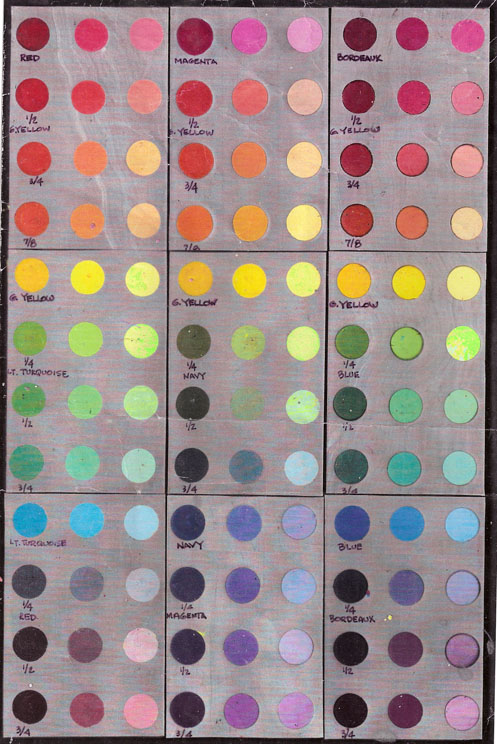
Lindly Haunani and I often tell the story of how we met. It was at the National Polymer Clay Guild retreat in the spring of ’95. I brought copies of a color mixing chart for Fimo that I was selling as a fundraiser for my daughter’s 6th grade class. The kids made all the mixes as part of a lesson […]
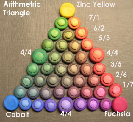
The best way to show the full gamut or range of colors that can be mixed from three primaries is with a triangle and, just like the color scales, there are two variations of color triangles; arithmetric and geometric. Mathematical vs Visual Balance Arithmetric Triangles put the 1/2:1/2 mixes (in the sample they are labeled 4/4) in the middle position […]
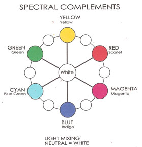
Complementary colors are shown opposite each other on most color wheels, but what is often missing is the neutral color in the center. There are at least four variations of complementary color wheels, each with a different neutral color in the center. Wheel #1: Spectral Complements Spectral complements mix to make white light. The value […]
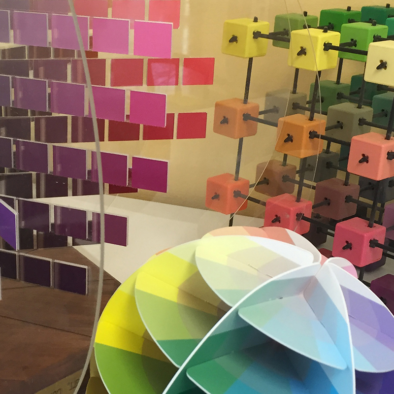
Most diagrams of color are two dimensional. The problem is that color has three distinct properties. HUE, VALUE and SATURATION The Three Properties of Color Hue – The color family. Ex. Green, Yellow. Some systems use six families, some eight, some ten. I don’t really care how many hue families you divide color into as […]
Split Ring Handout Split Ring Worksheet3 Video Handouts Polymer Scales Worksheet Worksheet for Making a Color Triangle from Color Scales Flow Triangle with Premo Polymer Clay Package Colors Instinctive Triangle with Premo Color Scales Zones in the Triangle Diagram Smashing Color Tutorial Handouts Smashing Color 1: Three Color Wheels (Crayon Exercise) Smashing Color 2 : […]
Color Scales in Polymer Clay Color Scales II – Playing with Color Scales Color Scales III – Color Triangles in Polymer Clay Polymer Clay Split Ring Chain Tutorial – Maggio Missing Link Color Collage
Joey and I spent some time tonight posting the third video, Smashing Color Triangles. Then I remembered I need to give you the links for the handouts. Here they are: Color Scales Handout Instinctive Mixing Handout Color Scales Triangle Worksheet The video ends with a suggestion to use the triangle to practice mixing colors instinctively […]
Variations of chartreuse have been popular for at least the last eight years and the color seems to keep getting hotter and hotter. Dante Marioni’s Chartreuse Trio 2006 Fall 2006 Runway Guide As I work on making sample triangles with different clays and different primaries I am struck by the amazing range of chartreuses […]

Pocket Softbox provides you a quick and easy light source for photography or video making. A fun way to explore additive color mixing in light, it can also be used to play with polarization and subtractive mixing using shapes cut out of theater gels or colored cellophane films.
Turn your phone/tablet screen into a colored light source, and use it for your photography or videos in low-light conditions when you can’t bring your heavy equipment with you. The interface is simple and built for speed. Just drag your finger across the screen to change the light color.
Pocket Softbox features two main modes:
? RGB colors: all the color spectrum is available, with fully saturated colors near the edge of the screen, and leaning towards white near the center. A tooltip gives you the hex value of the selected color.
? Kelvin scale: choose a color from the temperature spectrum, ranging from 1000K to 10000K. A tooltip gives you the approximate Kelvin value of the selected color.
Other functions:
• Color lock: lock the screen to prevent accidental color changes.
• Eye light: change light shape to a circle if you need a round light in your subject’s eyes.
• Save current color as a preset for reusing it in the future.
• 7 color presets already available.
1500K candle light
2700K incandescent lamp 40W
3200K tungsten lamp
4500K fluorescent lamp
5600K daylight
6500K overcast sky
9000K blue sky
Pocket Softbox is developed under the supervision of cinematographer Christian Denslow.
http://vimeo.com/christiandenslow
Last week I mailed off four pieces for the upcoming “(in) Organic” show at the Racine Art Museum. Here’s one of the pieces along with a short story describing how it came to be. I was planning on making a loop on loop collar. I had it all sketched out at full scale. I made […]
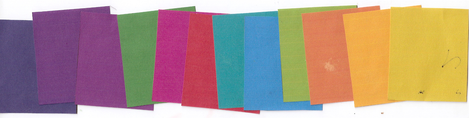
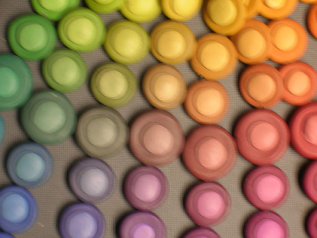
Putting colors in order according to value can be tough. Here are the twelve colors from the post about value last month. I put them in the order I thought they should go and scanned the results in grayscale. They fall into three value ranges – dark, medium, and light but, as you can see, […]
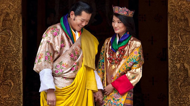
The photos and videos of the royal wedding in Bhutan are starting to stream in via the internet. Its a joy to see all the vibrant color! The first time I heard of Bhutan was reading Ancient Futures by Helena Norberg-Hodge. I’ve longed to visit this beautiful country that measures success on a Gross National Happiness scale […]
Every Labor Day weekend I look forward to Oregon’s premier art and fine craft show, Art in the Pearl. I did this show in Portland’s Pearl District for a few years way back when. My favorite was one year right next to a huge tree that provided just the right amount of late afternoon shade. My […]
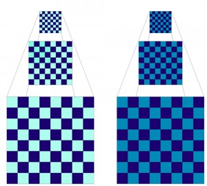
To contrast two colors you need to compare them. If their properties are very different, then the contrast is high. If not, then the contrast is low. Since color has three properties – hue, value and saturation – you need to compare colors in each of these areas. Let’s compare two checkerboards. Hue – Both the checkerboards are made out of two colors […]
© 2024 Maggie Maggio