Complementary colors are shown opposite each other on most color wheels, but what is often missing is the neutral color in the center. There are at least four variations of complementary color wheels, each with a different neutral color in the center.
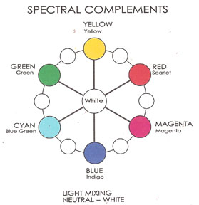
Wheel #1: Spectral Complements
 Spectral complements mix to make white light.
The value of two colors mixed in light will be lighter than the average value of the two colors.
Light mixing is predictable and complementary pairs are standardized as Magenta/Green, Cyan/Red, and Yellow/Blue.
Wheel #2: Optical Complements

Optical complements mix to make middle gray.
The value of two colors that are optically mixed will be the average value of the two colors.
Optical mixing is the result of colors blending as we look at them. Think of pointillist paintings or screen printing.
There are two ways to determine optical complements. One way, spinning two colors together to test for neutral gray, is described in this article on Munsell complements. A simpler way is to do afterimage tests.
Both hue and value reverse in afterimaging, for example a dark magenta’s afterimage will be a light green. The perfect middle value neutral gray has no afterimage.
Wheel #3: Process Complements
 Process complements mix to make a dark gray.
The value of two pigment colors that are physically mixed will be darker than the average value of the two colors.
The process wheel is used in the printing industry and is often used by artists as a guide for mixing colors. Notice that the process version of Cyan is bluer than spectral cyan and that the Blue has more red in it than spectral blue.
Mixing colors would be easy if the colors that are complementary in light were also complementary in pigment but unfortunately they are not all the same. For example: Spectral Blue and Yellow mix to make white light. Blue and Yellow pigments that “match” the hues of the spectral colors usually mix to make a dark green.
To further complicate things, pigment mixing is not predictable. Variables such as undertone, tinting strength and the source of the pigments used to make the color have to be taken into account when looking for pigment complements. The same two hues that mix to a neutral in watercolor may not mix to a neutral in polymer clay. The same hues from one brand of polymer clay may not mix the same neutral as another brand.
Wheel #4: Traditional Complements

If you use a tradional color wheel to predict which colors will mix to gray you will be very frustrated.
The traditional complements of Red/Green, Yellow/Purple and Blue/Orange mix to make mud.
Notice that the path between blue and orange also includes gray. Blues and oranges are complementary in both the CMY and RYB systems.
Even though the other traditional pairs do not mix to make gray can you still call them complementary?
Flexible Complementaries.
I have a looser definition of complementary and a broader definition of neutrals than most books on color. Colors don’t have to be exactly opposite for me to consider them complementary and I include browns as well as grays when I think of neutrals.
Since there is no way to know for sure which colors will be complementary until you mix them, you can let go of needing to know exact complements.
Color Wheels as Mixing Guides
The best way to learn how to successfully mix colors is to mix lots of colors, but until you feel comfortable mixing colors intuitively its OK to use a color wheel as a mixing guide. Be sure its designed for your medium and remember its just a simplified version of complex color relationships.
I am leading up to sharing with you my personal color wheel for polymer clay. In the meantime, a good example of a media specific color mixing guide is Bruce MacEvoy’s Visual Artists’ Wheel for watercolorists. An example of a non media specific wheel for use by artists is Don Jusko’s Real Color Wheel.
This week we will make versions of each of the four different complementary wheels. Next week we will start exploring color scales and experiment with mixing colors inside the color wheel.
Complementary Wheel Exercises.
Materials: An equilateral prism, daylight or a full spectrum light like an OTT light, box of 64 Crayola Crayons, and Handouts #6. (1 of 3 PDF) (2 of 3 PDF) (3 of 3 PDF) Follow the instructions in the handout to conduct three tests.
 Test #1. The best way to see the Spectal Complements is to look through a prism at a diagram made of horizontal stripes. I found this pattern in a book of Goethe’s experiments and even though I don’t agree with Goethe on lots of his color theory this is an easy way to see the primary and secondary colors of light.
Test #2. The best way to see the Optical Complements is to conduct your own afterimage tests. Afterimages can be hard to see. It takes practice. It is easier in good light so do the exercise near a window or use an OTT light.
Test #3. The best way to see the difference between Process and Traditional Complements is to mix the same yellow with a blue violet and then with a purple and observe the two neutrals that result. The handout exercise is in crayon. Next week we will try it with polymer clay.
October 3, 2007 at 4:28 am
This is brilliant – I am a PC newbie and have got lots of packs of clay which I just keep looking at wondering how to mix them – almost a bit scared of it. This has really helped and given mer some great ideas for what to try next. Thank you!