 Variations of chartreuse have been popular for at least the last eight years and the color seems to keep getting hotter and hotter.
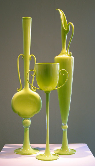
Dante Marioni’s Chartreuse Trio 2006

As I work on making sample triangles with different clays and different primaries I am struck by the amazing range of chartreuses that show up at the yellow end of the color scales.
 On most color charts the color yellow green is shown right next to yellow and all the colors in between are missing. That’s a shame because so many of the beautiful colors that we call “spring greens” are really mostly yellow with just a titch of blue in them.
For years I called these very yellow Yellow Greens “chartreuses,” not knowing where the name came from. I did a little research and found out that there are two colors of chartreuse.
 The new chartreuse is one of the websafe colors midway between yellow and green.

The old chartreuse is mostly yellow with a slight bias toward blue.
The color is named after the herbal liqueur called Chartreuse. I made a special trip to the local liqueur store thinking this would be the best way to see what the color really looks like. Unfortunately there are also two colors of Chartreuse on the shelf.
 Green Charteuse is a pale yellow green, sharp and at 110 proof it has quite a kick.
Yellow Chartreuse is very yellow, sweeter and 80 proof.
So which color is the real chartreuse? I don’t know. I’m inclined to use the old definition but as long as a color falls somewhere between a yellow green and a green yellow I think its OK to call it chartreuse.
_____________________________
 My investigations into chartreuse started when I read a review for “Into Great Silence,” a movie about the Grande Chartreuse monastery in the French Alps.
The color chartreuse takes it name from the liqueur. The liqueur takes its name from the monastery. And the monastery takes its name from the mountains nearby.
Over 20 years ago German director Philip Groening asked the Carthusians monks for permission to make a movie about life in their monastery. Sixteen years later they agreed.
 Founded in 1084 by Saint Bruno, the Carthusian order still practices a strict asceticism. The monks come together three times a day to chant the liturgy, and once a week to share a meal and go for a walk. Otherwise they spend their time alone in beautifully simple cells.
As someone who likes quiet – I enjoy music but usually forget to put it on – I was curious about a 2 hour and 40 minute movie with only a few moments of dialogue and no soundtrack. I went by myself one evening a few weeks ago and, restless at first, let myself sink into the silence.
I was moved by the slow, poetic interplay of images – landscape, architecture, monks working, praying and playing. Its not for everyone but I recommend it not as entertainment but more as a form of visual meditation.
“In our world we learn, at least we assume to learn, by way of new information rushing through our brain everyday. Contemplative life is different. Very different. It relies on the same being repeated over and over again: the same rituals, sights, movements, phrases. And by means of repetition, these few elements of everyday life will gain more and more meaning during the course of a life.”
From an interview with director Peter Groening.
Info on Movie: Into Great Silence
Reviews: Rotten Tomatoes
September 29, 2007 at 2:25 am
Fascinating information about the monastery and the name of the color. I love silence too. I’ve always loved chartreuse (the old one). I was surprised to read in _Dressed for Success_, quite a few years ago, that the colors chartreuse and mustard tested the absolute worst for wearing to work in the business world. But that was for a whole garment or suit. Anyway, love your color information!
June 12, 2007 at 5:01 pm
Thanks for the wonderful discussion of chartreuse! Your site is so inspiring. I hope you’ll keep going with the “color stories”.
Carol
June 10, 2007 at 11:39 am
Thanks so much for this information – there was a great story in the New Yorker a few months back about how colors (including chartreuse) become popular.
I took a seminar recently with Bruce Baker, crafts marketing guru. I was wearing a chartreuse scarf I’d dyed. He asked me what color it was ( I was being set up!) – when I answered, “chartreuse,” he said, “No! It’s now called “citrus.” You’ll be laughed out of high-end stores if you still call it ‘chartreuse!”
So, to show how on-top-of-things I am, “citrus” it is, I guess…
May 3, 2007 at 11:37 am
Thanks for the interesting information on chartreuse. I have been finding myself drawn to greens for some time, but chartreusey greens are among my very favorite.