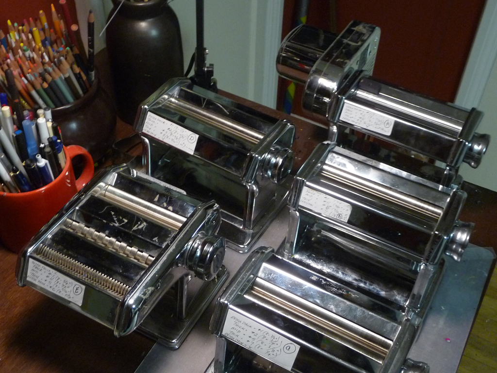
After struggling to write the instructions for a new project, I realized how crazy it is that we do not have standard settings on pasta machines. We can’t just use the numbers because every pasta machine is different. Sometimes the thickest setting is #1, sometimes the thinnest setting is #1. Sometimes the thickest setting is […]
Smashing Color
with Maggie Maggio
Page 6 of 15
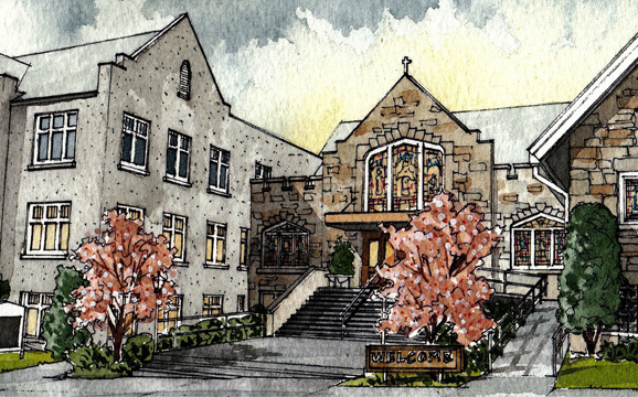
The Smashing Color Retreats in 2012 will take place in the ArtSpace at TaborSpace in Portland, Oregon. Located in the historic Mount Tabor neighborhood, TaborSpace is an innovative grassroots community center sharing sacred space with a 100 year old stone church. The ArtSpace is on the second floor of the Parish House. Its a comfortable, quiet, […]
There’s no Saturday School today. We are off for the holidays until Jan 7th. While you are waiting to get back to work on your color exercises, here’s my holiday gift to all of you – the link to the website of Hand/Eye magazine and blog. HAND/EYE is an independent, international publication which explores the nexus between […]
I am appalled by the Lite Sprites. Yes, I would love a light wand that could pick up colors from all around me and change the colors of the lights in my room. No, I don’t like such a great idea being used in such a crass commercialized way. Lite Sprites are the latest hot […]
In Chapter 5 of Interaction of Color, Albers notes that when students were shown two colors of similar value and asked which one was lighter the results were consistently 60% wrong. 60%! And these were art students at Yale! Why is it so hard to see value? I think part of the challenge has to […]
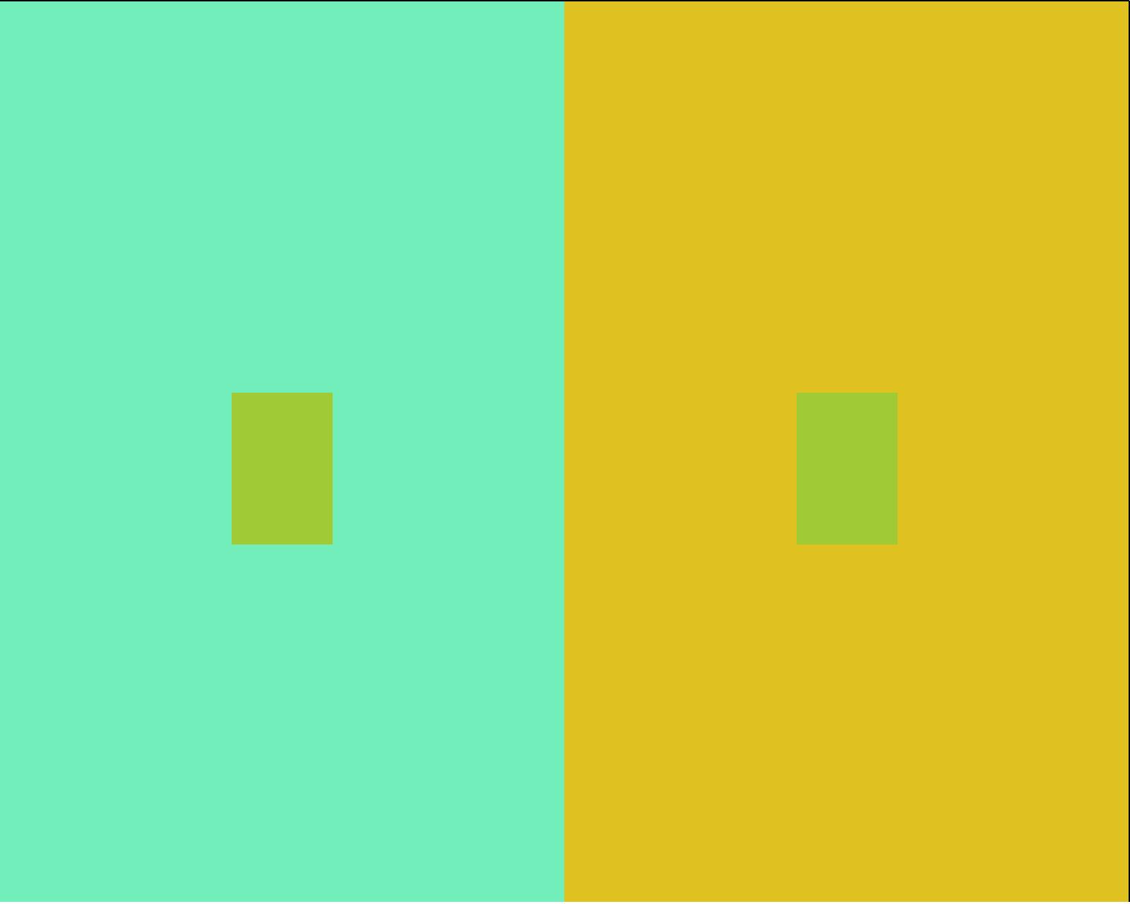
Albers encouraged his students “to try to find those colors which are more inclined to exert influence and to distinguish them from those which will accept influence.” I’ve played around with this exercise for years and still can’t quite predict where the bigger shifts will take place but one thing I know for sure . […]
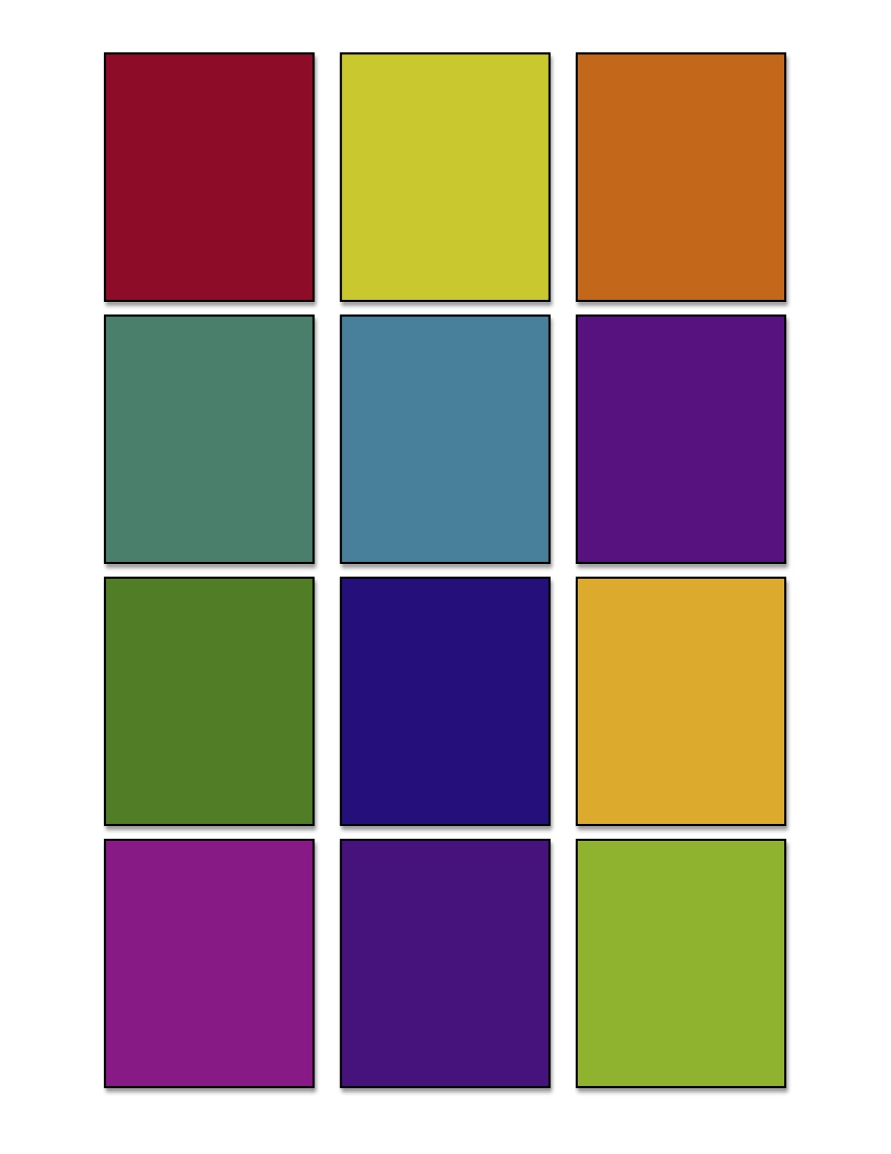
Last Saturday we asked these questions about colors shifting: Which colors exert influence – make colors shift the most? Which colors accept influence – shift easily. Which color combinations maximize the shift. Here are a few samples from last week. Can you make any conclusions?
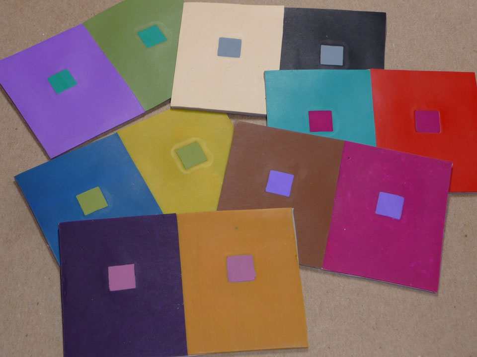
“Color is the most relative medium in art.” Chapter IV, Interaction of Color The first exercise is to make one color look like two. Start by downloading and printing a copy of the PDF Templates for Albers Color Studies. Cut out the template you want to use, or make a custom one for yourself. You can […]
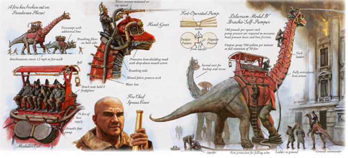
I found out yesterday that James Gurney of Dinotopia fame, and writer of one of my favorite blogs – Gurney Journey, was giving a lecture at the Maryland Institute College of Art in Baltimore tonight. Since its only about an hours drive from Damascus where I’m teaching this weekend I decided to combine his lecture […]
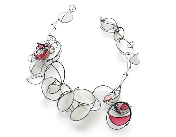
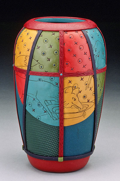
The Philadelphia Museum of Art Craft Show, one of the top craft shows in the country, opens on Thursday. Over 1300 artists applied this year and 195 were selected. Here’s a sampling from the Northwest artists at the show. Tia Kramer, Seattle, Washington | Emerging Artist . . . Ann Williamson, Portland, Oregon | […]
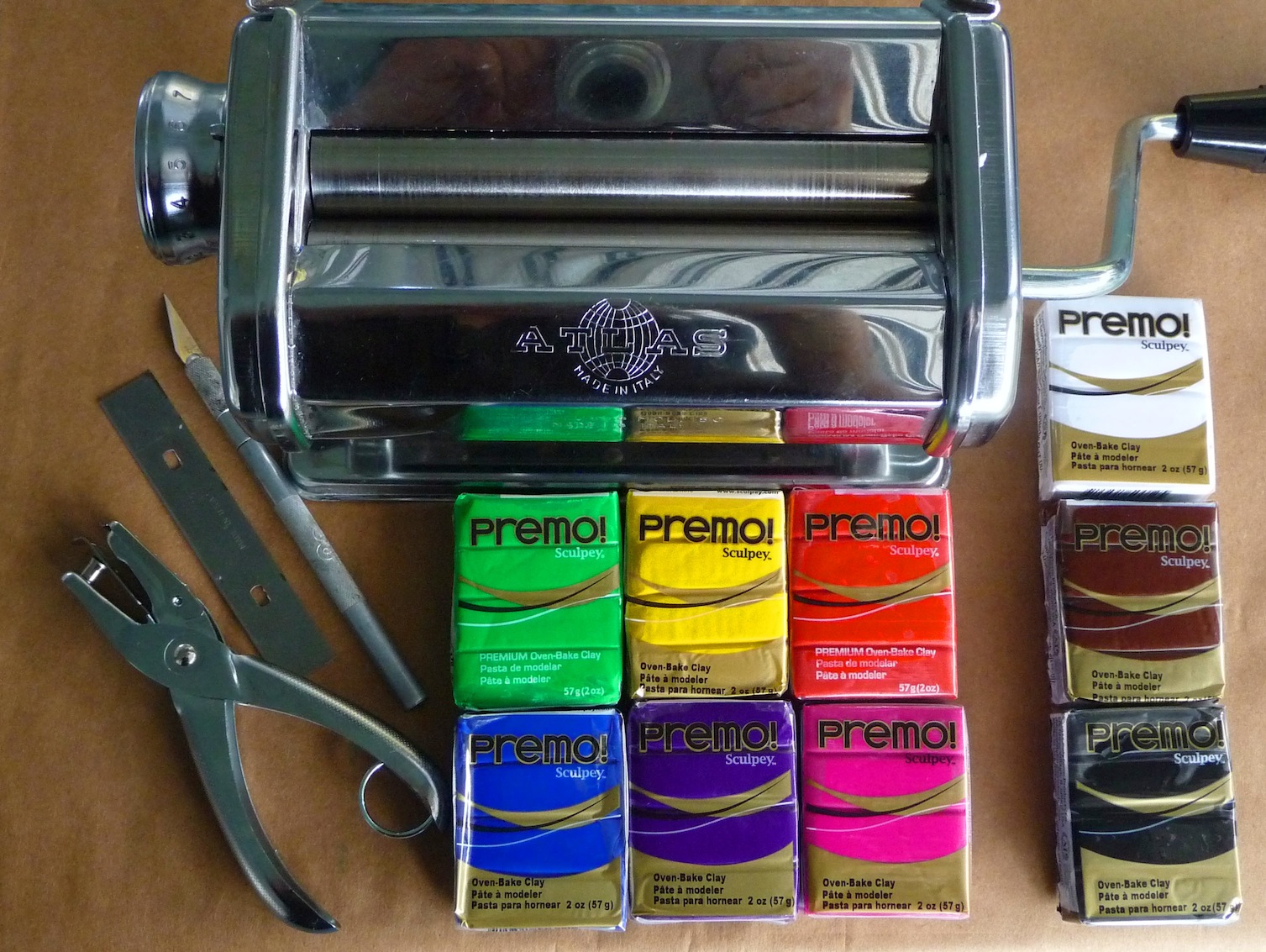
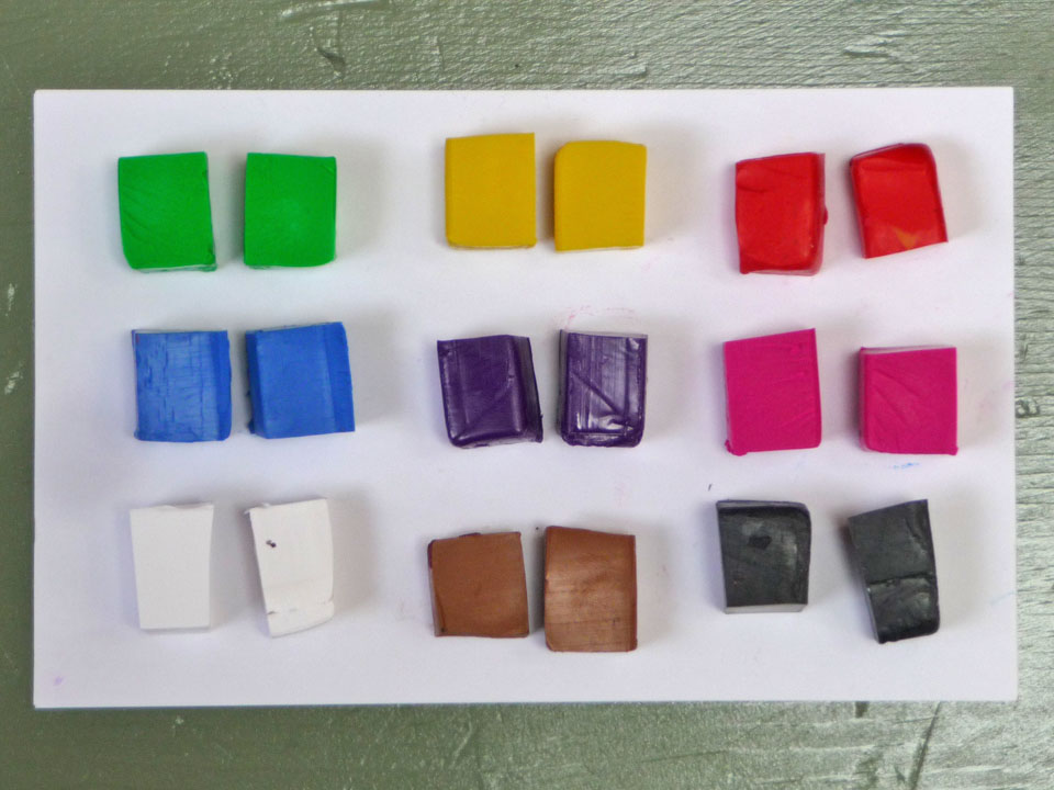
Chapter 3 of Interaction of Color is titled, “Why color paper – instead of pigment and paint.” I’m suggesting we try using polymer clay instead of paper or paint. For the exercises starting next week, you will need a pasta machine, 1/4″ hole punch, blade, # 1 X-Acto knife and nine colors of polymer clay. […]
Yesterday I visited the corporate offices of Crayola in Easton, Pennsylvania. It was the first step in my quixotic journey to gain widespread recognition for magenta and cyan as primary colors. Whenever I teach color workshops I find that most people don’t know that Red is not a primary mixing color in paint, polymer, dyes […]
My brain is still spinning from the opening of the Racine Art Museum’s Terra Nova: Polymer Art at the Crossroads exhibit and from the weekend symposium. I’ll need at least a month to process all the images, ideas, conversations, challenges and inspirations. The opening was wonderfully overwhelming. There are more than 200 pieces by 34 artists spanning the […]

I am in Racine, Wisconsin for the opening of the Racine Art Museum’s Terra Nova polymer show. The preview last night was spectacular. I was constantly thinking, “I remember when ____ made that!” One of the best parts of the weekend is seeing so many of the friends I’ve made in the polymer community over the […]

I own this Red. I named it Smashing Color Red. I did it to support UNICEF. The “Own a Colour” campaign aims to sell all 16.7 million colors that can be displayed on a computer for at least one British pound each (currently about $1.70 US). The money raised will go to support the […]
© 2026 Smashing Color