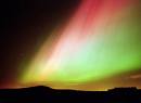
Congratulations to Georgana Gersabeck of Berkley, Michigan who proposed the name “Aurora” for Elise Winters’ new colorway. When she saw Elise’s bead strands she said, “I immediately felt I was looking at the Northern lights.” Elise sent this me this message on Sunday: ” Your deadline has passed and I checked in to gather the last […]
Smashing Color
with Maggie Maggio
Over the last year there has been a flurry of interest in my Watercolor technique with tutorials and videos by enthusiastic artists popping up in many places. Remember playing the game of “Telephone” or “Whisper Down the Lane” and by the time the last person repeated the information it was all mixed up? That’s what […]

Here are two more places to get prisms. Sargent-Welch has a 25mm x 25mm for $7.50 plus shipping. Science Kit also has an equilateral triangle with a base for display for $9.50 plus shipping. The shipping cost is $8.00 in both cases. If you order more than one the shipping costs can be shared.

As someone who sorts anything and everything into color flows, I love the hurleygurley photo site sent in by Christelle. Its fabulous. It reminds me of Jinny Beyers book Confidence for Quilters. Although its over ten years old, its one of the best books I know on creating color combinations that flow beautifully together. Her […]
Complementary colors do not have to be exact opposites to add hue contrast to a composition. This complementary colors exhibition gallery is not that strict about perfect complements. It doesn’t matter whether orange or yellow is the opposite of blue. Color contrast makes this photo a winner. The rules are tougher, and follow traditional color theory, […]
Thanks to everyone who let me know that the January 22 issue of the New Yorker had an article about the color industry. “Made in the Shade”, by Eric Konigsberg, tells the story of color consultant Leslie Harrington and gives an inside look at the color business. For a workhop a few years ago I […]
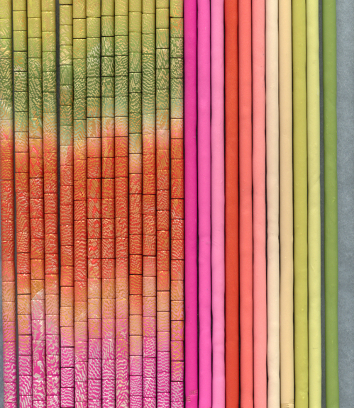
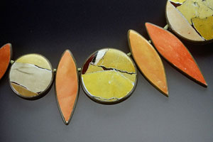
In my workshops I call magenta/fuchsia “new red” and the crayon color of red “old red” This is one of Elise Winters latest colorways that uses both – a beautiful combination of old red, new red and yellow green. Elise is looking for a poetic name for this gorgeous group of colors. What would you […]
In Monday’s tutorial I mislabeled Fuchsia. On the right side of the chart I called it Magenta. Thank you to Judy Reese in Washington for raising her virtual hand to ask the obvious question. Where do I find Premo Magenta? Ah. There is no such thing as Premo Magenta – just lots of confusion because I used […]
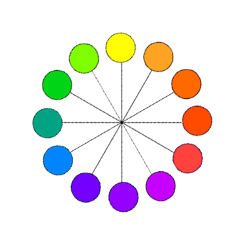
The concept of complementary colors is one of the cornerstones of color theory. Complements are Opposites The traditional way to define complements is that they are opposite each other on a color wheel. The problem with this definition is which color wheel to use. RYB? RGB? CMY? Newton? Munsell? Itten? Ives? Oswald? All have different […]

The Rubik’s Cube is making a huge comeback. I don’t care how fast you can solve it, its more fun to use the cube to make patterns and play with color combinations. Pick one up and don’t worry about fiquring it out. If you do get stressed, then try the optical illusion using a Rubik’s Cube at the […]
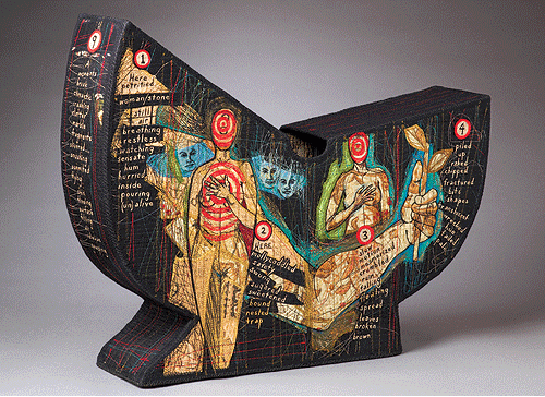
When I look at other artists’ work the first thing I respond to is COLOR. Then shape. Then imagery. A few years ago I was teaching in Santa Fe and saw the works of fiber artist Kay Kahn for the first time. I was blown away. […]
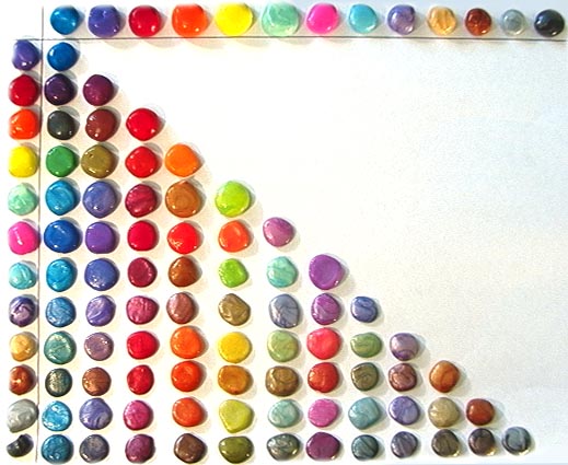
When you mix two colors in equal amounts you expect to get a color that appears to be in the middle. In reality this doesn’t often happen. Usually one of the colors will be stronger than the other and pull the half and half mix closer to its side than the other. Understanding the “tinting […]
I thought polymer artists were the only ones making color charts with blobs of color until I came across Crazy Aaron’s site. As a compulsive color mixer I may have to get the Hot Pink, Yellow and Lapis and start making my own favorites. Check out the gorgeous hot and cold Hypercolors! Wonder what would happen if you mixed […]
I am busy tonight trying to get photos and handouts up for yesterday’s test mixing tutorial. I hope to add them tomorrow. In the meantime . . . Lots of you emailed me about “Kuler” – Adobe’s fantastic new site for playing with color. I was planning to save it for when we study Hue Harmonies and color […]
Traditional theory says R+Y+B =Black, and Modern Theory says C+M+Y=Black. Reality is Three Primaries = MUD. I define MUD as the color you get when you mix primaries in equal amounts. Depending on which primaries you pick MUD can be many colors. Traditional MUD If you have been mixing colors using the traditional Red, Yellow, […]
© 2026 Smashing Color