My husband and I had one day to spend in London on our way home to Portland this week. We visited the Viking exhibit at the British Museum, took a selfie across the street from 221B Baker Street (no – we did not go in since there was no 221B in Conan Doyle’s time) and then, since Chuck is both an engineer and a train enthusiast, we went to see the west concourse at King’s Cross Station. I’ve seen photos with other colors but it was blue for us on Wednesday. Brilliant on a rainy day!
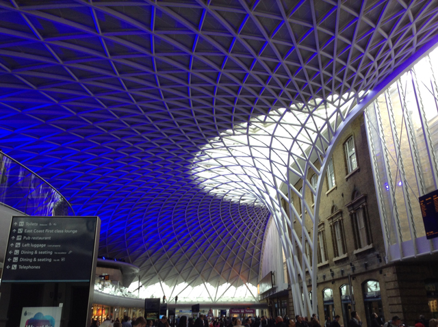
I assumed that, like the courtyard roof at the British Museum, the concourse roof was designed by Norman Foster. But I was wrong – the architect is John McAslan. No matter. I loved it.
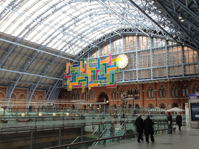
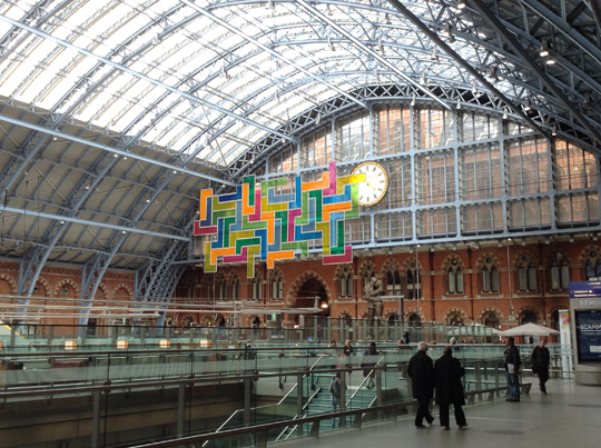
We headed next door to have tea at the Saint Pancras Station. The first thing we noticed as we walked though the center doors was a large, colorful panel hanging where Olympic rings greeted the athletes two years ago. “Wow!” said Chuck, “It looks like a huge game of Tetris!” And it did!
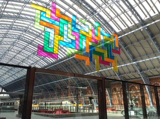
I have to admit that at first I didn’t like it. I thought the colors were all wrong, the angular design out-of-place, the construction too flimsy. Then I found the “Look Up” board describing the piece as the second installation in the Terrace Wires public art series. The title? Chromolocomotion. The artist? David Batchelor.
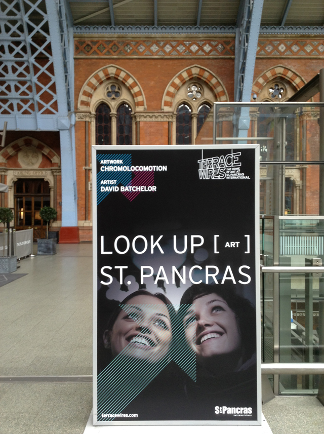
Now, you have to understand. I am a huge fan of Batchelor’s books. Chromophobia is a must read and I just bought his latest book, The Luminous and the Gray, when I was at the Tate’s Matisse show a few weeks ago. I read it on the way to Malta. Inspiring!
So I was faced with a bit of a dilemma. I consider Batchelor a fellow color geek. My first impression of the St. Pancras panel – not knowing the artist – was dislike. My second impression – knowing the artist – was a bit more forgiving, a combination of “Everyone has different color tastes.” and “I wonder what was he thinking?” and curiosity about the design competition parameters.
While waiting for the sun to come out, we sat down for tea and day dreamed about taking the Eurostar to Paris. Every now and then the clouds parted and bits of color sparkled over the concourse. Lovely!
Over the course of the day, I’d seen centuries old art pieces at the Viking exhibit, visited an engineering masterpiece from a few years ago, and marveled at a new work of public art.
With all the controversy over original work these days, what struck me most was the variety of my responses. In the Viking exhibit I noted the stylistic similarities between Celtic, Viking, and Moorish motifs. I loved them all and didn’t care who created the first interlace design.
My different response to the design of the King’s Cross concourse (I like it even though it reminds me of Norman Foster) and to Chromolocomotion (I don’t love it but I do appreciate it as an original work of public art by an artist I admire) made me realize that it doesn’t matter who the artist is or whether or not the design is “original.” I respond on a visceral level. I know what I like.
As I was sitting down to write this post this afternoon, I discovered that today is the 30th anniversary of Tetris. Batchelor insists that he was not inspired by the game. What a fun coincidence that an artwork that reminds so many people of a retro video game is hanging in a London train station on the anniversary of its creation.

Links:
BBC Video: Chromolocomotion
Camden New Journal: Shower of Colour
Leave a Reply