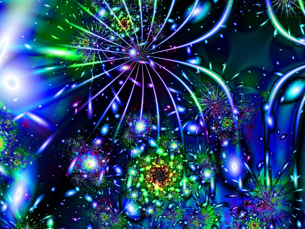
Happy New Year! I am spending the weekend in Seattle with my sister and her family. To celebrate I want to share a great site for color inspiration – Fractal Arts by Seattle artist Doug Harrington. Its one of the best I know for viewing fractal prints and is packed with gorgeous images. Be sure to check out all […]
Smashing Color
with Maggie Maggio
I don’t know if this beautiful and amazing commercial is already out there but I just love the combination of music, movement and color. It is not digitized. And the buildings are not models. They really did use all that paint. Be sure to turn on your sound before starting the video and afterwards scroll down […]
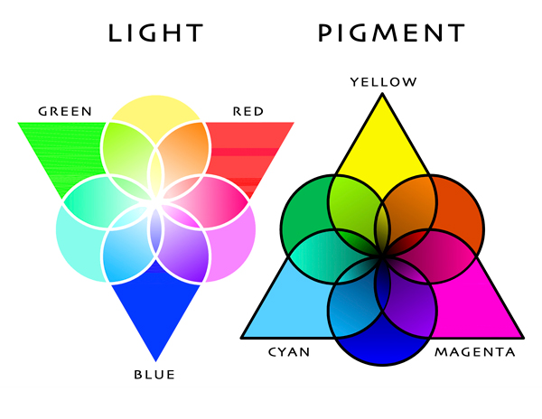
I’ve been looking for the perfect primaries ever since my first experience mixing colors for batik dyeing. At first I thought the manufactures were not making the colors I needed. Now I know that the differences between mixing light and mixing pigments make it impossible to have perfect primaries in pigments. Color Triangles Whenever you […]
I remember when Gretchen Schauffler first came out with her Devine Paints. Nine years ago I was working for a design build firm here in Portland, Oregon and she came to one of our Friday staff meetings to present her new line. She was mixing the paints herself and I was so jealous. Her new website has […]
Most diagrams of color are two dimensional. The problem is that color has three distinct properties. HUE, VALUE and SATURATION The Three Properties of Color Hue – The color family. Ex. Green, Yellow. Some systems use six families, some eight, some ten. I don’t really care how many hue families you divide color into as […]
Just got word that Michael’s has Fimo, Premo and Sculpey clay on sale for $ .99 until tomorrow (Saturday) in case you want to stock up.
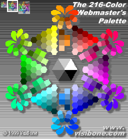
This is another one of many wonderful color tools available on the web for understanding RGB and CMY. Even though it is outdated – computers are not limited to 256 colors like they used to be – I like it because it shows the RGB, CMY and hex codes for the original websafe colors, plus it allows you […]
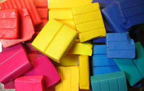
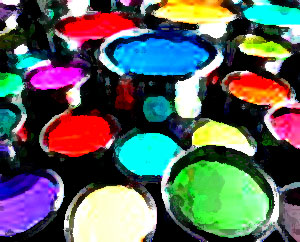
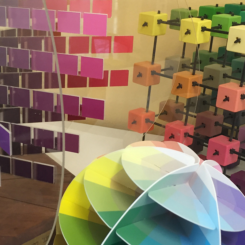
Whether you are a painter, dyer or polymer artist, I believe polymer clay is the best material for beginning color exercises because it is measurable, easy to use, not messy, not expensive and lets you mix colors right in your hand. There are now many brands to choose from. I am most familiar with Premo […]
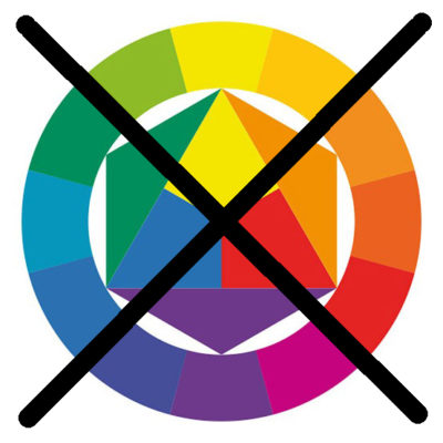
Color theory is not reality. It is a collection of concepts that explain the complexity of color in a very abstract way. Traditional color theory uses the same key concepts over and over because they are elegantly simple – not because they are always right. Primary Colors The first of these key concepts is the […]
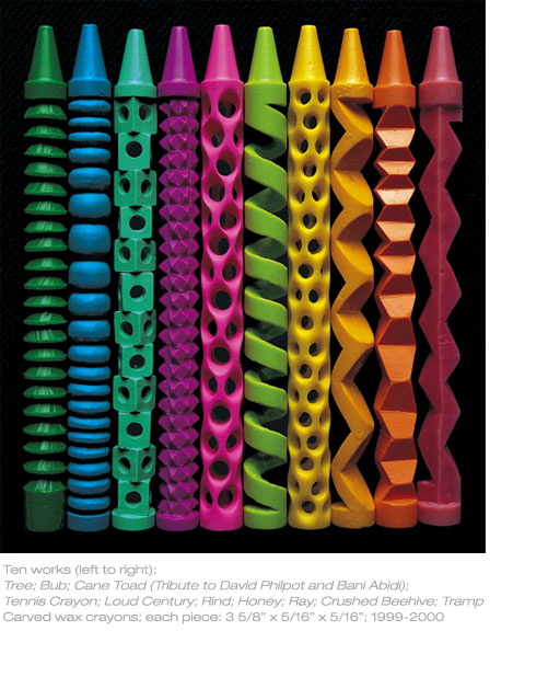
After marveling at the sculptured crayons of Pete Goldlust and Deim Chau on Tuesday courtesy of contributors to Cynthia Tinapple’s Polymer Clay Daily, I woke up the next day to more crayons on the front of the Living Section in our paper. “The “Crayon Man” created by Jen LaMastra was a superhero-style costume. LaMastra peeled papers […]

“I adored organizing mycolors as a child too! But I was taught to organize them as cool or warm colors.” Melanie’s comment made me think of the gorgeous cover of this book – Colors: The Story of Dyes and Pigments. Its a very beautiful little book with lots of color, and a good companian to Victoria Finlay’s […]
Starting in January the tutorials will use clay. I use Premo for color studies but you can use any of the clays. You will need 2 ounce blocks of six colors plus white. The six colors we will start with are: Magenta/Fuchsia, Red/Cadmium Red, Lemon/Zinc Yellow, Golden/Cadmium Yellow, Med.Blue/Cobalt, and Blue/Ultramarine. Until you get your […]
© 2026 Smashing Color