I’ve been looking for the perfect primaries ever since my first experience mixing colors for batik dyeing. At first I thought the manufactures were not making the colors I needed.
Now I know that the differences between mixing light and mixing pigments make it impossible to have perfect primaries in pigments.
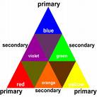 Color Triangles
Whenever you are trying to show the colors that can be mixed from three primaries it makes sense to shift to a triangle instead of a circle. The colors along the outside edges of a color triangle show secondaries – colors mixed from combinations of two primaries, and the colors on the inside of a triangle show tertiaries – colors mixed from combinations of three primaries or, as shown here in Goethe’s triangle, from combinations of two secondaries.
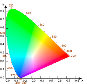
Additive Triangles
In the additive system (light), three primaries combine to make white light. The 1931 version of the CIE triangle shows the colors that come from Red-Green-Blue primaries.
In the CEI triangle, the spectrum colors run from Blue in the lower left , to Green at the top, to Red in the right corner.
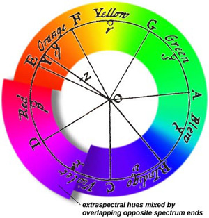
Missing Magenta
Notice that on the CEI triangle, Magenta is shown opposite green on what is called the “Purple Line”. Along this line are the colors that are “extraspectral” – not in the spectrum. They come from the overlapping of the blue and red ends of the spectrum.
White is in the Middle
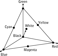
White is near the middle in the additive triangle. In order to darken or desaturate the colors the triangle goes to black.
Subtractive Triangles
In the subtractive systems (paints, dyes, inks, polymers) the three primaries are supposed to mix to black – the opposite of white. The traditional subtractive primaries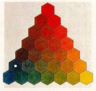 , Red-Yellow-Blue, come close to making a black depending on which colors you chose. For example, an ultramarine blue, alizarin crimson and golden yellow will mix to make a color that is a very dark neutral – almost black. But these same colors will not make clear secondaries.

The modern subtractive primaries, Cyan-Magenta and Yellow will not combine to make black. This is because they are bright primaries designed to imitate the light filled CMY secondaries of the RGB system.
Some manufacturers even add white to their CMY pigment colors to mimic the brilliance of the same colors in light. You will never mix black from these bright primaries. But the advantage of the CMY system is that you can mix much clearer secondaries.
Compromise
Selecting primaries is always a compromise between mixing clear secondaries and mixing a good black. There are no perfect primaries that will get you both. This should come as a huge relief. It did for me.
Rather than spend lots of time trying to find the perfect primaries or fighting for one system over the other, you can try mixing different combinations of three primaries to see what color palettes are possible. Then you can decide whether or not you want to use a three primary mixing system using your perfect primaries.
Exercise – Color Triangle in Crayons
This exercise is designed to get you used to thinking of color in triangles rather than circles.
- Print a copy of Handout #2 showing my version of the color sort into Saturation Families.
- Color in the circles and then cut them out. You don’t have to be too precise here. It should only take about 15 minutes to color in the circles and less than 15 minutes to cut them out.
- Print a copy of Handout #3 – Blank. Arrange the circles on the triangle. There will not be a crayon called Cyan or Emerald Green – the circles on the diagram are just markers for the primaries and secondaries of the CMY system.
- After arranging all the colors, print a copy of Handout #3. Color the circles. How does my version compare to yours?

July 28, 2024 at 8:23 am
Hi Glenn – Woah! It’s fun to know the blog posts are still relevant almost 20 years later! Thanks!
One of the edits I might make now is that I would change the label of the Cyan of subtractive mixing – i.e. process Cyan – to Cyan Blue to distinguish it from Ultramarine Blue and also make it clear that it is very different from additive Cyan which appears closer to turquoise.
July 28, 2024 at 4:37 am
Dear Maggie,
Hello from the future, it is 2024, and I want to say that, 18 years later I found and enjoyed this post.
It is difficult getting people to understand why CMY are important, but I am trying.
I also love that you have a reveal here that Newton was talking about Cyan when he said Blue.
December 31, 2006 at 4:45 am
Me, too, Myra. I have no Spring Yellow-just Spring Green
December 30, 2006 at 12:49 am
I just pulled all the colors of the different brands and my Premo Zinc Yellow says “zinc yellow hue” and the number is #5072 instead of 5077. Is mine just old & named different or is it actually different from #5077?
Am beginning to wonder why I’m the only one with these questions.
Hi Myra – Just back from New Year’s in Seattle. Sorry about the mixups. I have to admit to being lousy with details. No matter how many times I check something always slips by me. Spring Yellow is Spring Green (too much cut and paste on the charts) and who knows where Brick Red went? As for the clay, Primo Zinc Yellow Hue (#5072) is what you want.
BTW – Putting “hue” after a color name is standard practice when the color is manufactured to match a color but does not include the named pigment as the main ingredient. It comes from the paint world where cheaper, student quality paints are available in place of the more expensive paints made with the actual pigments. I noticed Premo started adding “hue” on the packages and figured they wanted to follow the naming standards for paint since their clays are all traditional paint colors.
December 29, 2006 at 1:00 am
If I’m having trouble understanding what your instructions are telling me to do is this the place to say so? Sorry to have so many entries today but I spent most of the day catching up on some of the exercises. I thought I was done and then I found one more…tomorrow is another day!
December 28, 2006 at 8:26 pm
And there is no circle in the handout for the “brick red” crayon…are we on the same page?
December 28, 2006 at 7:59 pm
Handout #2 has “spring yellow” under Rainbow Pastels. My crayon box only has “spring green”. One and the same…right?
December 28, 2006 at 1:53 pm
“There are no perfect primaries that will get you both. This should come as a huge relief. It did for me.”
Ahmen! Thanks, Maggie, for confirming what I always suspected – I had begun to think it was like searching for the Holy Grail!
Oh, and here’s another cool site. It was created for web designers, but I find it’s a good place to go for a kick start on any color project.
Thanks again, Maggie, for your fantastic blog!
December 28, 2006 at 2:23 am
You mention Goethe’s triangle in this entry, and I thought people might want to know that his book, _Theory of Colors_, is now being reprinted by Dover Books. Here is the link: http://store.doverpublications.com/0486448053.html
Thanks for all these marvelous tutorials!
Rhet [Philadelphia PC Guild]
Hi Rhet – For anyone interested in color observations Goethe’s book is a must read, and Dover’s price is the best out there for a new book. But rather than trying to read the Eastlake translation, which can be a bit of a slog – no pictures! – I recommend finding a copy of Rupprecht Matthaei’s book Goethe’s Color Theory. Professor Matthaei was director of the Goethe archives and the 1971 English edition of his book has some of the best illustrations of Goethe’s experiments that I have seen. It is hard to find but interlibrary loans might work and sometimes Amazon has a copy available.