Watercolor Technique Tutorial

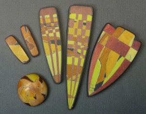
Here’s a quick and dirty tutorial on using the watercolor technique to make “torn paper” beads similar to the bead on the lower left.

1. Mix a palette. I always start a project by mixing a set of colors that “hang together.” Make at least one color in each hue family and add a mud color to create a palette that you like. You don’t need much clay – 1/2 oz of each color is plenty.
Option: Add a little bit of aluminum leaf to each of the colors. This adds a slight sparkle similar to mica in stones. I use aluminum leaf because it doesn’t tarnish.

2. Mix top colors. I like to marbleize three pea sized colors from my palette to make the top colors. I often include my mud in the mix. This mutes the starting colors so that the final watercolor sheets are more natural – not too “easter-eggish.” Run the clay at the thinnest manageable setting on the pasta machine to make a very thin sheet that is no bigger than 2″ x 3″.
Option: Do not mix the clay all the way – leave it a little bit mottled. This will add variations of color to the final sheet.

3. Add black and white. Sheet white and black at the thickest setting, stack them together, and then place the top color on the white.
There are many variations of this step. The basic idea is to “wash” the very thin top color over a thick sheet of white. This spreads the color so that it becomes lighter and brighter without actually mixing it with white clay. The black sheet is added to the bottom for contrast when the sheet is torn.
Option: Use an off-white such as ecru for the white layer, and a deep dark for the black layer. This option is often used by Judith Kuskin to make her beautiful jewelry.

4. Wash the top color. Run the stacked sheets though the pasta machine starting with the thickest setting. Go progressively thinner until the sheet is very thin (and usually fairly long!). Mix different proportions of your palette colors to make many variations of watercolor sheets.
Notice how much lighter and brighter the washed color is compared to the original top color.
Option: If your colors are coming out too bright, add more mud to the top color.

5. Select a color scheme. Looking at all your watercolor sheets, use your instincts to decide which colors to put together. Audition each color with the other colors and adjust proportions until the combination looks good to you.
Before going on to the next step, lay the sheets out next to each other to see where there is lots of value contrast and where there is little. Don’t assume that all the colors will look equally as good against each other.

6. Make mud. Because the sheets go lighter and brighter I usually use a dark color for my background. I keep my scrap clay sorted into three bins – blues and purples, greens and yellows (including oranges which are really just yellows with a little bit of red!) and reds and magentas. This makes it easier for me to mix clearer colors when I don’t want mud. When I do want mud, I pull a little bit from each pile taking more from the blues/purples if I want a gray mud, more from the green/yellows if I want an ocher mud, and more from the reds/magentas if I want a brown mud.

7. Make base beads from mud. To make base beads, mix some mud from scraps until it is all one color. Roll it into a ball while pressing all the air out. Roll the ball into a log and cut off chucks to make smaller balls.
Option: If you want all your beads to be similar in size, measure and cut the same amounts off the log.

8. Collage torn sheets. Tear off small pieces of the watercolor sheets and collage them onto the bead blanks. I like to leave some of the dark background color showing for contrast. Gently roll the collaged sheets into the base bead and then form the bead into a shape you like. Pierce the beads before baking if you don’t want to drill holes after baking. Bake according to the clay brand instructions.
Option: Roll the beads with some cornstarch to make them smooth. Bake the beads on a bed of cornstarch to prevent flat spots.
Note: The beads and pendants at the top of this post are all older variations of the watercolor technique. The pivot beads from Chapter 2 of Color Inspirations are a new variation that uses a black, white and gray striped cane as the white layer. Play with making watercolor sheets using:
- A stretched out cane slice for the top color.
- Crumbly old white clay for the middle layer.
- A Skinner blend for the top color.
- A textured white piece for the middle layer.
- Mokume gane for the top layer.
- A dark color for the middle layer.
The possibilities are endless!
January 29, 2012 at 7:44 am
Make the skinner blend as small as possible from side to side. You can squish a blend back by rolling it into a log and then pushing the ends in to make the log thicker – the reverse of reducing. Square it up and then cut a very thin slice off it. Sheet a a thickness equivalent to 1 mm (#6 or so on an Atlas) and put in on top of a sheet of white at about 2.5 mm thick ( #1 or 2 on an Atlas) Sheet the stack at 1 mm. It probably did not quite wash. Put it on top of either a black or white sheet at 1 mm, turn it 90 degrees and run through again at 1 mm. Now it should be washed.
Hope this helps a little bit.
January 29, 2012 at 1:13 am
Maggie,
How do you do the wash with a skinner blend? I don’t want to muddy the blend, just thin it.
September 20, 2011 at 2:56 pm
thank you for being so generous by sharing your watercolor technique with us. ive been looking at your work and wondering how you do it for a long time . so grateful to see the tutorial that you shared. cant wait to try it. “the possibilities are endless.”
July 19, 2011 at 4:28 am
Hi. Thank you for your nice reply. I use mostly acrylic but I used to paint with watercolor too. I also do murals. You can see examples on my web sight. The polymer attracts me because of the likeness in behavior in mixing and it gives me a chans to try to work three dimensional. I love to learn something new I got so inspired by the book. Best regards, Ingrid
July 18, 2011 at 11:38 pm
Thanks Ingrid. I am so glad that you like it and that you find it useful for teaching. That’s why we wanted to write the book!
What kind of painter are you? I am playing with both acrylics and watercolors these days and they mix the same as polymer.
Have fun trying the watercolor technique. I never get tired of seeing the colors wash over white!
July 18, 2011 at 6:18 pm
Hi. I am a painter living in Sweden and I have jewelery as a hobby. I have your fantastic book Color inspiration. I use your mixing schemes in my teaching how to mix color. I is the best I have seen for understanding how to get the interesting tertiary colors.
I thank you for your great work with the book and I also am so very grateful for this watercolor tutorial. It appeals to me. I have to try it since it have the same feel as when you paint. Best regards, Ingrid