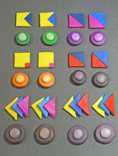
The rally was lots of fun. Pioneer Courthouse Square was filled to the brim with people carrying 350 banners. I love my city! Here are my Kato tasting tiles, including four muds made with equal parts of the various three primaries. The set-up for the muds is different from the book. I cut the squares of each primary […]
Smashing Color
with Maggie Maggio
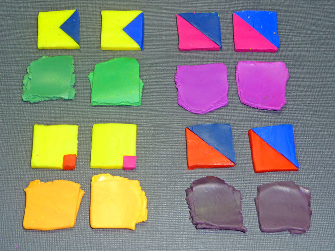
Here is the first step in making the tasting tiles using Kato Clay. I used Yellow, Blue, Turquoise, Magenta and Red. Greens: The first mixture of Yellow with Blue came out slightly muted. That is due to the Blue clay’s bias toward magenta. The Yellow with Turquoise came out very clear. Oranges: The mixtures of the Yellow/Magenta and […]
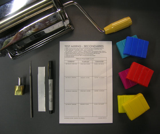
This is the first of two Studio Tool exercises in the book. We originally had more of them, including a fan deck of Skinner blends, but due to space limitations we had to cut them out. I will try to add instructions for the missing tools at the point in the book where we wanted them to […]
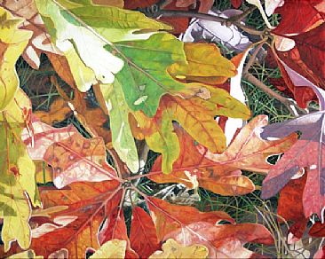
I live in the Pacific Northwest. We don’t have the same kind of fall leaf season that I grew up with in the Northeast. I remember as a kid coming up over a hill and seeing a panoramic view of mountains lush with color. The colors were so bright I remember thinking, “The leaves are all the colors of Fruit Loops!” […]
Middle Value Muddle To make this project, we ask you to pick a light value clay and a dark value clay based on colors from your collage. If you are having trouble seeing the values, try making a black and white copy of your collage using a color copier. […]
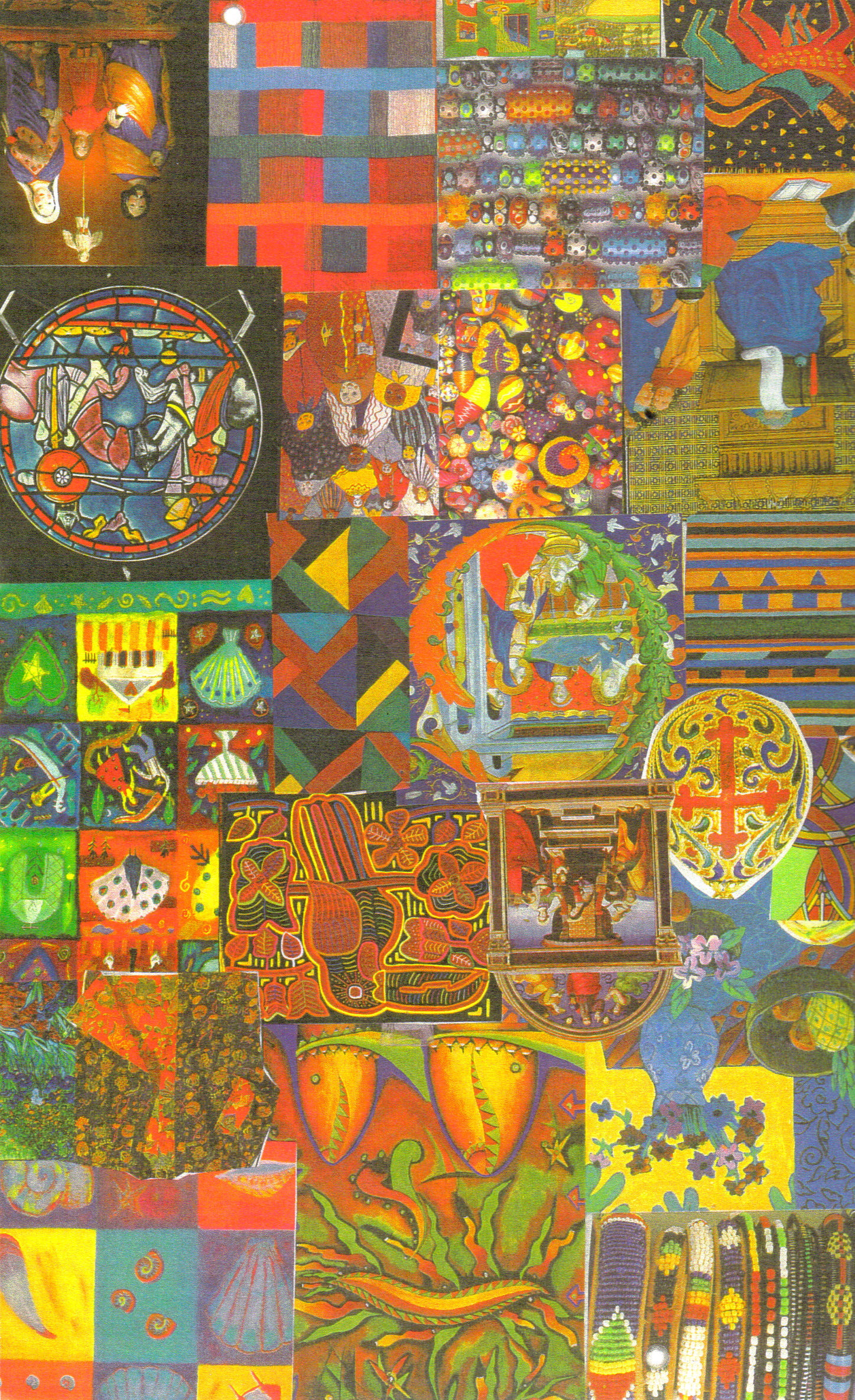
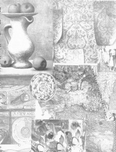
I began making color collages when I moved into my first out-of-the-house studio in 1996. I finally had lots of wall space and decided to pull out the basket with postcards, greeting cards, clippings, art catalogs, and memorabilia that I had saved over the years and get them up on the wall. At first they went up willy-nilly, but when […]
© 2026 Smashing Color