Value is the most difficult of the three properties of color to see correctly. Hue is very easy – we are used to putting colors into their family groups. Saturation is easy once you get the hang of it – colors are clear, muted, or muddy. But value often stumps us.
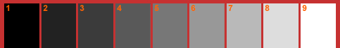
Color theory books traditionally illustrate a value scale using one of the many variations of a gray scale. The most common gray scales have 9 to 11 values running from black to white with a middle gray somewhere in the center.
For me it is easier to start analyzing value contrasts by thinking of value as having only three families – light, medium and dark.

Dark Medium Light
Dark = Colors that you have trouble seeing on black backgrounds.
Medium = Colors that you can see clearly on both white and black backgrounds.
Light = Colors that you have trouble seeing on white backgrounds.
Training Your Eye. Its easy to practice looking at colors and naming their values, especially with only three groups to put them in. You can check yourself by comparing the full color image to the black and white version.
Here are some ways to turn a color image into black and white so you can “see” the values.
1. Squint. The easiest way to check value contrast is to squint your eyes until they are almost closed and look at an image. The light colors will pop. The dark colors will fall into a dark hole. And the middle value colors will hang in between.
Let’s look at my header. There’s lots of color, or Hue, and value variation.

Now let’s look the header in black and white.
Since the beads are polychromatic, made of many hues, the values naturally run from the dark value blues and violets to the light value yellows.

2. Photoshop. If you have Photoshop or some other photo program, you can remove color from an image and check out the values.
 This is Dante Maroni’s Chartreuse Trio with the color removed. Even though the vessels are all chartreuse- the shadows and highlights create many values.
3. B&W Print. If you don’t have a photo program, you can insert an image into a word processing document and then print it on your printer.
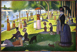
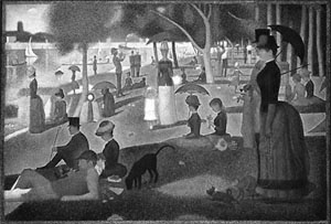
This is a Seurat painting printed in color and then printed in grayscale on my color printer.
4. B&W Copy. You can also make a black and white copy of an image – or of your own work – to check the value range. Use a color copier if you can. It costs more but the value range will be much better than a regular copy.
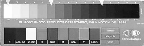
Here is a Dupont Value Scale in color and copied in black and white. Squint your eyes until they are almost closed and compare the amount of value contrast in each version. The yellow appears darker in the black and white. Its difficult for copiers to “see” all the value correctly.
Notice that cyan, magenta and yellow are all lighter in value than red, green and blue.

5. Digital Camera. On most digital cameras, there’s an option to shoot in black and white. It fun to switch to black and white mode and use your camera as a value sorter. Just point it at something and look at the screen to see it in b&w.
When you get a chance, use one of the above methods to compare full color to black and white images. Its always an eye opener.
Leave a Reply