 Putting colors in order according to value can be tough. Here are the twelve colors from the post about value last month. I put them in the order I thought they should go and scanned the results in grayscale.
They fall into three value ranges – dark, medium, and light but, as you can see, the middle colors from the green to the orange are all a jumble. That’s because its hard to see value separate from hue and saturation.
Sometimes I take swatches into a closet, close the door and then open it just a hair. The lightest colors pop. Then I open it another hair and the next lightest colors pop. I keep going until all the colors are in order. This method is accurate up to a point. (Sometimes there’s an issue with the reds. Could be Perjinke Shift but that’s another post.)
You can take a photo or make a black and white copy – but again this is only fairly accurate. Scanning in grayscale seems to work better but it’s not foolproof. Some quilting books recommend using a red filter gel – but that really doesn’t work! (All the colors except red get darker so the reds throw the value relationships off.)
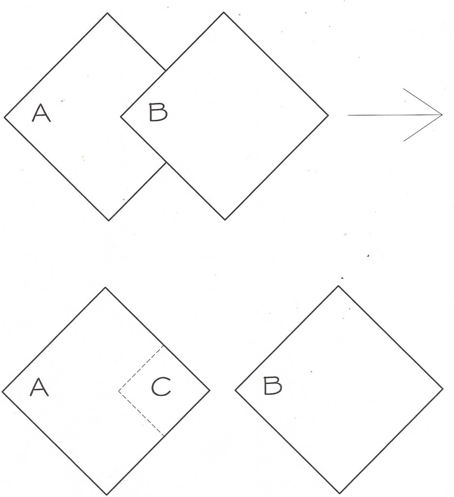
Anytime you want to know for sure which colors are lighter and which darker you can conduct this simple test that Albers recommends in his book.
 1. Taking two colors at at time, overlap the corner of Color A with the corner of Color B. Stare at the overlapping area for longer than feels comfortable. You will start to see a halo around the edges.
2. Slide Color B to the side while looking at the area C.
3. If area C appears lighter than the rest of Color A then Color B is the darker of the two colors. If area C appears to be darker than the rest of Color A then Color B is the lighter of the two colors.
Its easier to see the results if you start with colors that are not as close in value and work you way into comparing colors that are very close in value. When you can’t see any afterimage then you know that the colors are the same value.
When is the best time to use this trick? Anytime its important to get the value relationships right. Maybe you are putting together a complex skinner blend going from dark to light but two of the colors are so close you’re not sure what order to put them in. Do a quick afterimage check ala Albers.
Another time to try this test is when you plan to use a bright color and a muddy color in a cane. If the value of two colors next to each other are too close they will blend together. This may not be what you want. Its easy to think the muddy color is darker than it really is so do a quick check to determine if it really is darker or if the two colors are too similar in value to work in your design.
Its also easy to be fooled by colors with white in them. Sometimes a tinted purple will appear to be lighter than a pure yellow green. Just because it has white in it doesn’t mean its lighter than a color without white. Do the afterimage check.
The test is not as easy as it looks. It takes some practice to see the afterimage as lighter or darker than the surrounding color. Area C is often very saturated and glowing and that can throw you off. But with practice you will be able to sort through a whole stack of colors and get them into a smooth run from light to dark.

Leave a Reply