Sherwin Williams is opening a new store in our neighborhood and offering 40% off on all paint. Even though I am not planning to repaint my living room anytime soon, it did get me thinking about changing the color.
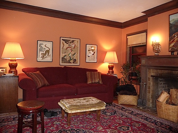
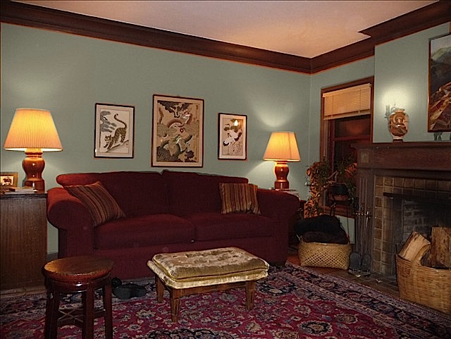
Don’t get my wrong. I love the color it is now. We wanted something warm and cozy for our Portland gray days so we took a brown egg into the paint store and asked them to color match it. Who knew that brown eggs were really the same color as a terra cotta pot?
Round One
Just for fun, I thought I would try the Sherwin Williams Color Visualizer. You can play with the photos they have in stock or you can upload photos of your own. I decided to see if I might like a cooler color on my living room walls.
After taking a photo and uploading it to their site, I spent some time going through the demo (highly recommended since the program is not as intuitive as it could be) and then masking just the walls so that I could play with new colors. I found out the hard way that you need to be registered to save your favorites. Oops. There is probably a way to not lose the image but I didn’t figure it out so I had to register and then start from scratch.
I also discovered that when you are done masking a surface and hit the “continue” button, you then have to select a description before trying to save it. After a number of failed attempts at downloading my scenes – here are a few of the results.
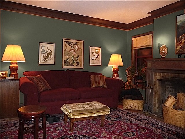
A dark gray green? Maybe. But I need to get rid of the pinkish cast on the ceiling from the reflected color of the terra cotta walls in order to really see it.
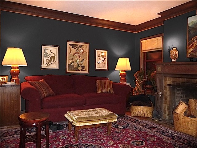 A dark gray blue? Whoa. That would ultra dark and cozy. But I kind of like it.
A light gray green? Yuck!
 A yellow green? Nice contrast to all the red and wood. But I’d need to get a different rug. And different art.
Round Two.
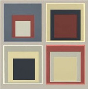
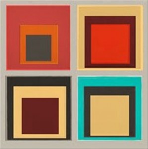
I could have kept going but then I started to think about using the program for something else entirely. Why not try various colors on a photo of a painting instead of a room? I knew squares would be easiest so I uploaded the Albers image from the last post.
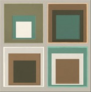
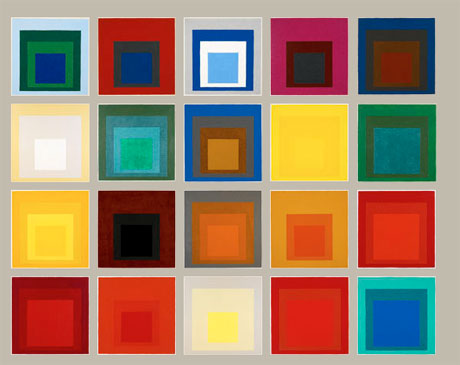 Replacing the colors using the rectangular masking and erasing tools was easy after I got the hang of it. (I do wish there was an easy way to do curves so that I could juggle some of my jewelry designs!)
Compare the new version above to the original on the right. I replaced a bunch of the blues and some of the reds with olive green.
Round Three
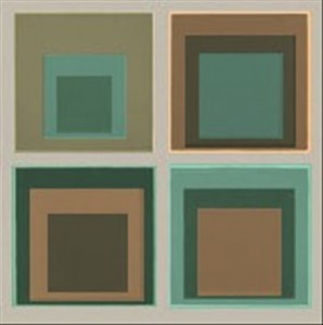
Next I cropped the image to just the four squares on the lower right and kept on playing. It will take a few more tries to get the colors I like but, just like in real life, the possibilities are endless.


April 13, 2013 at 4:28 am
Hey Mags – I am forwarding this post to a friend of mine who is painting her kitchen. She has green counters that have specks of blue. I thought this tool would help!
P.S. I really like the dark grey blue for your living room!! 😀
October 16, 2011 at 10:23 pm
Mags – I have been wanting a tool like this forever! Thanks for sharing. I am amazed at your endless curiosity regarding color. Only my sister, the colorist, would put in an Albers on the Sherwin Williams color visualizer!! I love it!!!
October 11, 2011 at 8:48 pm
What a cool tool. I’ll keep it in mind for when we’re ready to paint. Thanks for sharing.