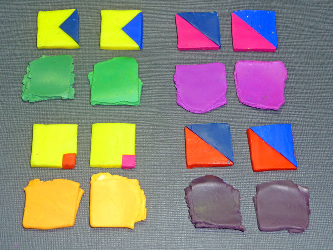
 Here is the first step in making the tasting tiles using Kato Clay. I used Yellow, Blue, Turquoise, Magenta and Red.
Greens: The first mixture of Yellow with Blue came out slightly muted. That is due to the Blue clay’s bias toward magenta. The Yellow with Turquoise came out very clear.
Oranges: The mixtures of the Yellow/Magenta and the Yellow/Red both came out clear. That’s because there is no blue bias in either the Magenta or the Red. You will often hear that magenta is a red with a blue bias. That is not true. Magenta is a true primary. Red is actually a magenta with yellow in it.
Purples: The first mix is with Kato Blue. Kato Blue has a magenta bias, so it mixes with Magenta to make a clear purple. Kato Turquoise clay is a true primary blue. It doesn’t have much of a bias to either yellow or to magneta so when it is mixed with the Magenta , the Turquoise also makes a clear purple. But look at the mixtures with Kato Red! They are both brown instead of purple. That’s due to the yellow in the Red clay. Remember that yellow is the third primary. It combines with the other two primaries to make mud. If you need a clear purple in Kato clay, be sure to use Magenta as your primary, or buy the package Purple.
Today is the International Day of Climate Action and I am off to the rally in downtown Portland. When I get back I will use the Kato Tasting Tiles that are now in the oven to show you how to find the best primaries for mixing the colors in your collage.


October 31, 2009 at 11:02 pm
Thanks Laura – You are right about the Sharpies. The same is true for any permanent marker – they are more permanent if heat set. As for the Kato clays – they are lighter out of the package than the other clays so they will never mix to make the rich, deep dark colors that you can mix with Premo and Fimo clays.
October 28, 2009 at 2:57 pm
Thanks so much for these testing tiles! It helps me understand the differences between Premo and Kato. I worked all the color triangle exercises a couple years ago using Premo. When I tried to work them with Kato, nothing made sense. The colors came out all wrong and I could not figure out why. I still cannot get a nice blue red that is not kato magenta from Kato clay. I miss the colors I could get from Premo. I don’t understand why I can’t reproduce them in Kato.
PS- I found that when I marked baked test beads with a Sharpie, the ink would eventually smear. If I quickly heat set the ink with a heat gun, or marked the beads/tiles while they were still very warm, the ink would not smear later. 🙂 (I have A LOT of Premo color beads!)