The concept of saturation is a tough one. The terms tinting and shading usually have to do with changing the value of a color but they also have to do with changing the saturation. Tinting is mixing a color with white, shading is mixing a color with black (or mud, or the complement.) The term “tone” is used when a color has both white and black in it. In strict color theory books – a tone is a grayed out version of the original color that still has the same value of the original color.
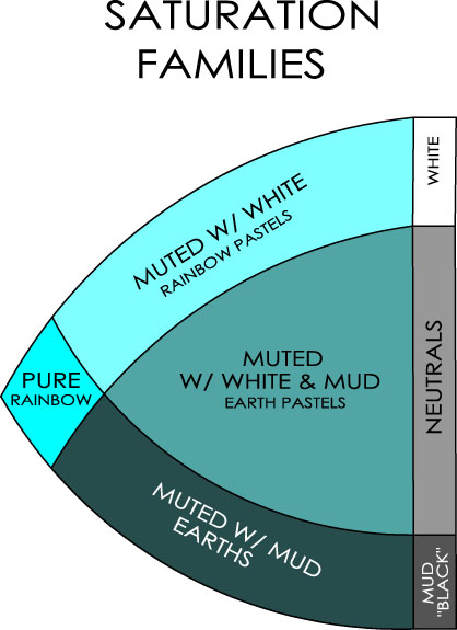
Instead of the standard terms “tint, shade and tone” we chose to sort colors into saturation families. Colors are either rainbow pastels, earths or earth pastels depending on how much the pure color is mixed with white, with black/mud, and with both white and mud together.
As soon as you start mixing a color with black/mud, or white, you are changing the saturation as well as the value and the hue. It doesn’t matter if you call the shifted colors muted or desaturated, tints or rainbow pastels, tones or earth pastels, shades or earths, the fact is that the new colors are no longer 100 % pure. 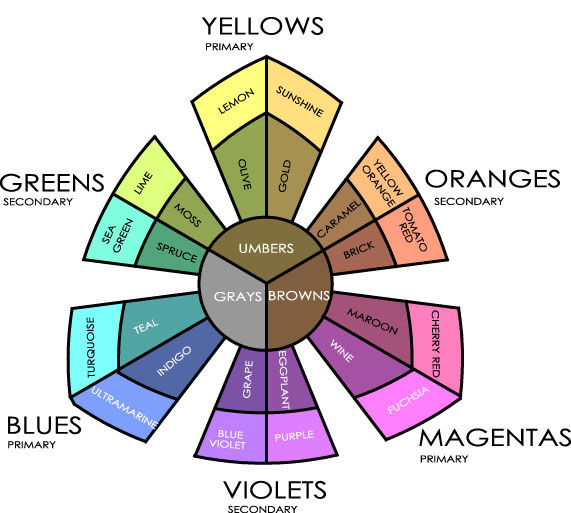
Pastel Color Sorter. All the colors on the pastel color sorter have been desaturated with just white, or white and mud together. Notice that they have a very different feel from the colors on the Classic Color Sorter which have no white in them at all.
Saturation Zones or Families
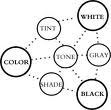 Our illustration for saturation families is based on Faber Birren’s “Tint, Tone and Shade” drawing. This classic diagram appears in many books on color. It shows a color modified by adding white to get tints, gray to get tones and black to get shades.
The pivot tiles you are making are designed to show all these variations of colors. The more variations you make the better you will understand the subtle differences that are available to you when you start putting colors together.
Weekend Extra Exercises
1. Any color can be pivoted. Try making pivot tiles with colors that are not pure package colors. Mix up a beautiful earth color and then make a warmer and cooler version of that color. Tint each of the three variations with white, tone them with grey and shade them with black.
2. Make at least one tile using variations of white and black. For example, use Premo Ecru as a white, Burnt Umber as a black, and a 1:1 mix of Ecru and Burnt Umber as the “gray”.
3. Intentionally mix a dark mud to use instead of a black. There are many ways to make dark muds – try mixing a cool blue with a brown (Ultramarine Blue and Burnt Umber.)
4. Later on in the book, once you have mixed colors to go with your collage, make more pivot tiles to go with “your” colors.
TIPS
 Use a Sharpie to label the back of your pivot tiles with the names and proportions of the warming and cooling colors you chose and with the black and white you used.
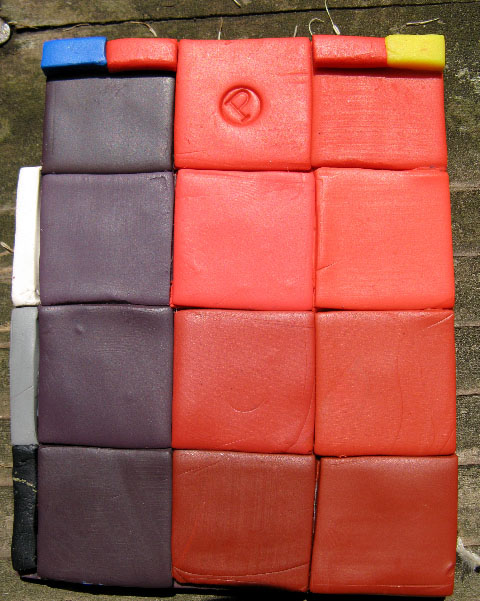
Jeanette Sclar sent in this photo showing her variation on pivot tiles. She keeps track of the colors added and the proportions used by adding stripes to the top and side of each of the sections. In this sample she used Cobalt and Zinc Yellow Premo to pivot Cadmium Red. The proportions on the left are: half blue/half red and 1/4 of another square of either white, gray or black. She wrote: ” This is the perfect illustration of your statement that cad red with any blue results in muddy purples!”
Keep track of which black and white you are using.
Jeanette Kandray is doing a new blog just on the exercises from the book. She emailed me about the difference in the strength of the Kato clay vs the Premo blacks: “I started out working with Kato and learned that adding the black made an intense change in the color properties. I switched to Premo and there is a big 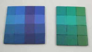 difference. Now I know that I have to go very easy on the black with Kato but not so with the Premo.”
If you look at the comparison chart on page 33 , you will see the differences in the strengths of the black and white package colors for the various brands of clay. The black and white of the Polyform clays are fairly balanced in strength – a half and half mix (1:1)makes a middle gray. The black of Fimo Classic is a little bit stronger than the white – it takes 6 parts of white to 2 parts of black (3:1) to make a middle value gray. The black of Fimo Soft and Kato clay is lots stronger than the white – it takes 7 parts of white to 1 part (7:1) of black to make a middle gray. That is a big difference!
FAQ’s
1. Why doesn’t your saturation diagram use the terms “tints, tones and shades?”
Our diagram was designed to show large saturation shifts – from pure to earth color for example. These large shifts put colors into groupings that have a similar feel. We think the names we chose reflect these different feelings. Tinting, toning and shading are smaller shifts that can be done to any color, regardless of the saturation family. Picture a terra cotta (an orange with both mud and white = an earth pastel ). It can be tinted, toned, and shaded the same way a pure orange can be tinted, toned and shaded to make many variations of the same color.
2. I added green to my yellow in the proportion you show (4:1) and it turned the yellow a bright green. Can I change the proportions?
Absolutely. The idea is to get slight variations – not change the color entirely. Yellows are wimps. Instead of adding 1/4 of a cool color to the yellow, you may want to add less because your green is a bully. Just be sure to label the tiles, expecially if they vary from the directions in the book.
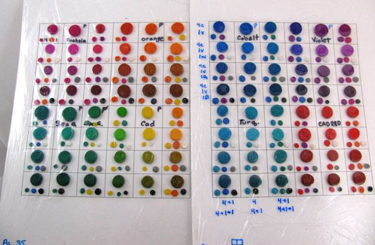 3. What to do with all the little bits leftover after making your pivot tiles?
They can be used for the Pivot Bead project or Jill Kollmann sent me this wonderful photo and said, ” I had so much fun making my pivot tiles! And all these wonderful swatches of clay left over. So I made these additional “reminder” charts to reinforce the mixes in my mind. Each of the mixed colors is in a square, and underneath each mix are dots of the 2 or 3 colors I used to make each mix. It’s not proportional – I drew a square at the bottom so I would remember how I “got there”. It’s raw, and covered in plastic. So this will also help me to remember which colors shifted during baking. Eventually I’ll “just know”, but for now this is going to help reinforce the learning. I love color school! “

June 28, 2010 at 11:16 pm
Hi
Love the book. I got it a month ago and am working through some of the exercies having previously enjoyed doing the colour scale tutorials on the website.
One problem I’m having is that I’m not mathematically minded so when I have a tile of a colour I like I can’t work out a basic formula for what proportions of colour went into that tile.
As an example, say I have the pivot tiles belonging to Fuschia (premo sculpey) and I want to recreate the colour that is the value tile for fuschia mixed with violet. My violet was 1 Fuschia : 1 cobalt blue. Is there a simple method to work out the proportions for each mixture. I’m just getting lost in fractions and ratios. I had the same problem when I wanted to work back from the colour scales jellyfish I’d made.
Thanks for any help you can give.
September 30, 2009 at 2:57 am
Oh and I forgot my little tip. I usually consider myself to have a straight eye but cuting my little squares of white, grey and black they were just not looking equal. So I decided instead to cut corner to corner, like an x over my square so I end up with 4 identical triangles – Perfect!
September 30, 2009 at 2:52 am
I love following along here. It gives me that extra push to stay on track, but the pace is good. I’ve had similar results to Jeanette. I pivotted Premo Cobalt and I like the more subtle tint the ecru gives but the burnt umber results are very similar. I think I may try fuchsia with burnt unber and ecru next to see if I can get greater variation in shade.
I used an earthy blue for my non-package experiment (1:1:2 Fu:CadY:Cob) My shade is barely distinguishable from my starting point so the lesson I’m taking there is that since the value was already so low the small addition of black doesn’t produce a noticeable change. I think I already “knew” that but going through the exercise reinforces the point. If I want a darker shade of my nice earthy blue I’m going to have to use a lot more black (hm or use Kato black).
September 26, 2009 at 2:52 am
Hi Jeanette – Do you have photos of the ecru/burnt umber tiles? As for values – I am working on an illustration to show how colors shift in value and hope to get it up on the blog soon.
September 25, 2009 at 7:13 pm
I did a pivot tile with a color that was not a pure package color and used ecru & burnt umber to tint, tone & shade. I did the same color with black, white & gray. I learned that by using the ecru & burnt umber the color changes were more subtle and quite nice.
I am still struggling with “value”. Hopefully by the end of the book I will be able to do this.