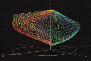
Most diagrams of color are two dimensional. The problem is that color has three distinct properties. HUE, VALUE and SATURATION
The Three Properties of Color
 Hue – The color family. Ex. Green, Yellow. Some systems use six families, some eight, some ten. I don’t really care how many hue families you divide color into as long as you understand that HUE is the property that gives a color its name. Hue is usually diagrammed as a circle.
- Value (Lightness, Brightness) – How much light the color reflects. Ex. Dark or Low value colors absorb more light than they reflect, and Light or High value colors reflect more light than they absorb.
 Value is usually shown on a vertical axis.Think of the north – south axis of the globe with North as White and South as Black. Many color spaces will show the pure hues at all the same value. But they are not.Imagine the hues in a circle around the middle of the earth and then tilt the equator/hue circle until yellow is near the top and blue violet is near the bottom. This will help you visualize how much lighter pure yellow is than pure blue violet.
 - Saturation (Chroma, Intensity): How close is the color to the purest version of the color. This is usually shown as a horizontal flow from the outside of the globe (rainbow colors) to the center of the globe (neutrals).Many color spaces will show all the pure colors taking the same number of steps to get to the neutal axis. The reality is that some pure colors need more steps than others.
Color Spaces
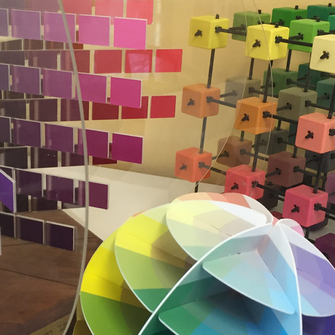
Whenever you have three properties to diagram, you need three axis. There are many 3D systems designed to chart the location of all colors. These 3D systems are commonly called Color Spaces. Here are two of the many variations.
Munsell Color Space
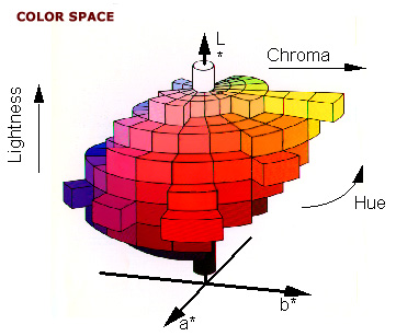
The Munsell system is the most commonly used color space for subtractive colors – colors used by artists. Munsell used the 10 hues shown below. Notice that he only has one Orange called Yellow Red (YR). There is no Red Orange or Yellow Orange. Also notice that h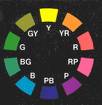 e did not have colors labeled Magenta and Cyan. But he did show all the hues at their relative values – pure yellow near the top etc. and he did show all colors at their relative saturations – red has more steps to neutral than blue.
Color Cube
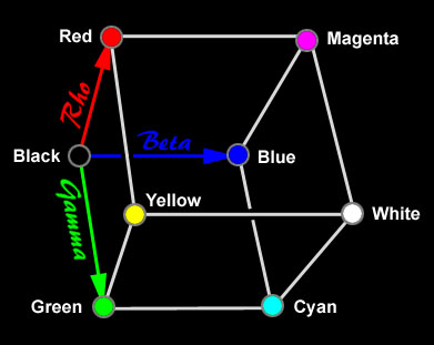
If Munsell is a traditional Color Space model then the Color Cube is a modern model. Black is on one corner with white on the opposite corner, Yellow is opposite Blue and Magenta is opposite Green. Play with unstacking the cube. Turn off all the layers. Then turn on the top and bottom. Trace an imaginary line along the edges of the cube going from the yellow corner to the green corner to cyan to blue to magenta to red and then back to yellow. This is the same color flow that you see in CMY color wheels.
CIE-Lab

Next week’s tutorial will cover RBG color space.
Exercise #1: Visualizing the Three Properties
Go to the samples of the Munsell system and click on each of the ten colors. Notice where the pure color is located on each diagram. How many steps does each color need to take to get to the center axis? To black? To white? Where do browns fall in the color space.
Smashing Color Exercise #2: Sorting into Three Properties
- Divide your crayons into Hue Familes – you can go with the traditional six – ex. R,Y,O,G,B,V; or use eight – ex. Blue, Green, Yellow Green, Yellow, Orange, Orange Red (Scarlet), Magenta, Purple; or use Munsell’s ten – Y, YR, R, RP, P, BP, B, BG, G, GY; or any number you prefer.
- Divide each Hue Family into three Value Families – Light, Medium and Dark colors. The easiest way to do this is to use your black and yellow crayons to color two 2″ squares on a white paper. Use the paper as a quick value sorter.If a color almost disappears on the black it is dark. If it almost disappears on yellow then it is light. If it “pops” on both black and yellow then it is medium.Note: There may not be all three variations in each hue family.
- Divide the Light, Medium and Dark piles into two piles – Clear, Muddy/Grayed. 4. Make a chart for each of your hue families similar to the Munsell charts.(This is not a test – just a way to become familiar with the properties of color. Everyone will have different charts – there is no right or wrong way to do this.)
Smashing Color Exercise #3:
Sorting into Saturation Families
- I like to divide colors into four Saturation families. I call them Rainbow, Earths, Rainbow Pastels and Earth Pastels. Divide your crayons into these four piles. Each pile will have colors from all the hue families. Note: If you did the exercise from Friday of dividing colors by how they are named you will notice a pattern here.
- Divide a piece of paper into four quarters. Label the top two sections – Rainbow Pastels and Earth Pastels. Label the bottom two sections – Rainbow and Earth.
- Record the results of your Saturation Families sort.

December 29, 2006 at 5:29 pm
Maggie, I found my way here from a link on Polymer Clay Daily. I just printed out your color information so I can read it more carefully. I’m so excited to see that someone else thinks of color as “not 2D!” I had stopped talking to people about my color thoughts because their eyes glaze over rather quickly.
–writing to you from Michigan, where I enjoy playing with polymer clay & other stuff
December 19, 2006 at 8:31 pm
MAGGIE – Thank you so much for your efforts here! I worked 13 years for a chemist as a r&d technician in a Textile Dyes Plant and I have learned more here in these few short weeks than all the time spent at my job. I LOVE color, and Polymer Clay. I look forward to whatever you have to add in the following weeks to come! – Member of the New Hampshire Polymer Clay Guild.