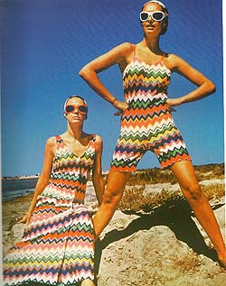
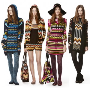
Vintage Missoni – 1968 Missoni for Target – 2011
This weekend I was inspired by Missoni chevrons. The Italian fashion house, famous for over 40 years for their iconic stripes and patterns, has been in the news quite a bit lately due to the huge hoopla surrounding the launch of Target’s new Missoni designed product line. The stores were swamped, the animitronic 25′ doll a big hit, and the Target website crashed yesterday due to the overwhelming response. The full line was shown on Fashionista in August – that might be the only way to see it all!
This weekend I experimented with rule-based color selections to see if I could mimic the seemingly random Missoni color combinations. I was curious about what colors would emerge if determined by chance. I used three collections of 26 crayon colors, coordinated with the alphabet, to color in a pattern of stripes. To keep a record of the color studies I made two blank forms. The first form included a frequency chart and alphabet key (based on Christian Faur’s Color Alphabet concept) along with a small test pattern for a 19 stripe phrase “Its all about color.” The second form was a larger 2 1/2 repeat version of the same pattern.
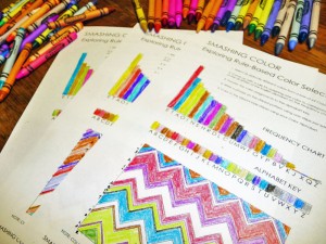 The first group of colors was based on random selection from a box of 64 crayons – I just pulled them out one by one. For the second group I choose 26 distinctly different colors and lined them up in spectrum order on the alphabet key.
For the third group I assigned colors to the frequency chart starting with my favorite color and continuing until I had 26 colors.
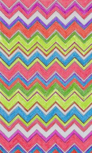
Three different rules. Three different results. I only liked the last one so I used those colors to fill in the full page pattern. The result is shown below.
 Here’s an excerpt from an article written in 2007 about the designers – “Missonis are masters of colors. It seems that all family members see and understand colors in a different way than the rest of us. Other designers’ work can be good or not good, new or already seen, in color or black and white, but every detail that comes from Missoni’s imagination is full of stunning color combinations. I believe that “color fireworks” are the right words to describe that thinking. No matter whether we are looking at stripes or zig-zags, there are as many colors as there can be, but always in new and unexpected relationships. Sometimes it may seem that there was an error in choosing the color combination, but the second look clearly shows that’s not the case.
I thought it would feel like paint by numbers, and it did, but I learned a few things from the process of working by a set of rules. I confirmed that its often the unexpected color that makes the wow factor. I found out how much I love warmer versions of colors because whenever I pulled a cool color I was tempted to put it back and try again. But best of all, when I decided to start with my favorite colors, I learned that its easy to manipulate the rules to get what you want.
The “coloring book” pages are kind of fun. If you want to try your own colors here are the PDF’s. Rule-Based Color Selection/Rule-Based Color Selection -2.


August 17, 2012 at 8:38 am
Brilliant. I was looking for yarn substitutions to knit an old missoni pattern and have to determine my own color ways. How do they do this?! This methodology is fun and gives extra meaning to the work. I feel like a ww2 spy encoding secret messages into my knitting. Very fun and a little subversive.