 What do you get if you combine language and color?
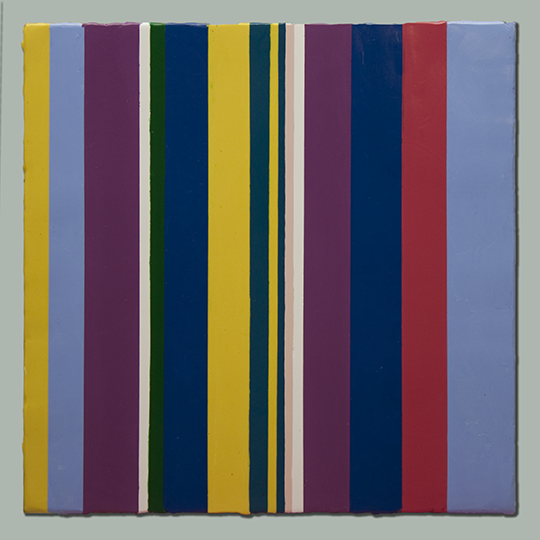
If you take the analytical approach of Christian Faur then you might create something similar to the stripe paintings in his recent Words, Words, Words collection.
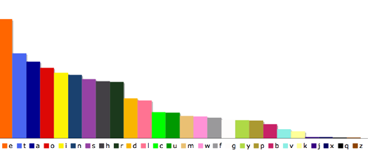
Faur developed a color alphabet connecting a specific color to each of the 26 letters in the English alphabet.
His rationale for choosing colors was based on linking the most frequently used letters, 5 vowels and 6 consonants, to the basic colors terms that are the most recognizable across cultures as identified by researchers Berlin and Kay (1969.) He then took the remaining letters and gave them colors that differed in hue, value and saturation from the first set of colors.
Here are the letters in order of their frequency of use and the color choices for each letter. But why accept these color assignments?
There is something unsettling about the colors used in Faur’s paintings. Perhaps that was his intent, or perhaps my sense of color is just different from his. Maybe they could be seen strictly as coded messages – more conceptual exercise than art.
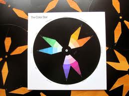
 The idea of using a set of rules for color selection and placement is not uncommon. Many color classes use Itten’s color star with the cut-out masks representing the different kinds of color harmonies. Just spin the black masks and go with the color combination seen in the openings. This kind of mechanical process takes thinking out of the picture – and leaves no room for instinctive choices.
I’m afraid that I do not really like most of the color combinations I’ve seen that resulted from using some kind of “rules based” approach.
I don’t want to get into the “does art need to be beautiful?” debate (because of course it doesn’t), but I’m going to ask a few questions. Are there shortcuts to harmony? Can beauty be codified? If I could find just the right method for methodically picking colors, would all my work suddenly morph from so-so to gorgeous?
My experience says “No. ” Color selections might start with some kind of system but they usually will need tweaking once the colors are put together. That said, it would be fun to assign different colors to the letters and redo each of Faur’s paintings using a new set of rules to see if, just possibly, different rules might generate something I liked better.


Leave a Reply