 Since summer ends this weekend, let’s look at some of the color forecasts for the Fall.
Even though I don’t believe that color forecasts are always accurate, it is fun to look at them and find colors that you might like to try in your work.
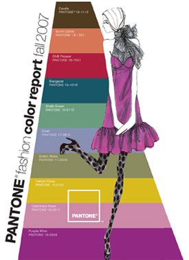
This Fall’s Pantone Colors are a mixture of deep earths, soft earth pastels and a few lightened up rainbow colors.
Its not an especially smashing group of colors but the idea is not to use them all together but to use a few of them to add fresh flavors to stale color combinations.
In addition to black and gray (the perennial neutral favorites for fall and winter) the colors that I like the best for this season are Carafe – a variation of last years dark chocolate brown, Stargazer – a deep peacock blue, and Dusk – a slightly muted periwinkle blue.
The combination of darks and pastels in stripes and prints is still a popular trend. You might want to try some new pairings; Chili Pepper with Green Moss, Purple Wine with Deep Ochre, Stargazer with Shale Green.
CAUS is a member organization. You have to be a member to get the advance forecasts but they publish the current forecast for free on their website.
The Color Association of US fall colors for interiors and men’s, women’s, and youth’s fashions include more colors than the Pantone forecast.
Go to “Color Trends” and then open the “Interactive Color Forecast.” The site allows you to look at the colors in three textures and to play with creating different groupings of colors.
The forecasts are fun to look at but don’t depend on them for creating your fall palette. Use them to give you a feeling for current color trends. And use them for inspiration.
Mixing Exercise
Clay is on sale for .99 at Michaels this week. Buy some Premo Cobalt Blue, Zinc Yellow, Fuchsia and try to make colors to match the forecast with just these three primaries plus white. Here are some formulas that will get you close.
Note that one unit can be any size you like. The samples I made are all close to 16 units. I like to use a 1/2″ square or circle cutter to cut the units from a sheet of clay rolled out on thickest setting of the pasta machine.
You will want to tweak these colors to work with your fall palette. Have fun mixing and matching these new colors with your old favorites!
Formulas for Pantone Colors
Carafe: 3 cobalt, 8 z.yellow, 6 fuchsia
Burnt Ochre: 1/8 cobalt, 3 z.yellow, 5 fuchsia, 8 white
Chili Pepper: 0 cobalt, 3 z.yellow, 10 fuchsia, 2 white
Stargazer: 14 cobalt, 1.5 z.yellow, 1 fuchsia
Shale Green: 5 cobalt, 3 z.yellow, 1/4 fuchsia, 9 white
Dusk: 4 cobalt, 0 z.yellow, 2 fuchsia, 11 white
Green Moss: 2 cobalt, 6 z.yellow, 2.5 fuchsia, 6 white
Lemon Curry: 0 cobalt, 16 z.yellow, 1/16 fuchsia
Cashmere Rose: 1/2 cobalt, 1/2 z.yellow, 4 fuchsia, 12 white
Purple Wine: 1/2 cobalt, 0 z.yellow, 13 fuchsia, 3 white
October 24, 2007 at 3:48 pm
Thank you Maggie, that’s a great project you did 🙂
Hi Iris – Its great to hear from you. There is so much going on in the polymer world and Israel is especially active! I’ve put your link below for anyone who wants to check it out:
http://polymerionline.blogspot.com/
October 1, 2007 at 11:48 am
Hi Mo – Aha! So that’s where the your colors came from. My experience is that you don’t use the forecast colors as a new palette but as modifiers of your own palette. Sometimes – like this year’s fall colors – they really do look ugly all together! So just have fun with the new colors that resonate with you. I am play ing with the tealy blue – just love it. Maggie
September 27, 2007 at 6:04 am
Maggie, thanks for the recipes. Earlier this year, for fun, I selected my six favorites from Pantone’s Spring ’07 forecast and tried to use them in as many ways as possible (this was the palette I showed you recently at your Sacramento workshop). Since taking your Smashing Colors class I know I will have a much easier time custom-mixing in the future. Thanks again for the “cheat sheetâ€; I planned to wait until after the workshop to try to match a few of these fall Pantone colors, but you’ve done the work for me!