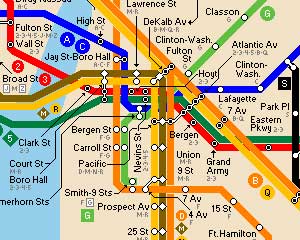
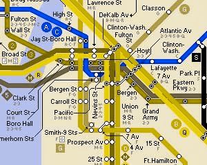
 This chart shows ten colors selected because they can be differentiated by people with normal, protan and duetan vision.
When would you want to use these colors? Probably not in jewelry design or quilting or painting but can you imagine how difficult it might be to use a map if you were color blind?
Daniel Flueck from Zurich, Switzerland is red colorblind.Last year he started a blog, Colblinder: Color Blindness through Color Blind Eyes. His post evaluating subway maps around the world is a real eye opener.


I found a number of sites with recommendations for designing graphics and websites for the color blind. Lighthouse International has the best suggestions for designing with the color blind in mind.
Roger Johannson, a Swedish web professional, just posted his 10 Colour Contrast Checking Tools to Improve the Accessibility of Your Design.
Their recommendations all boil down to the same thing. Use value and saturation contrast instead of hue contrast when you want your design to be easily understood by someone who is color blind. For example, instead of using pure green, red and blue, use a light yellow green, medium red and dark navy blue.
Come to think of it, using value and saturation contrasts to make your design more readable is a good idea whether or not you are concerned about color blindness.
A last little bit about color blindness. There’s a new technology that has the potential to allow those that are color deficient to see more variations of colors. Thanks to Lili Velez from Baltimore, MD for the link to:


September 16, 2007 at 1:56 am
Nice article you put together here. I’m the Colblindor and would like to thank you for linking up to me. By the way, I can almost not distinguish your links from your text with my red-blindness….