Color Education for the 21st Century
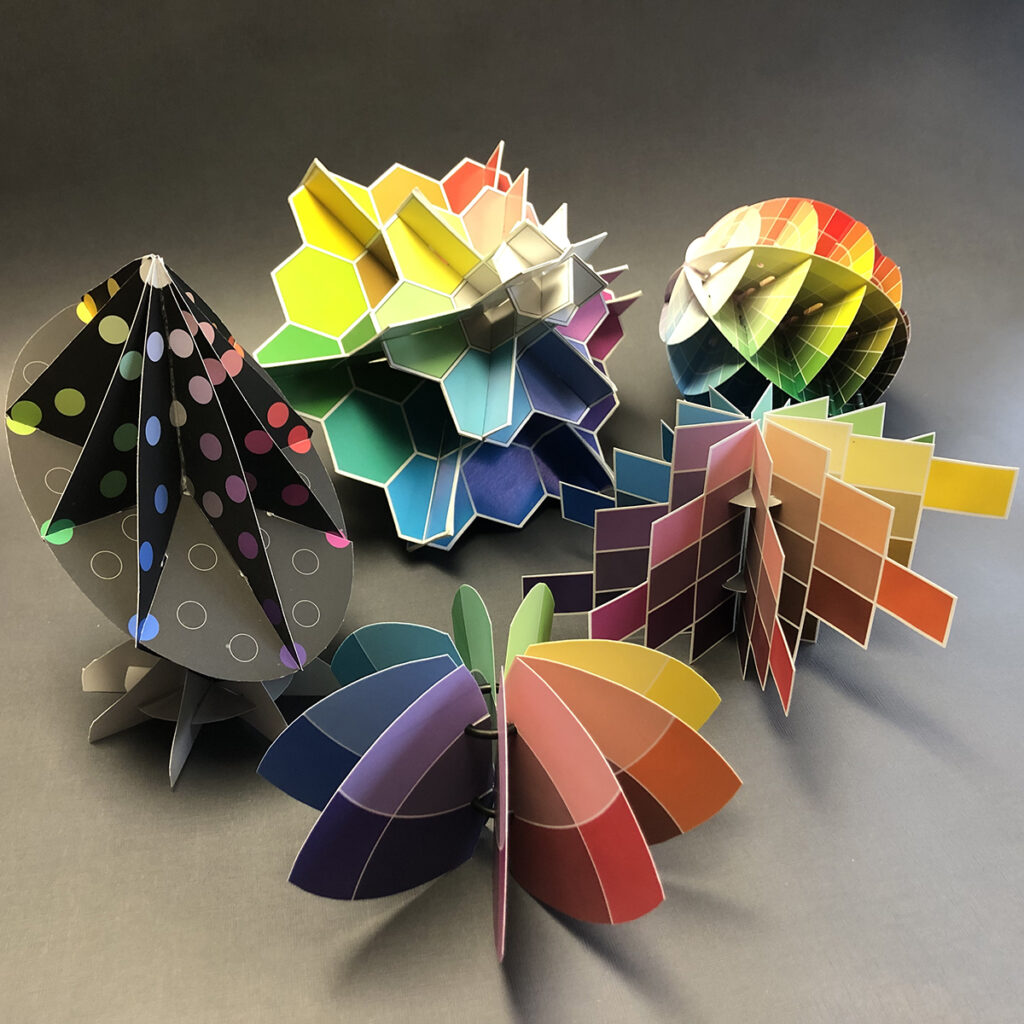
Color in Three Dimensions
Visualize color relationships by switching from a 2D color wheel to a 3D color model! Smashing Color Workshops and Open Studios are based on years of teaching students to see and describe color attributes in a variety of color order systems.
Expanding from 2D to 3D takes your understanding of color to a whole new level.
Hands-On Interactive Exercises
The more you experiment, the more you learn. In addition to the Smashing Color projects and activities, workshops include beta-test exercises from the international Color Literacy Project curriculum.
Sharing your color exercises with fellow color explorers takes you further than you can go alone and makes learning fun!
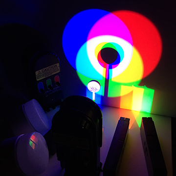
Color and Light
With the increasing use of computers, LEDs and digital technologies, it's time to connect the light based and pigment based color systems into one integrated 21st century color system.
With some simple instruction and a bit of practice, it's easy to learn how to use color effectively in both digital and traditional media.
Guided Color Exploration
Maggie Maggio is a designer, artist and art educator who has studied and worked with color for over forty years.
Maggie’s personal explorations into the science of light and pigments led to the creation of workshops for artists and designers to incorporate the latest research in color science into their creative practice.

Smashing Color Workshop in the Cotswolds