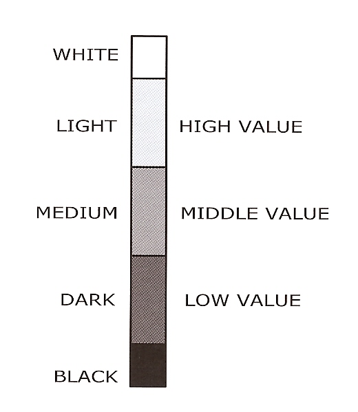
Value is defined as the amount of light reflected by a color. If a color reflects more light than it absorbs it has a high value. If it absorbs more than it reflects, it has a low value. In the book we recommend sorting colors into just five values – colors close to white, high value/light colors, middle value/medium colors, low value/dark colors, and colors close to black.
Weekend Extra Exercises
1. Using the value scale chart on p. 33, make more than one value scale using different brands of clay. Note that Black Fimo Soft and Kato Clay are both bullies. It takes equal amounts of black and white to just shift the black one step to a dark value.
2. Group the package colors into piles according to their value. How big is each pile?
3. Values are easier to see if the colors are muted. Take your value sorter and find the value of natural materials both inside and outside the house. For example – if you have a wood floor, what value is it? What about the sidewalk? The dirt?
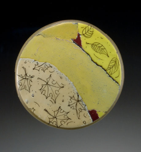
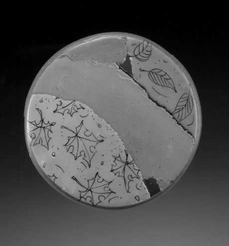
4. Using a color copier, make a color copy of one of your pieces, then while it is still in the copier make a black and white copy. Identify the value of the colors in your piece by first comparing the values on the sorter to the black and white copy, then to the color copy, and then to the actual piece.
5. If you have a photo of your piece on your computer and access to Photoshop, edit the photo by going to enhance/adjust color/remove color. Compare the two photos side by side. Is there anything that surprises you?

Tips
If you squint your eyes you can compare values easier than with your eyes wide open. Try looking at the color and b&w image of the watercolor bead above. Do the values match or did Photoshop “play” with the contrast?
When I first started sorting colors by value, I made 2″ x 2″ swatches, and then took them all into my bedroom closet on a piece of black paper and closed the door. They all disappeared. Then I opened the door a crack and the yellow and very light colors popped out. I put any color I could see into a pile. Then I opened the door a little more and put any color that now appeared into another pile. I continued to open the door half inch by half inch until all the colors were sorted. Try it!
FAQ’s
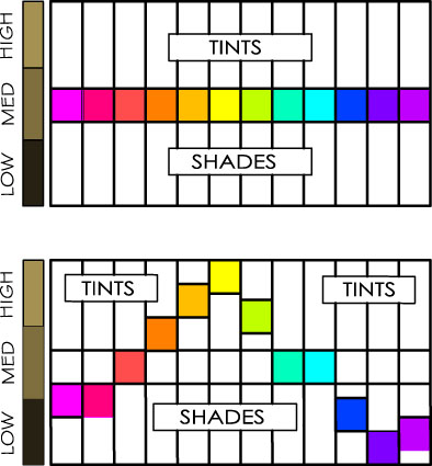
 1. Are all pure colors the same value? No, pure yellows have a high value and blue-violets have a low value. The other pure colors fall in the medium to low value range except for yellow oranges and yellow greens which are closer to high value yellows. See the Value Comparison Chart on page 27.
The top chart shows a common – but misleading- way to show tints and shades. Why is it misleading? Because it implies that all the pure colors are equal to a middle value gray.
The bottom chart shows the relative values of pure colors.
2. Do I have to make a value sorter from clay or can I use a ready made version? Most of the ready-made versions will have more steps, which may make it easier to find the exact values, but makes it harder to sort colors into piles because there are too many choices. Plus there is nothing like making grays to help you see value more clearly!
3. Should I bake the 1/2″ test circles before putting them in the sorter? For the purposes of the exercise, you don’t need to bake the circles (just have fun sorting) but if you want to document the value of the package colors for future use you may want to bake them before sorting since some colors darken more than others.


September 20, 2009 at 12:00 am
Hi Jeanette – Love your drawings! We will be covering how to combine values later on in the book when we talk about value keys. One of the reasons we recommend thinking in terms of only five values is to make it easier to “see” value contrasts.
September 15, 2009 at 7:21 am
I worked on my “Tasting Tiles” today. I made some changes to my pie charts because I couldn’t work with the circular ones. You can see what I did on my blog.
September 14, 2009 at 5:01 am
I can hardly wait to see where this is going…love the gray scale value tool! You have put SO much work into this book to make it easy for your readers to understand these principles. Are there some principles about mixing or not mixing values in a piece?
September 13, 2009 at 5:28 am
I will definitely have to try the closet trick. I have the hardest time discerning the value.