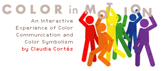
 If you have some time this weekend to play with color symbolism – here’s a fun interactive site produced a few years ago by Claudia Cortes as her thesis project for the MFA in Computer Graphic Design at Rochester Institute of Technology.
The project received Best of Category honors in the I.D. Magazine 2004 Student Design Review competition, and was featured by Communication Arts Magazine in the 2004 Interactive Design Annual. Here’s an interview with Claudia from when she won Best in Category in the I.D. Competition.
In Claudia’s comments (under Info Design) from the Communications Arts award, she talks about color as a communications tool. Even though I am not a fan of color symbolism – too simplistic and too culturally biased – I do believe we can use color variations to reinforce the feeling of whatever we are making.
Think of the different feelings produced by bright red, pale pink, dusty rose and deep burgundy.
Now think of all the colors of the rainbow in all values and saturations . . . millions of colors.
Imagine the simplicity of color symbolism layered with all the complexity of color variations and the possibilities for communicating with color are endless.


Leave a Reply