When you mix two colors in equal amounts you expect to get a color that appears to be in the middle. In reality this doesn’t often happen.
Usually one of the colors will be stronger than the other and pull the half and half mix closer to its side than the other.
Understanding the “tinting strength” of each color is as important as understanding the undertone of each color. Let’s analyze the secondary mixes from the last tutorial to figure out the undertones and tinting strengths of each of the primaries.
Smashing Color Exercise – Analyzing Secondary Test Mixes
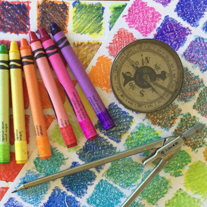
Materials List: Test Mixing Results from Tutorial #4, Handout #5 (Download PDF), Box of 64 Crayola Crayons. 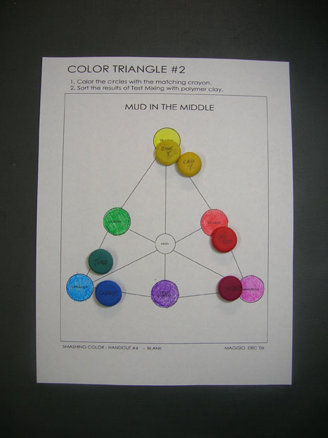
Color Handout #5 with Scarlet, Magenta, Cerulean, Green, Violet (Purple), and Yellow. Notice the colors I chose for the secondaries are a hybrid of the RYB and CMY system.
Make small samples of each of the primaries that you used to make the secondaries and position them on the triangle where you think they should be in relation to the crayon colors.
The primary colors shown in the example are Premo primaries Cad Red, Magenta, Cobalt, Turquoise, Zinc Yellow and Cad Yellow. 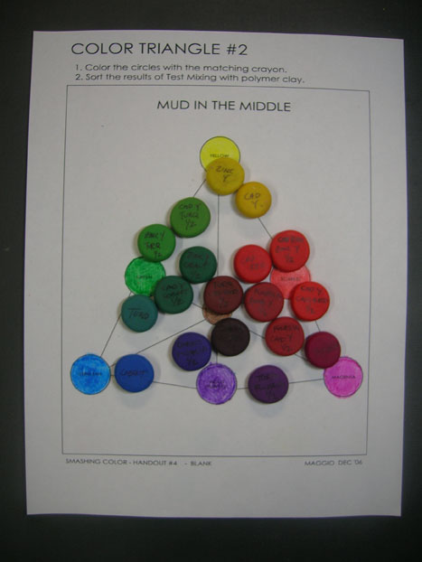
Put all the secondary test mixes on the triangle. Position each color in relation to the crayon secondaries. Note: There is no crayon for MUD – yet. If the mix is muddy put it inside the triangle. If the mix is clear put it on the outer lines of the triangle.
Analyze the results separately for each secondary test mix starting with the purples. 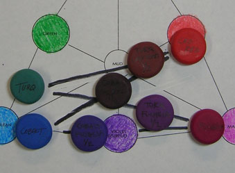 The purples show the most variation. Lots of MUD in the colors mixed with Cad Red. That’s because Cad Red is really not a primary.
It is a secondary – an orange-red (magenta with lots of yellow.) All the yellow in Cad Red is mixing with the blues to make MUD.
Turquoise and Cad Red have yellow undertones. Cobalt has a little magenta. Fuchsia has a little cyan.
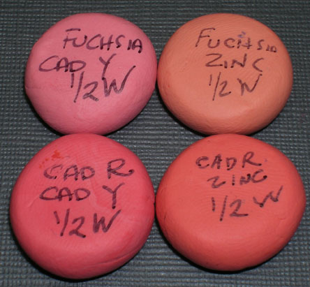
Compare how far each color pulls the other. Some are bully colors and some are wimps. Cad Red is much stronger than Turquoise and a little stronger than Cobalt. Cobalt is much stronger than Fuchsia. Fuchsia is stronger than Turquoise.
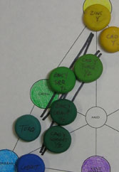 The greens show some variation but not as much as the purples.
The greens mixed with Cad Yellow have some MUD coming from its magneta(red) undertone.
The colors mixed with Zinc are clearer. But notice that Premo Turquoise seems to have some white in it and that it is much weaker than Cobalt. 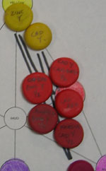
The oranges are not orange. The Cad Red is so strong it completely takes over and the half and half mixes look just like Cad Red.
And the half and half mixes with the yellows and Fuchsia are reds not oranges.
There is not much undertone in Zinc.
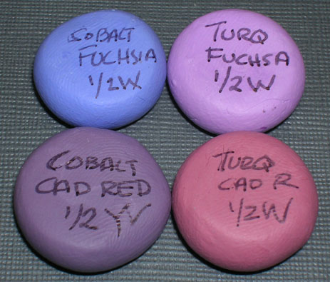
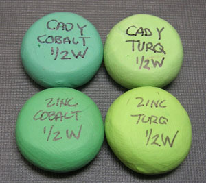
It is easier to see the tinting strengths and undertones if you mix the secondaries with 1/2 white and then compare the results.
Purples
Cobalt/Fuchsia – Clear, Cobalt much stronger
Cobalt/Cad Red – Muddy, Cad Red stronger
Turquoise/Fuchsia – Clear, equal strength?
Turquoise/Cad Red – Muddy, Cad Red much stronger
Greens
Cad Y/Cobalt – Slightly muddy, Cobalt stronger
Zinc/Cobalt – Clearer, equal strength?
Cad Y/Turquoise – Slightly muddy, Cad Y stronger
Zinc/Turquoise – Clear, Zinc stronger
Oranges
Fuchsia/Cad Y – Slightly muddy, Fuchsia stronger Cad Red/Cad Y – Clear, Cad R lots stronger (bully color, wimp color) Fuchsia/Zinc – Slightly muddy, Zinc stronger Cad R/Zinc – Slightly muddy, Cad R stonger

December 3, 2009 at 1:34 pm
As I said before I love your site and all you share with the polymer clay community. I am in awe of all you teach about color. Lindly is also good at it as well, what a pair. Keep up the great work and you are awesome. Lynn W.
January 11, 2007 at 3:17 am
I sent you an email several weeks back asking whether you had a book describing how to do your “watercolor” technique. (I had seen pictures of your work on the internet and was wanting to learn how it is done.) You advised you did not have a book but would be teaching the “watercolor” technique on your website in a few months (after the colors tutorials). After receiving your response I took a look at maggiemaggio.com and am delighted to have found this great site. I was obviously putting the cart before the horse in wanting to learn the “watercolor” technique before understanding colors. I have enjoyed your tutorials, the links and everything else about your site. I am a novice to what you are teaching and so far it has all been clear to me. Perhaps starting with the crayons (an tool we all know and feel comfortable with) helped. Thank you, thank you, thank you.
January 9, 2007 at 5:21 pm
I was conditioning & sheeting my clay this morning when the pasta machine started acting up. So I switched to another machine…and then realized…to be sure that the measured pieces of clay are the same amount of clay the sheets need to be run off on the same machine AND probably not stretched at all. So, is my background in science a good thing, or crazy making? Things that make you say “hmmmm”.