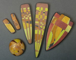
I am having trouble with my camera but here’s a quick and dirty tutorial on using the watercolor technique to make “torn paper” beads similar to the bead on the lower left. 1. Mix a palette. I always start a project by mixing a set of colors that “hang together.” Make at least one color in each hue […]
Smashing Color
with Maggie Maggio
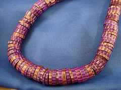
This pivot bead strand is up on tricksy_gnome’s Flickr site. A beautiful combination of colors! The idea for the pivot beads came when I started using canes as the underlayer for my watercolor technique. The original watercolor beads were made for the silent auction at the second Ravensdale conference in 1998. Lindly and I were teaching […]
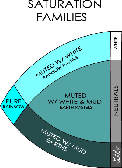
The concept of saturation is a tough one. The terms tinting and shading usually have to do with changing the value of a color but they also have to do with changing the saturation. Tinting is mixing a color with white, shading is mixing a color with black (or mud, or the complement.) The term “tone” […]
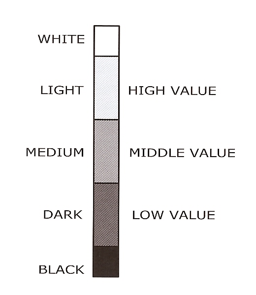
Five Step Value Scale Value is defined as the amount of light reflected by a color. If a color reflects more light than it absorbs it has a high value. If it absorbs more than it reflects, it has a low value. In the book we recommend sorting colors into just five values – colors […]
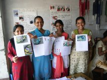
“Namaste” from Kumari, Ambikha, Sharmila and Kopila. Color is connecting us all over the world! Wendy Moore, an Australian rehab therapist and artist, is working with the non-profit group Summanat Nepal to help women who have experienced domestic violence. Cynthia Tinapple is generously building their website and through PolymerClayDaily we are now linked to this new sisterhood of polymer […]
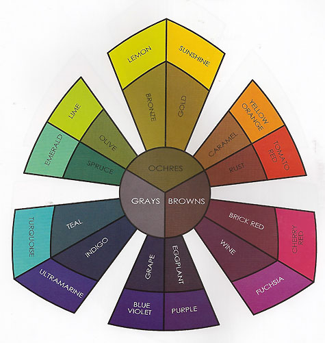
A New Color Diagram After playing with many versions of triangular and circular color diagrams, I decided to design a hybrid Color Sorter specifically for the book. I called the primaries Yellow, Blue and Magenta and divided them each into two variations. I have argued […]
It looks as if the big box craft stores are having sales just in time to stock up for all the color exercises. My local Jo-Ann’s is having a “buy one get one free” sale on all brands of polymer clay starting today through Monday, and Michael’s has polymer clay on sale at 4 for […]
© 2026 Smashing Color