In Chapter 5 of Interaction of Color, Albers notes that when students were shown two colors of similar value and asked which one was lighter the results were consistently 60% wrong. 60%! And these were art students at Yale!
Why is it so hard to see value? I think part of the challenge has to do with the fact that the pure colors are not all the same value. They range from very light to very dark. Pure yellows are very light. Pure reds are middle value. Pure blues are very dark.
To see relative value you need to start by comparing colors to each other.
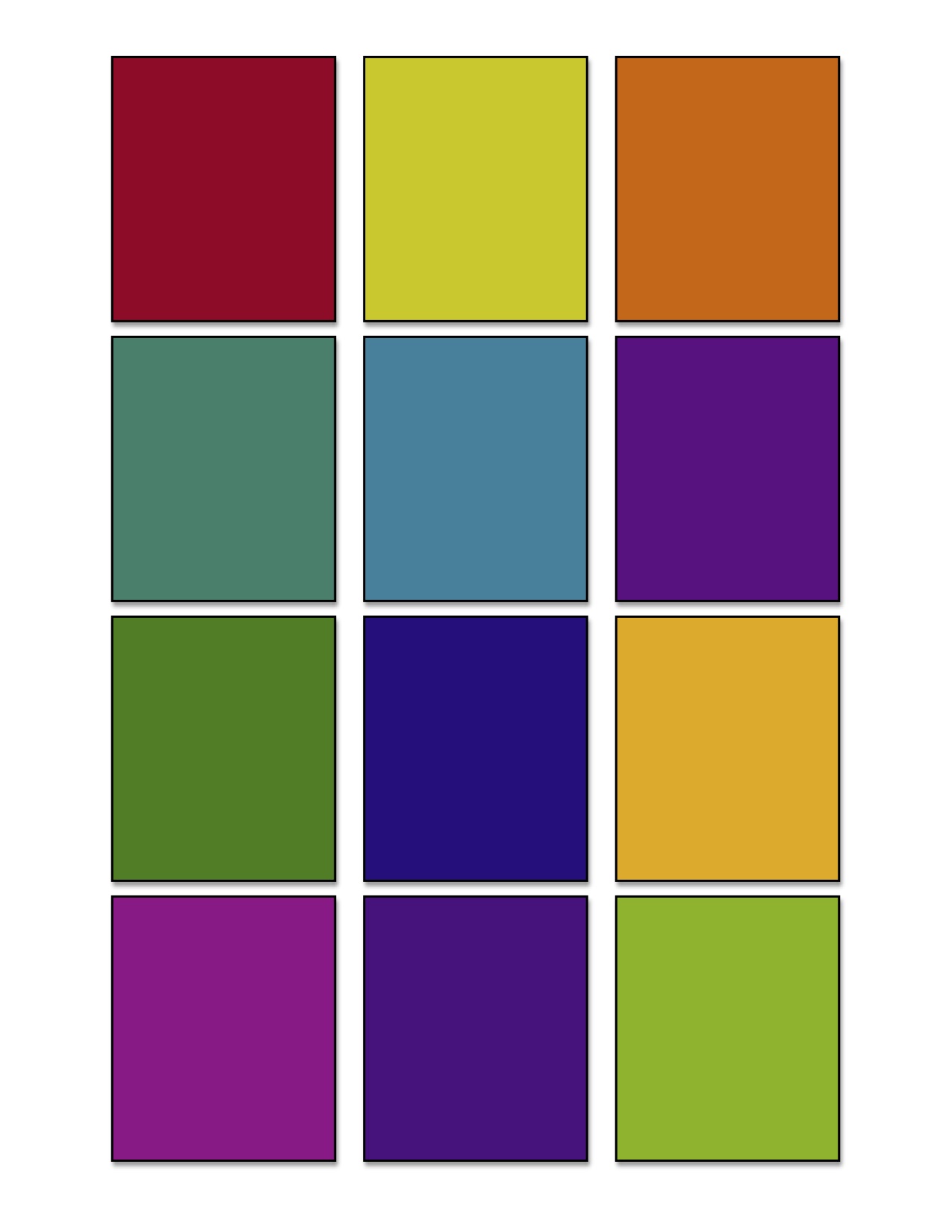
Identify the value of each of these 12 colors. Which ones are high value – close to white?Which ones are low value – close to black? Which ones are in the middle?
 If you want to do this with color swatches, try this exercise. (Note that the printed colors will be slightly different from the colors you see on the computer screen.)
1. Print out the PDF Templates for Albers Color Studies – value1
2. Cut out the rectangles.
3. Print out the PDF Templates for Albers Color Studies – black and white
4. Identify the colors as either high value – they show up easily against black, low value – they show up easily against white, or middle value – they show up easily against both black and white.
5. Note that pure colors with lots of yellow are lighter than pure colors with lots of blue.
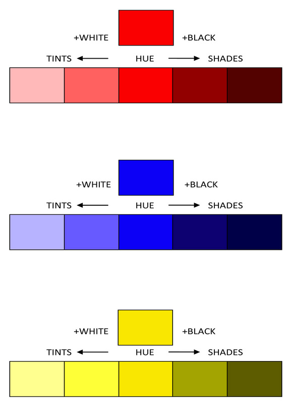
When you learn about value its usually in the context of tinting and shading colors. You often see diagrams similar to the one below.
 The problem with this diagram is that it implies that a pure red, a pure blue and a pure yellow are all the same middle value. We know that this is not true.
You can also see that it appears that a slightly shaded yellow will be darker than a pure blue. This is also not true. The reality is that a slightly shaded yellow will still be lighter in value than a pure blue and sometimes a shaded yellow is even lighter than a tinted blue.
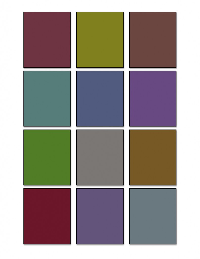
The next exercise is much more difficult. It involves identifying the relative values of colors that are close in value – in this case a collection of 12 middle value colors.
 If you really want a challenge, try it with these color swatches.
1. Print out the PDF Templates for Albers Color Studies – value
2. Cut out the rectangles.
3. Squint and try to put them in order from lightest to darkest.
This is not easy to do. The black and white comparison is not useful since they are all middle values. Its especially hard to ignore the hue and saturation of each of the swatches. Compare them two at a time until they fall into place from light to dark.
Albers had a trick for comparing two colors that seem close in value. I’ll share this with you in the next Saturday School post after the holidays. I am having fun playing with a new body of work, so my blogging will be sporadic until after the New Year. Then I hope to have some fun images to show you!


Leave a Reply