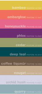
When you look at the past few years of the Pantone Fall forecasts you can see that there are similarities in the sets of colors selected. There’s always a yellow, a teal/turquoise blue, an off pink, a clear purple, a deep red or orange, a muted green of some kind, and a neutral. Plus a […]
Maggie Maggio
Smashing Color for the 21st Century
Page 8 of 15
We started this week with the new line of products designed by Missoni for Target. Over the years Target has worked with a number of famous designer to produce affordable, well designed products. Remember Target’s whistling bird teapot? The designer was architect Michael Graves. Michael Graves also designed the Portland Building – one of the most controversial projects […]
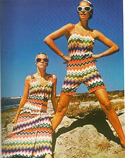
Vintage Missoni – 1968 Missoni for Target – 2011 This weekend I was inspired by Missoni chevrons. The Italian fashion house, famous for over 40 years for their iconic stripes and patterns, has been in the news quite a bit lately due to the huge hoopla surrounding the launch of Target’s new Missoni designed product line. […]
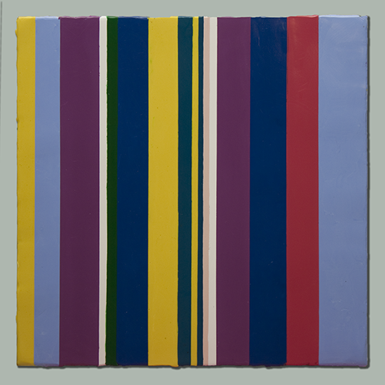
What do you get if you combine language and color? If you take the analytical approach of Christian Faur then you might create something similar to the stripe paintings in his recent Words, Words, Words collection. Faur developed a color alphabet connecting a specific color to each of the 26 letters in the English alphabet. […]
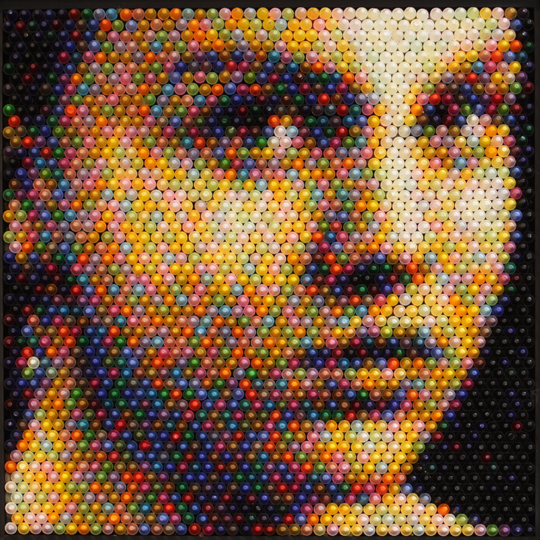
For the past five years Christian Faur has used crayons standing on end to create pointillist images of people, faces and building. The crayons are lined up side by side in boxes with their pointed ends up like a new box of crayons. In his most recent series, A Set of Melodies, Faur riffs on the […]
Every Labor Day weekend I look forward to Oregon’s premier art and fine craft show, Art in the Pearl. I did this show in Portland’s Pearl District for a few years way back when. My favorite was one year right next to a huge tree that provided just the right amount of late afternoon shade. My […]
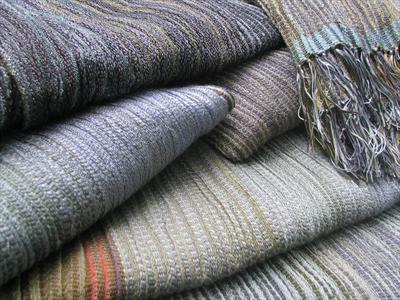
As much as I love polychromatic color schemes there are times when I just want to work in neutrals, or in the case of the three artists below – almost neutrals. Scarves by Bobbie Kowciejowski. Glass beads by Dan Adams. Painting by Glenys Porter […]
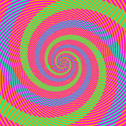
The swirls that look green and the swirls that look blue are the same color. Yes, really. Published by Akioshi Kitaoka in 2009, this illusion is based on mixing colors optically. What you don’t notice at first is that the colors of the thin stripes crossing the swirls are alternating between orange-red and purple. Look closely […]
What is it about color that I find so fascinating? Maybe its the wonder of it all; the amazing colors of the natural world and the equally amazing fact that anyone can pick up color and play with it in a creative way. Maybe its the complexity of it all; the interconnection of so many […]
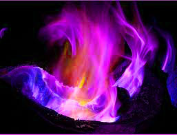
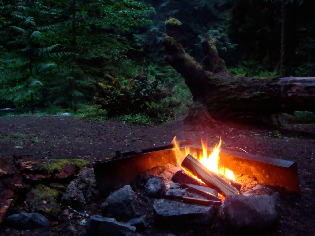
The natural colors of flames flow from red through orange, yellow and white to blue. This is the expected range of colors but what if you want something unexpected? I remember logs and pine cones that burned different colors because they were soaked in certain chemicals. Each chemical produces different colors. Here is a short […]
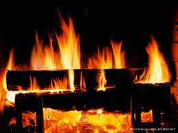
The dominant color in a flame changes with temperature. The photo of the fireplace fire is a good example of this variation. Near the logs, where most burning is occurring, the fire is white, the hottest color possible for organic material in general, or yellow. Above the yellow region, the color changes to orange, which […]
In 1971 thirty senior high Girl Scouts flew from Philly to Denver to spend two weeks camping, hiking and riding horses. We stayed in the Tetons, Yellowstone, and the middle of nowhere in Wyoming. It was a blast. Last week was the 40th anniversary (how can that be true?) of this adventurous and very memorable trip and we celebrated […]
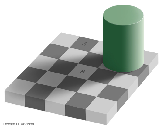
One of the most important concepts in color study is an appreciation of the difference between what a color is and what it appears to be. In our book, Lindly and I introduced this concept in the Chapter “Games Colors Play.” We explored simultaneous contrast, blending, and the apparent shifting of hue, value and saturation […]
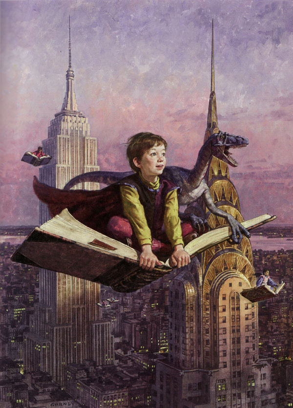
I first came across the work of James Gurney when my daughter was into dinosaurs and we read the Dinotopia books together. It wasn’t until a few years later that Lindly Haunani asked if I knew about his posts on color. Since then I’ve faithfully checked into his blog, Gurney’s Journey, at least once a […]
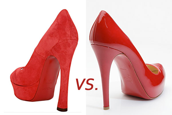
Yves Saint Laurent vs Louboutin French designer Louboutin started using a glossy red sole on his high fashion shoes in 1992 and trademarked the red sole in 2008. YSL’s 2011 spring collection included a red shoe with red sole – and a blue shoe with a blue sole, a green shoe with a green shoe, […]
© 2025 Maggie Maggio