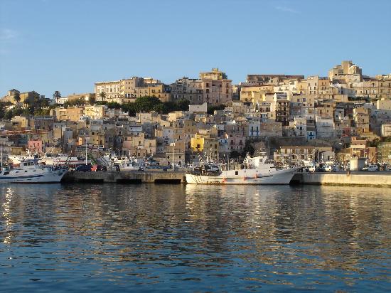
We are staying this week in Sciacca, a middle sized town perched on a hillside on the southwestern coast of Sicily. All of my husband’s great grandparents – all eight! – were born in Sciacca and died in Norristown, Pennsylvania. Three of his grandparents were born here as well, before the families left for America at […]
Maggie Maggio
Smashing Color for the 21st Century
Page 10 of 15
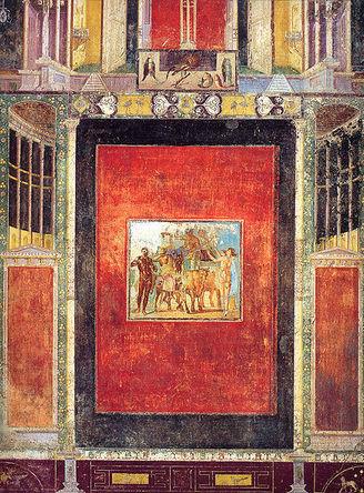
As we arrived in Rome, my daughter asked what is the one thing you hope to do while in Italy? I replied, ” See the real Pompeian Red.” I have longed to see the ruins of Pompeii and Herculaneum since my first architectural history course. The reason had nothing to do with architecture or with history. The reason had to do […]
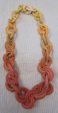
The response to the split ring video has been amazing. Thank you to everyone for your wonderful comments. I am so glad you are having fun with them! A few people have mentioned that their split rings start to open while they are being worn. There could be many reasons for this. First – The […]
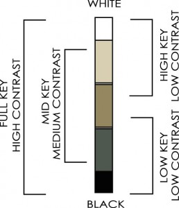
Value Keys As we saw last week, contrast of value is relative. Combinations of colors that are all high/light in value are called high key. Color combinations that are low/dark in value are called low key, and if all the colors are in the middle value range then the combination is in the mid key. All these combinations are […]
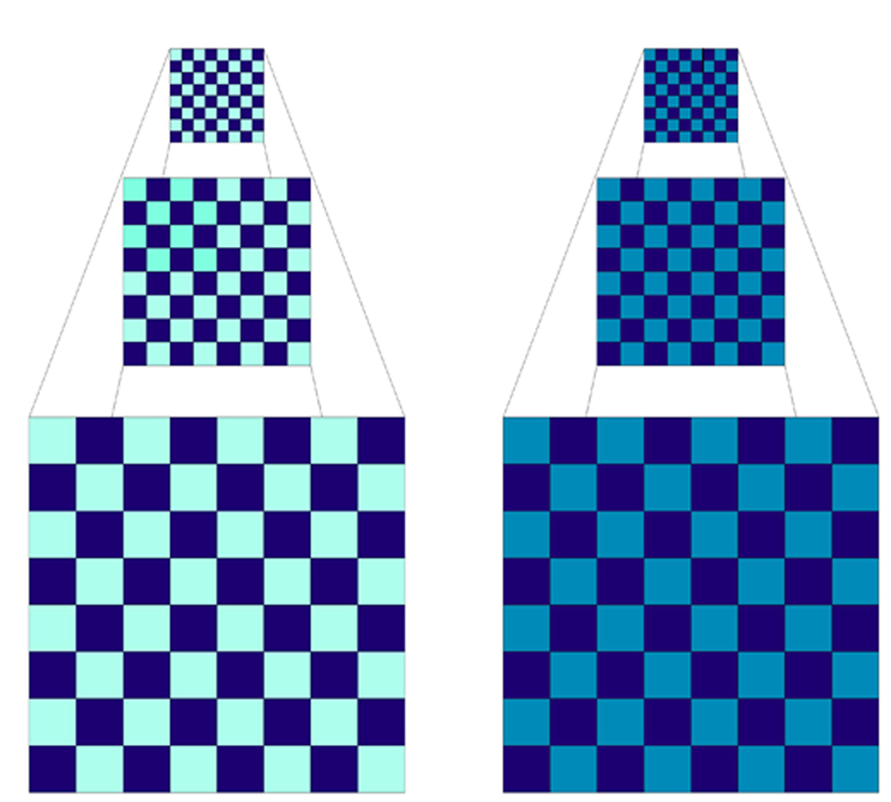
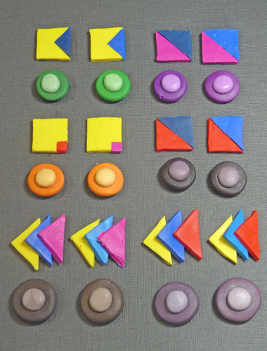
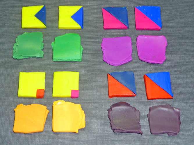
To contrast two colors you need to compare them. If their properties are very different, then the contrast is high. If not, then the contrast is low. Since color has three properties – hue, value and saturation – you need to compare colors in each of these areas. Let’s compare two checkerboards. Hue – Both the checkerboards are made out of two colors […]
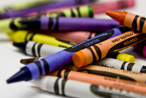
Treat yourself to a box of 64 crayons and clear some space in your studio. Its time for the return of Saturday School! Starting next Saturday, September 11th, I will be expanding on the exercises in Lindly’s and my book, Color Inspirations. Last year we covered Chapters 1 to 5. This year we will start with some […]
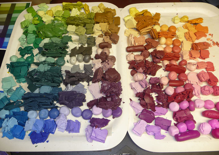
The first round of color scales I made used two primary colors, for example Red to Yellow. It didn’t take long before I started making value scales – taking a color to a white and then taking a color to a black. After awhile, I started making color scales using complementary colors to find the earth colors and neutrals in […]
Taking some time to make and document color mixes is the best way to learn how to mix colors instinctively. Playing scales on the piano trains the ear, making color mixes trains the eye. Color scales are my favorite way to record my color mixes but I encourage you to come up with your own system for keeping track […]
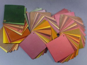
The idea for the Color Scales came when I was struggling to keep track of all the test mixing I was doing when I first started using polymer clay in the mid ’90’s. I decided there had to be a better way to organize all the little bits of clay and tried all kinds of systems before […]
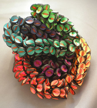
The Polymer Penguin’s pivot beads take the idea in a whole new direction. Zjet’s Flickr site has some gorgeous collages and shows more of her many colored pivot beads. The color coordinated caps add a beautiful finishing touch. Dora Arsenault strung multi-colored pivot beads into an eye-catching necklace. Dottie McMillan, author of Artful Ways with Polymer Clay, […]
There are many ways to play with this project. Jeanette Kandray sent a photo of her necklace on the collage that inspired it. Its not a rainbow skinner blend. Instead it is more of a value study from the dark purples though the pinks with the yellows of the collage captured in the yellow used for the […]
I’ve seen some wonderful images posted online by artists who have already made the Pinched Petal Necklace project in Chapter 4. Here’s a gorgeous one from Nora Pero’s flickr site. I especially love the tomato red centers! I would like to post a sampling of Pinched Petal necklace photos on Saturday for the Weekend Extra. If you have […]
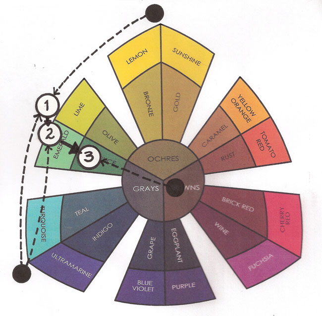
When you are instinctive mixing it helps to imagine the direction that you want to move the color. Once you know the direction, you can find the path. The “path” is the imaginary line that runs between the color you have and the color that you want. If you extend this line across the color sorter, any color along that line can be used to move the color to where […]
The rally was lots of fun. Pioneer Courthouse Square was filled to the brim with people carrying 350 banners. I love my city! Here are my Kato tasting tiles, including four muds made with equal parts of the various three primaries. The set-up for the muds is different from the book. I cut the squares of each primary […]
Here is the first step in making the tasting tiles using Kato Clay. I used Yellow, Blue, Turquoise, Magenta and Red. Greens: The first mixture of Yellow with Blue came out slightly muted. That is due to the Blue clay’s bias toward magenta. The Yellow with Turquoise came out very clear. Oranges: The mixtures of the Yellow/Magenta and […]
© 2025 Maggie Maggio