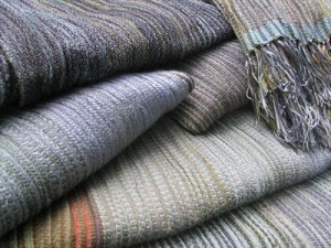
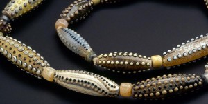
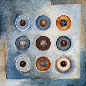
As much as I love polychromatic color schemes there are times when I just want to work in neutrals, or in the case of the three artists below – almost neutrals.
Scarves by Bobbie Kowciejowski.
Glass beads by Dan Adams.
Painting by Glenys Porter
Once I posted I realized I needed to include some white space to separate this post from the last one or they would clash.
Hmmm – what is clash and why is it a bad thing?


September 7, 2011 at 10:37 am
I agree. Its often the unexpected color that creates the wow factor. That’s a good kind of clash. But I’m thinking more about the grit your teeth, nails on blackboard kind of clash. Great if you are intending to push buttons. But someone’s clash is someone else’s pleasure. (Couldn’t help myself.)
September 3, 2011 at 6:31 am
I think clash is like humor. It’s an unexpected turn of events. A set of colors juxtaposed that you didn’t expect. As such, I don’t think clash is a bad thing. The complementary color scheme is a form of clash. Just a technique that can be used or abused depending on the artist.