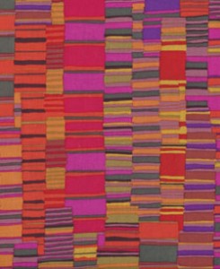
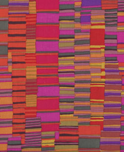
 I didn’t discover Kaffe Fassett‘s gorgeous designs until about ten years ago. To say I was stunned when I came across his knitting books at a friend’s house is an understatement. I was mesmerized. Color combinations that shouldn’t work somehow looked brilliant. The wow factor was huge.
Whether he is designing for knitters, quilters, tapestry artists, or needlepointers, Fassett’s projects are immediately recognizable for their vibrant use of color and strong patterns. How does he do it?
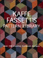
I found some clues in his book Pattern Library from 2003. Not only is it chock full of his distinctive patterns for knitting, it has an inspiring section in the back on choosing color palettes.
 Fasset writes about capturing color moods, about the deep glow that you get from using multiple shades of one color, about finding a “kick” color and, what was most formative for me, the importance of doing color trials. He says:
“The main thing is to have a go at trying out colours, the wilder the better. None of us designers really know what works until we see it, so sampling becomes wonderfully exciting as you stumble on really unpredictable and interesting colouring.”
I learned three things from this simple quote.
1. The importance of sampling. Trying out color combinations in a small way. You can’t really know how colors will look together until they are together. The time spent is well worth it and the materials you use do not have to go to waste. Fassett tries out three or four colourways for each new pattern and then turns his samples into blankets.
2. Even the best and most experienced designers cannot predict what will work. What a relief!
3. Exciting color combinations do not come from picking colors from a color wheel. You can follow all the rules and it will probably end up boring. Its the unpredictable choices that create the wow factor.
In a recent video interview for Erlman Tapestry, Fassett shares his passion for color and talks about how he works out the “colors and complications of colors” for his needlepoint designs. As a bonus, you can see him knitting surrounded by baskets of yarn and his own color inspirations.


August 11, 2011 at 12:12 am
Its the reds, magentas, and oranges all together that reach out and grab me. Wonder if someone who’s favorite color is blue responds the same way?? There’s also lots of info on his website – you just have to dig a little.
August 10, 2011 at 10:31 am
Kaffe has delved deeply into an number of subjects, mostly “decorative arts”- including mosaics, designing color ways for knitting yarns, two books on quilting and needlepoint. He also designs fabulous fabrics for quilters. If you do a quick search on Ebay for Kaffe Fassett fabric…you will see hundreds of very colorful, unusual and unique fabric designs.
Most recently I have been re- reading several of his books ( I am designing and cutting out a quilt at the moment). He certainly doesn’t shy away from reds and has a masterful eye for balancing color and value contrasts. Another fabric designer I admire for color is Marc Jacobs.
August 9, 2011 at 2:39 am
Yum! I love the idea of letting our inner colors out!
thanx
Cynthia
August 9, 2011 at 2:37 am
You may know him as a needlepointer but knitters and quilters will claim him as well. He has “fans of Kaffe Fassett” groups all over the fiber arts world. I recently checked out a dozen of his books from my local library for inspiration – and they are just the tip of the iceberg!
August 9, 2011 at 2:17 am
I love kaffe’s work. I discovered it before I did PC. Doesn’t he do needlepoint though instead of knitting?