Contrast Tables (p.84)

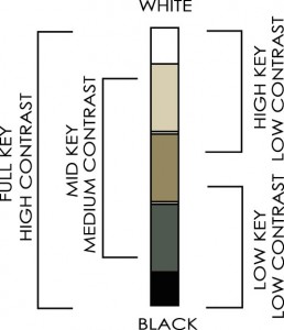
Value Keys As we saw last week, contrast of value is relative. Combinations of colors that are all high/light in value are called high key. Color combinations that are low/dark in value are called low key, and if all the colors are in the middle value range then the combination is in the mid key.
All these combinations are low in value contrast because the values of each color are similar. To get combinations that are high in value contrast you need to use colors that are far apart in value.
Hue Harmonies Color schemes are usually defined by hue or, more specifically, by the combination of hues. Combinations of hues are known as hue harmonies
Six common hue harmonies are show below.
 What is important to note is that the pure hues range in value from light (yellows) to dark (blue violet.)
This means that a polychromatic hue harmony using pure hues will automatically have value contrast.
The complementary hue harmony of sunshine yellow and blue violet is both high in hue and in value contrast.
But shade the yellow and tint the blue violet and the value contrast will be lost because the yellow and the blue violet both shift to a similar middle value. Using a high hue contrast color scheme does not guarantee value contrast.
 Saturation Ranges. The hardest contrast to understand is saturation. The highest saturation contrast would be color scheme that uses pure colors and black and white together. The difference in saturation from pure colors to neutrals is as big as it can get.
Weekend Extra Exercise: Make Variations of the Contrast Table

1. Think about a color scheme that you are interested in trying and mix eight to ten colors as the starting point for playing with the contrasts. Keep mixing until you get colors that you like together. Make enough of each color to use for three contrast tables.
2. Follow the instructions in the book for making the first contrast table using the colors you mixed.
3. Vary the values of each of the colors and make a second contrast table.
4. Vary the saturation of the colors and make a third contrast table.
5. Bake the contrast tables according to the manufacturers instructions.
6. Compare the levels of contrast in the three tables. The hue harmony will be the same in all three but the feeling will be completely different because the amount of contrast has shifted.