Using Tasting Tiles (p.59)
 The rally was lots of fun. Pioneer Courthouse Square was filled to the brim with people carrying 350 banners. I love my city!
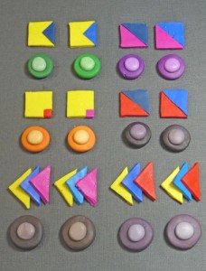
Here are my Kato tasting tiles, including four muds made with equal parts of the various three primaries. The set-up for the muds is different from the book. I cut the squares of each primary color in half diagonally.
Note that even though I am taking these photos under full spectrum lights, they are not totally accurate. The blues are especially hard to capture.
Analyzing the Tiles
I can tell just by looking at my collage that I probably won’t be using Magenta. It doesn’t appear in my collage and doesn’t make the secondary mixes I need.
Just for fun, I cut up a copy of my collage that appears in the book. I was curious to see how much of each primary and secondary hue there would be. It turns out  that in my collage there are some slightly muted greens, a larger section of blues, lots of red orange and oranges, and a very large section of yellows with a good amount of ochres. There are no clear purples. Instead of purples, there are many dark eggplant browns that match the Kato purples made with Kato Red.
Choosing Primaries
 If I was going to use Kato clay to match colors to my collage, I could rule out using Magenta very quickly. The Red will give me the oranges and the eggplant purples that I need so its the better choice. Since there is only one yellow, the big question is – which blue should I use? I would choose Kato Blue instead of the Turquoise because the greens I want are a little bit muddy. I also like the dark brown mud that results from using the Blue. The tasting tiles helped me confirm that the Kato primaries for this collage are the traditional Red, Yellow, and Blue. The colors I mix with these three primaries will give me a palette that matches my collage.
Weekend Extra Exercises
1. Make a color copy of your collage and cut it up into color swatches. Don’t be too picky – stick to just the six hue families and one or two mud colors.
2. Sort the swatches into hue families and glue them onto a piece of 11″ x 17″ poster board. Because you will lose some of the collage as you cut and because you’ll end up overlapping some of the piece, you will probably only cover about 3/4 of the board.
3. Look at all the variations in each of the hue families. How much hue, value and saturation range is there?
TIPS
If you use more than one brand of clay, be sure to mark your tasting tiles with the brand.
If your white clay is crumbly out of the package, cut a slice of white that is the same thickness as your tasting tiles. Then you don’t have to make a snake. Just use the circle cutter to cut pieces from the slice to mix with the pieces cut from the center of the tasting tile.
Look at both the untinted and tinted parts of the tasting tiles to determine which primaries make the colors that match your collage.
When I was cutting up my collage I used small envelopes for each of the hue families. This kept all the little pieces from flying away or getting lost on the table in my studio. (Easy to do given the mess!)
FAQs
1. Why limit the clays to just three primaries?
We suggest starting this way so that you can learn how to mix colors using the fewest package colors. Sometimes you need more than three to get the colors you need and sometimes its just easier to start with a package color for each of the six hue families. That’s OK.
2. Can I use black if its in my collage?
I like to use a mixed black instead of a package black but if you have lots of pure black in your collage then you can use package black.
3. What should I do if I can’t decide between two primaries?
You can mix the two primaries together or you can choose to use both for your palette. There are no fixed rules. The goal is to be able to mix colors to match your collage. A little exploration goes a long way toward making color mixing much easier.